

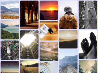
This tutorial will guide you through creating a CSS image grid with different image sizes. We’ll use CSS Grid to achieve this responsive layout, making it adaptable to various screen sizes. This is a great way to showcase images in an engaging and visually appealing manner.
Step 1: Setting up the HTML Structure
First, we need a container to hold our images. Inside this container, we’ll add each image with specific class names to control their size and position within the grid.
Here’s how the basic HTML structure should look:
 <div class="parent">
    <img class="general val1" src="https://cdn.pixabay.com/photo/2023/07/11/17/24/ai-generated-8121001_1280.jpg" />
    <img class="general val2" src="https://cdn.pixabay.com/photo/2023/08/03/13/49/ai-generated-8167209_640.png" />
    <img class="general val3" src="https://cdn.pixabay.com/photo/2022/12/03/16/26/crater-7633035_640.png" />
    <img class="general val4" src="https://cdn.pixabay.com/photo/2023/08/04/08/35/ai-generated-8168687_640.jpg" />
    <img class="general val5" src="https://cdn.pixabay.com/photo/2023/07/28/12/29/ai-generated-8155175_640.png" />
    <img class="general val6" src="https://cdn.pixabay.com/photo/2023/02/20/20/44/ai-generated-7803070_640.jpg" />
    <img class="general val7" src="https://cdn.pixabay.com/photo/2023/07/03/09/36/ai-generated-8103801_1280.jpg" />
    <img class="general val8" src="https://cdn.pixabay.com/photo/2023/02/17/10/44/ai-generated-7795744_640.jpg" />
    <img class="general val9" src="https://cdn.pixabay.com/photo/2023/08/03/11/57/ai-generated-8166964_640.jpg" />
  </div>
Step 2: Styling with CSS
Applying CSS Grid
Now, let’s style our grid using CSS. We’ll use CSS Grid’s grid-template-columns, grid-column-gap, and grid-row-gap properties to define the grid layout and spacing. We’ll also use individual classes for each image to specify its size and position within the grid.
Here’s the CSS code:
body{
  background-color: black;
}

.parent {
  display: grid;
  grid-template-columns: repeat(4, 1fr);
  grid-column-gap: 10px;
  grid-row-gap: 10px;
}

.general {
  width: 100%;
  height: 100%;
}

.val1 {
  grid-column: 1 / span 1;
  grid-row: 1 / span 1;
}

.val2 {
  grid-column: 2 / span 1;
  grid-row: 1 / span 1;
}

.val3 {
  grid-column: 3 / span 1;
  grid-row: 1 / span 2;
}

.val4 {
  grid-column: 4 / span 1;
  grid-row: 1 / span 1;
}

.val5 {
  grid-column: 1 / span 2;
  grid-row: 2 / span 1;
}

.val6 {
  grid-column: 4 / span 1;
  grid-row: 2 / span 2;
}

.val7 {
  grid-column: 1 / span 2;
  grid-row: 3 / span 2;
}

.val8 {
  grid-column: 3 / span 1;
  grid-row: 3 / span 1;
}

.val9 {
  grid-column: 3 / span 2;
  grid-row: 4 / span 1;
}

@media (min-width: 320px) {
  .parent {
    margin: 20px;
  }
}

@media (min-width: 480px) {
  .parent {
    margin: 20px 50px;
  }
}

@media (min-width: 600px) {
  .parent {
    margin: 50px 150px;
  }
}

@media (min-width: 801px) {
  .parent {
    margin: 50px 200px;
  }
}

@media (min-width: 1025px) {
  .parent {
    margin: 50px 300px;
  }
}
That’s all! Hopefully, you have successfully created image grid with different sizes using HTML & CSS. If you have any questions or suggestions, feel free to comment below.

