

This tutorial will guide you through creating a simple image gallery with an accordion-like effect using HTML, CSS, and a touch of JavaScript. This responsive design will enhance your website’s visual appeal and user experience.
Step 1: Setting up Header Assets
First, we’ll add some external resources to our HTML document’s header. This includes linking to a font and a CSS reset file.
<link href="https://fonts.googleapis.com/css?family=Oswald:700" rel="stylesheet">
<link rel="stylesheet" href="https://public.codepenassets.com/css/reset-2.0.min.css">
Step 2: Building the HTML Structure
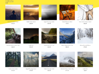
Next, let’s create the basic HTML structure for our image gallery. We’ll use divs to organize the gallery and its images. Each image will be contained within its own div.
<div class="container">
  <h1>Gallery</h1>

  <div class="gallery-wrap">
    <div class="item item-1"></div>
    <div class="item item-2"></div>
    <div class="item item-3"></div>
    <div class="item item-4"></div>
    <div class="item item-5"></div>
  </div>
 </div>

<div class="social">
  <a href="https://twitter.com/StefCharle" target="_blank">
    <img src="https://s3-us-west-2.amazonaws.com/s.cdpn.io/149103/twitter.svg" alt="">
  </a>
</div>
Step 3: Styling with CSS
Now, let’s add the CSS to style our gallery. We’ll use flexbox for layout and add some transitions for a smooth hover effect. The CSS will handle the appearance, layout, and hover behavior of the gallery images.
html, body {
  width: 100%;
  height: 100%;
}

.container {
  padding: 75px 0;
  margin: 0 auto;
  width: 1140px;
}

h1 {
  position: relative;
  margin-bottom: 45px;
  font-family: "Oswald", sans-serif;
  font-size: 44px;
  text-transform: uppercase;
  color: #424242;
}

.gallery-wrap {
  display: flex;
  flex-direction: row;
  width: 100%;
  height: 70vh;
}

.item {
  flex: 1;
  height: 100%;
  background-position: center;
  background-size: cover;
  background-repeat: none;
  transition: flex 0.8s ease;
}
.item:hover {
  flex: 7;
}

.item-1 {
  background-image: url("https://images.unsplash.com/photo-1499198116522-4a6235013d63?auto=format&fit=crop&w=1233&q=80");
}

.item-2 {
  background-image: url("https://images.unsplash.com/photo-1492760864391-753aaae87234?auto=format&fit=crop&w=1336&q=80");
}

.item-3 {
  background-image: url("https://images.unsplash.com/photo-1503631285924-e1544dce8b28?auto=format&fit=crop&w=1234&q=80");
}

.item-4 {
  background-image: url("https://images.unsplash.com/photo-1510425463958-dcced28da480?auto=format&fit=crop&w=1352&q=80");
}

.item-5 {
  background-image: url("https://images.unsplash.com/photo-1503602642458-232111445657?auto=format&fit=crop&w=1234&q=80");
}

.social {
  position: absolute;
  right: 35px;
  bottom: 0;
}
.social img {
  display: block;
  width: 32px;
}
Congratulations! You’ve successfully created a simple image gallery. Remember to replace the placeholder image URLs with your own images.