
Here’s how to create a dynamic and visually appealing Bootstrap Collapsible Panel with Up/Down Arrow Icon, enhancing user experience and interface clarity. This guide will walk you through the process step-by-step.
Step 1: Include Bootstrap CSS
To begin, you’ll need to include the Bootstrap CSS framework in the <head> section of your HTML document. This provides the fundamental styling and structure for the collapsible panel.
<link rel='stylesheet' href='https://maxcdn.bootstrapcdn.com/bootstrap/3.3.6/css/bootstrap.min.css'>
Step 2: Construct the HTML Structure
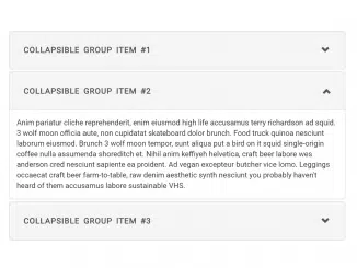
Now, let’s create the HTML structure for the collapsible panel. This involves using Bootstrap’s panel, panel-group, and accordion classes to create the desired layout and functionality.
<div class="wrapper center-block">
  <div class="panel-group" id="accordion" role="tablist" aria-multiselectable="true">
  <div class="panel panel-default">
    <div class="panel-heading active" role="tab" id="headingOne">
      <h4 class="panel-title">
        <a role="button" data-toggle="collapse" data-parent="#accordion" href="#collapseOne" aria-expanded="true" aria-controls="collapseOne">
          Collapsible Group Item #1
        </a>
      </h4>
    </div>
    <div id="collapseOne" class="panel-collapse collapse in" role="tabpanel" aria-labelledby="headingOne">
      <div class="panel-body">
        Anim pariatur cliche reprehenderit, enim eiusmod high life accusamus terry richardson ad squid. 3 wolf moon officia aute, non cupidatat skateboard dolor brunch. Food truck quinoa nesciunt laborum eiusmod. Brunch 3 wolf moon tempor, sunt aliqua put a bird on it squid single-origin coffee nulla assumenda shoreditch et. Nihil anim keffiyeh helvetica, craft beer labore wes anderson cred nesciunt sapiente ea proident. Ad vegan excepteur butcher vice lomo. Leggings occaecat craft beer farm-to-table, raw denim aesthetic synth nesciunt you probably haven't heard of them accusamus labore sustainable VHS.
      </div>
    </div>
  </div>
  <div class="panel panel-default">
    <div class="panel-heading" role="tab" id="headingTwo">
      <h4 class="panel-title">
        <a class="collapsed" role="button" data-toggle="collapse" data-parent="#accordion" href="#collapseTwo" aria-expanded="false" aria-controls="collapseTwo">
          Collapsible Group Item #2
        </a>
      </h4>
    </div>
    <div id="collapseTwo" class="panel-collapse collapse" role="tabpanel" aria-labelledby="headingTwo">
      <div class="panel-body">
        Anim pariatur cliche reprehenderit, enim eiusmod high life accusamus terry richardson ad squid. 3 wolf moon officia aute, non cupidatat skateboard dolor brunch. Food truck quinoa nesciunt laborum eiusmod. Brunch 3 wolf moon tempor, sunt aliqua put a bird on it squid single-origin coffee nulla assumenda shoreditch et. Nihil anim keffiyeh helvetica, craft beer labore wes anderson cred nesciunt sapiente ea proident. Ad vegan excepteur butcher vice lomo. Leggings occaecat craft beer farm-to-table, raw denim aesthetic synth nesciunt you probably haven't heard of them accusamus labore sustainable VHS.
      </div>
    </div>
  </div>
  <div class="panel panel-default">
    <div class="panel-heading" role="tab" id="headingThree">
      <h4 class="panel-title">
        <a class="collapsed" role="button" data-toggle="collapse" data-parent="#accordion" href="#collapseThree" aria-expanded="false" aria-controls="collapseThree">
          Collapsible Group Item #3
        </a>
      </h4>
    </div>
    <div id="collapseThree" class="panel-collapse collapse" role="tabpanel" aria-labelledby="headingThree">
      <div class="panel-body">
        Anim pariatur cliche reprehenderit, enim eiusmod high life accusamus terry richardson ad squid. 3 wolf moon officia aute, non cupidatat skateboard dolor brunch. Food truck quinoa nesciunt laborum eiusmod. Brunch 3 wolf moon tempor, sunt aliqua put a bird on it squid single-origin coffee nulla assumenda shoreditch et. Nihil anim keffiyeh helvetica, craft beer labore wes anderson cred nesciunt sapiente ea proident. Ad vegan excepteur butcher vice lomo. Leggings occaecat craft beer farm-to-table, raw denim aesthetic synth nesciunt you probably haven't heard of them accusamus labore sustainable VHS.
      </div>
    </div>
  </div>
</div>
</div>
Step 3: Add Custom CSS Styling
Next, include custom CSS to style your panel and to manage the up/down arrow icon. This ensures the panel looks and behaves as expected, especially concerning the icon’s rotation.
body{
  padding:50px;
  background:#fff;
}
.wrapper{
  width:70%;
}
@media(max-width:992px){
 .wrapper{
  width:100%;
}
}
.panel-heading {
  padding: 0;
	border:0;
}
.panel-title>a, .panel-title>a:active{
	display:block;
	padding:15px;
  color:#555;
  font-size:16px;
  font-weight:bold;
	text-transform:uppercase;
	letter-spacing:1px;
  word-spacing:3px;
	text-decoration:none;
}
.panel-heading  a:before {
   font-family: 'Glyphicons Halflings';
   content: "\e114";
   float: right;
   transition: all 0.5s;
}
.panel-heading.active a:before {
	-webkit-transform: rotate(180deg);
	-moz-transform: rotate(180deg);
	transform: rotate(180deg);
}
Step 4: Implement JavaScript Functionality
To make the panel’s arrow icon change direction when the panel is collapsed or expanded, you’ll need to add some JavaScript. This script toggles an ‘active’ class on the panel heading, which is used to rotate the arrow icon via CSS.
$('.panel-collapse').on('show.bs.collapse', function () {
    $(this).siblings('.panel-heading').addClass('active');
  });

  $('.panel-collapse').on('hide.bs.collapse', function () {
    $(this).siblings('.panel-heading').removeClass('active');
  });
By following these steps, you’ve successfully implemented a Bootstrap Collapsible Panel With Up/Down Arrow Icon, enhancing the interactivity and user-friendliness of your web page.
