
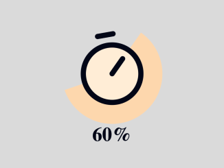
Here’s how to create a Circular Scroll Indicator Using Pure CSS. This tutorial will guide you through building a visual indicator that represents the user’s scroll progress on a webpage, crafted entirely with CSS, offering a dynamic and engaging user experience.
Adding Header Assets
To begin, you’ll need to include the necessary CSS reset stylesheet in the section of your HTML document. This ensures consistent styling across different browsers.
<link rel="stylesheet" href="https://public.codepenassets.com/css/reset-2.0.min.css">
Constructing the HTML Structure
Next, you need to create the core HTML structure for the circular scroll indicator. This includes a warning message for unsupported browsers and the SVG element that visually represents the indicator.
<div class="warning">
  <p>⚠️ Scroll-driven animations are not supported in this browser. Try this demo in Chrome 115+.</p>
</div>

<figure class="component" aria-hidden="true" webc:root="override">
  <div class="timer-wrapper">
    <svg class="timer" xmlns="http://www.w3.org/2000/svg" width="24" height="24" fill="currentcolor" viewBox="0 0 256 256">
      <rect width="256" height="256" fill="none"></rect>
      <circle cx="128" cy="128" r="88" fill="var(--color-theme)"></circle>
      <circle cx="128" cy="128" r="88" fill="none" stroke="currentcolor" stroke-miterlimit="10" stroke-width="16"></circle>
      <line class="timer-hand" x1="128" y1="128" x2="167.6" y2="88.4" fill="none" stroke="currentcolor" stroke-linecap="round" stroke-linejoin="round" stroke-width="16"></line>
      <line class="timer-switch" x1="104" y1="8" x2="152" y2="8" fill="none" stroke="currentcolor" stroke-linecap="round" stroke-linejoin="round" stroke-width="16"></line>
    </svg>
  </div>
  <figcaption class="caption"></figcaption>
</figure>
Styling with CSS
Now, let’s define the CSS styles to create the visual appearance and animation of the circular scroll indicator. This involves styling the container, the circular progress bar, and handling the animation based on scroll position.
:root {
  --color-bg: #fffefd;
  --color-text: #020617;
  --color-theme: #ffedd5;
  --color-theme-accent: #fed7aa;
}

@property --progress {
  syntax: "<integer>";
  initial-value: 0;
  inherits: false;
}

body {
  color: var(--color-text);
  background-color: var(--color-bg);
  font-family: system-ui, sans-serif;
}

.component {
  --size: 30vmin;

  display: grid;
  grid-template-areas:
    "timer"
    "caption";
  place-items: center;
  place-content: center;
  gap: 0.2em;
  position: fixed;
  inset: 0;
  margin: auto;
}

.timer-wrapper {
  grid-area: timer;
  display: grid;
  place-items: center;
  place-content: center;
  grid-template-areas: "container";
  width: var(--size);
  height: var(--size);
  border-radius: 50%;
  background: conic-gradient(
    from 45deg,
    var(--color-theme-accent) calc(var(--progress) * 1%),
    transparent 0
  );
}

.timer-wrapper > * {
  grid-area: container;
}

.timer {
  width: calc(var(--size) / 1.2);
  height: calc(var(--size) / 1.2);
}

.caption {
  grid-area: caption;
}

.caption::before,
.caption::after {
  margin-inline: auto;
  content: counter(progress);
  font-size: calc(0.6em + var(--size) / 6);
  font-weight: bold;
  text-align: center;
  font-variant-numeric: tabular-nums;
}

.caption::after {
  content: "%";
}

/* Warning for unsupported browsers */
.warning {
  color: black;
  background: papayawhip;
  padding: 1rem;
  line-height: 1.3;
  text-align: center;
}

@supports (animation-timeline: scroll()) {
  .warning {
    display: none;
  }

  body {
    height: 1000vh;
  }

  :is(.component, .timer-wrapper, .timer, .timer-hand, .timer-switch) {
    -webkit-animation-fill-mode: both;
            animation-fill-mode: both;
    -webkit-animation-timing-function: linear;
            animation-timing-function: linear;
    animation-timeline: scroll();
  }

  .component {
    --plunge-offset: 10rem;
    --plunge-start: calc(100% - var(--plunge-offset) * 2);
    --plunge-end: calc(100% - var(--plunge-offset));

    -webkit-animation-name: progress;

            animation-name: progress;
    animation-range: 0 var(--plunge-start);
    counter-reset: progress var(--progress);
  }

  .timer-wrapper {
    -webkit-animation-name: progress, turn-upright;
            animation-name: progress, turn-upright;
    animation-range: 0 var(--plunge-start),
      var(--plunge-start) var(--plunge-end);
  }

  .timer {
    --plunge-depth: 0.25em;
    transform-origin: 50% 0;
    -webkit-animation-name: plunge;
            animation-name: plunge;
    animation-range: var(--plunge-start) var(--plunge-end);
  }

  .timer-switch {
    --plunge-depth: 1em;
    transform-origin: 50% 0;
    -webkit-animation-name: plunge;
            animation-name: plunge;
    animation-range: var(--plunge-start) var(--plunge-end);
  }

  .timer-hand {
    transform-origin: 50%;
    rotate: calc((var(--progress) / 100) * 360deg);
    -webkit-animation-name: progress;
            animation-name: progress;
    animation-range: 0 var(--plunge-start);
  }

  @-webkit-keyframes progress {
    to {
      --progress: 100;
    }
  }

  @keyframes progress {
    to {
      --progress: 100;
    }
  }

  @-webkit-keyframes turn-upright {
    from {
      rotate: -10deg;
    }
    to {
      rotate: 0;
    }
  }

  @keyframes turn-upright {
    from {
      rotate: -10deg;
    }
    to {
      rotate: 0;
    }
  }

  @-webkit-keyframes plunge {
    50% {
      translate: 0 var(--plunge-depth);
    }
  }

  @keyframes plunge {
    50% {
      translate: 0 var(--plunge-depth);
    }
  }

  @-webkit-keyframes fade-out {
    from {
      opacity: 1;
    }
    to {
      opacity: 0;
    }
  }

  @keyframes fade-out {
    from {
      opacity: 1;
    }
    to {
      opacity: 0;
    }
  }
}
Adding Footer Assets
If your project requires any JavaScript libraries or custom scripts for enhanced functionality, add them now.
You’ve successfully created a Circular Scroll Indicator Using Pure CSS. This approach provides a visually appealing and informative way to display scroll progress. If you have any questions or suggestions, feel free to reach out.