
If you need to quickly build a functional and visually appealing control panel for your web application, this tutorial provides the perfect Admin Dashboard HTML CSS Source Code. This comprehensive guide helps you create a responsive and interactive dashboard layout. It features vertical tabs for navigation and dynamic content panels. This ensures a smooth user experience. The code is ideal for displaying key metrics, managing projects, and handling settings efficiently.
How to Create Your Admin Dashboard
1. Set Up Your HTML Document Head
First, include the necessary meta tags and external resources in the <head> section of your HTML file. This ensures proper responsiveness and styling.
<meta charset="UTF-8">
    <meta name="viewport" content="width=device-width, initial-scale=1.0">
    <title>Vertical Tabs</title>
    <script src="https://cdn.jsdelivr.net/npm/@tailwindcss/browser@4"></script>
    <link href="https://fonts.googleapis.com/css2?family=Inter:wght@300;400;500;600;700;800&display=swap" rel="stylesheet">
2. Build the Core HTML Structure
Next, create the main content for your dashboard. This includes the navigation tabs and their corresponding content panels. Each section will be clearly organized.
<div class="main-container">
<!-- Vertical Tabs Navigation -->
<nav class="tabs-nav">
<div class="nav-header">
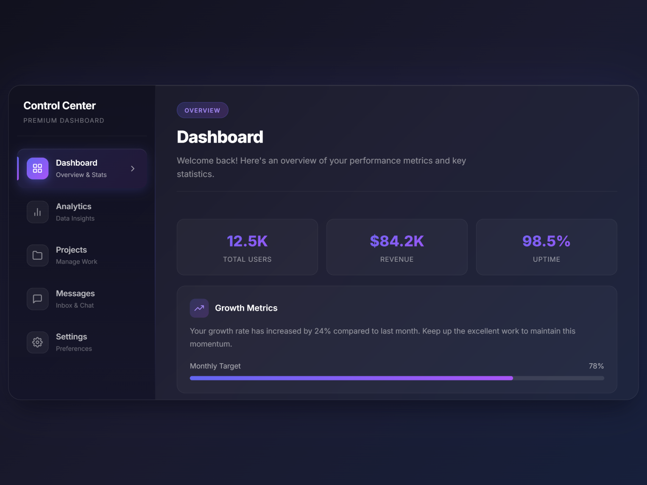
<h2>Control Center</h2>
<p>Premium Dashboard</p>
</div>
<button class="tab-btn active" data-tab="dashboard">
<div class="tab-icon">
<svg viewBox="0 0 24 24" fill="none" stroke-width="2" stroke-linecap="round" stroke-linejoin="round">
<rect x="3" y="3" width="7" height="7" rx="1"></rect>
<rect x="14" y="3" width="7" height="7" rx="1"></rect>
<rect x="3" y="14" width="7" height="7" rx="1"></rect>
<rect x="14" y="14" width="7" height="7" rx="1"></rect>
</svg>
</div>
<div class="tab-text">
<div class="tab-title">Dashboard</div>
<div class="tab-subtitle">Overview & Stats</div>
</div>
<div class="tab-arrow">
<svg viewBox="0 0 24 24" fill="none" stroke-width="2" stroke-linecap="round" stroke-linejoin="round">
<polyline points="9 18 15 12 9 6"></polyline>
</svg>
</div>
</button>
<button class="tab-btn" data-tab="analytics">
<div class="tab-icon">
<svg viewBox="0 0 24 24" fill="none" stroke-width="2" stroke-linecap="round" stroke-linejoin="round">
<line x1="18" y1="20" x2="18" y2="10"></line>
<line x1="12" y1="20" x2="12" y2="4"></line>
<line x1="6" y1="20" x2="6" y2="14"></line>
</svg>
</div>
<div class="tab-text">
<div class="tab-title">Analytics</div>
<div class="tab-subtitle">Data Insights</div>
</div>
<div class="tab-arrow">
<svg viewBox="0 0 24 24" fill="none" stroke-width="2" stroke-linecap="round" stroke-linejoin="round">
<polyline points="9 18 15 12 9 6"></polyline>
</svg>
</div>
</button>
<button class="tab-btn" data-tab="projects">
<div class="tab-icon">
<svg viewBox="0 0 24 24" fill="none" stroke-width="2" stroke-linecap="round" stroke-linejoin="round">
<path d="M22 19a2 2 0 0 1-2 2H4a2 2 0 0 1-2-2V5a2 2 0 0 1 2-2h5l2 3h9a2 2 0 0 1 2 2z"></path>
</svg>
</div>
<div class="tab-text">
<div class="tab-title">Projects</div>
<div class="tab-subtitle">Manage Work</div>
</div>
<div class="tab-arrow">
<svg viewBox="0 0 24 24" fill="none" stroke-width="2" stroke-linecap="round" stroke-linejoin="round">
<polyline points="9 18 15 12 9 6"></polyline>
</svg>
</div>
</button>
<button class="tab-btn" data-tab="messages">
<div class="tab-icon">
<svg viewBox="0 0 24 24" fill="none" stroke-width="2" stroke-linecap="round" stroke-linejoin="round">
<path d="M21 15a2 2 0 0 1-2 2H7l-4 4V5a2 2 0 0 1 2-2h14a2 2 0 0 1 2 2z"></path>
</svg>
</div>
<div class="tab-text">
<div class="tab-title">Messages</div>
<div class="tab-subtitle">Inbox & Chat</div>
</div>
<div class="tab-arrow">
<svg viewBox="0 0 24 24" fill="none" stroke-width="2" stroke-linecap="round" stroke-linejoin="round">
<polyline points="9 18 15 12 9 6"></polyline>
</svg>
</div>
</button>
<button class="tab-btn" data-tab="settings">
<div class="tab-icon">
<svg viewBox="0 0 24 24" fill="none" stroke-width="2" stroke-linecap="round" stroke-linejoin="round">
<circle cx="12" cy="12" r="3"></circle>
<path d="M19.4 15a1.65 1.65 0 0 0 .33 1.82l.06.06a2 2 0 0 1 0 2.83 2 2 0 0 1-2.83 0l-.06-.06a1.65 1.65 0 0 0-1.82-.33 1.65 1.65 0 0 0-1 1.51V21a2 2 0 0 1-2 2 2 2 0 0 1-2-2v-.09A1.65 1.65 0 0 0 9 19.4a1.65 1.65 0 0 0-1.82.33l-.06.06a2 2 0 0 1-2.83 0 2 2 0 0 1 0-2.83l.06-.06a1.65 1.65 0 0 0 .33-1.82 1.65 1.65 0 0 0-1.51-1H3a2 2 0 0 1-2-2 2 2 0 0 1 2-2h.09A1.65 1.65 0 0 0 4.6 9a1.65 1.65 0 0 0-.33-1.82l-.06-.06a2 2 0 0 1 0-2.83 2 2 0 0 1 2.83 0l.06.06a1.65 1.65 0 0 0 1.82.33H9a1.65 1.65 0 0 0 1-1.51V3a2 2 0 0 1 2-2 2 2 0 0 1 2 2v.09a1.65 1.65 0 0 0 1 1.51 1.65 1.65 0 0 0 1.82-.33l.06-.06a2 2 0 0 1 2.83 0 2 2 0 0 1 0 2.83l-.06.06a1.65 1.65 0 0 0-.33 1.82V9a1.65 1.65 0 0 0 1.51 1H21a2 2 0 0 1 2 2 2 2 0 0 1-2 2h-.09a1.65 1.65 0 0 0-1.51 1z"></path>
</svg>
</div>
<div class="tab-text">
<div class="tab-title">Settings</div>
<div class="tab-subtitle">Preferences</div>
</div>
<div class="tab-arrow">
<svg viewBox="0 0 24 24" fill="none" stroke-width="2" stroke-linecap="round" stroke-linejoin="round">
<polyline points="9 18 15 12 9 6"></polyline>
</svg>
</div>
</button>
</nav>
<!-- Tab Content Panels -->
<div class="tabs-content">
<!-- Dashboard Panel -->
<div class="tab-panel active" id="dashboard">
<div class="panel-header">
<span class="panel-badge">Overview</span>
<h1 class="panel-title">Dashboard</h1>
<p class="panel-description">Welcome back! Here's an overview of your performance metrics and key statistics.</p>
</div>
<div class="panel-content">
<div class="stats-grid">
<div class="stat-item">
<div class="stat-value">12.5K</div>
<div class="stat-label">Total Users</div>
</div>
<div class="stat-item">
<div class="stat-value">$84.2K</div>
<div class="stat-label">Revenue</div>
</div>
<div class="stat-item">
<div class="stat-value">98.5%</div>
<div class="stat-label">Uptime</div>
</div>
</div>
<div class="content-card">
<div class="card-header">
<div class="card-icon">
<svg viewBox="0 0 24 24" fill="none" stroke-width="2" stroke-linecap="round" stroke-linejoin="round">
<polyline points="23 6 13.5 15.5 8.5 10.5 1 18"></polyline>
<polyline points="17 6 23 6 23 12"></polyline>
</svg>
</div>
<h3 class="card-title">Growth Metrics</h3>
</div>
<p class="card-text">Your growth rate has increased by 24% compared to last month. Keep up the excellent work to maintain this momentum.</p>
<div class="progress-bar-container">
<div class="progress-label">
<span>Monthly Target</span>
<span>78%</span>
</div>
<div class="progress-bar">
<div class="progress-fill" style="width: 78%"></div>
</div>
</div>
</div>
</div>
</div>
<!-- Analytics Panel -->
<div class="tab-panel" id="analytics">
<div class="panel-header">
<span class="panel-badge">Insights</span>
<h1 class="panel-title">Analytics</h1>
<p class="panel-description">Deep dive into your data with comprehensive analytics and detailed reports.</p>
</div>
<div class="panel-content">
<div class="content-card">
<div class="card-header">
<div class="card-icon">
<svg viewBox="0 0 24 24" fill="none" stroke-width="2" stroke-linecap="round" stroke-linejoin="round">
<circle cx="12" cy="12" r="10"></circle>
<polyline points="12 6 12 12 16 14"></polyline>
</svg>
</div>
<h3 class="card-title">Real-time Analytics</h3>
</div>
<p class="card-text">Monitor your metrics in real-time with live updates every 5 seconds. Get instant insights into user behavior and system performance.</p>
</div>
<div class="stats-grid">
<div class="stat-item">
<div class="stat-value">2.4M</div>
<div class="stat-label">Page Views</div>
</div>
<div class="stat-item">
<div class="stat-value">18.3%</div>
<div class="stat-label">Bounce Rate</div>
</div>
<div class="stat-item">
<div class="stat-value">4:32</div>
<div class="stat-label">Avg. Session</div>
</div>
</div>
<div class="content-card">
<div class="card-header">
<div class="card-icon">
<svg viewBox="0 0 24 24" fill="none" stroke-width="2" stroke-linecap="round" stroke-linejoin="round">
<path d="M21 16V8a2 2 0 0 0-1-1.73l-7-4a2 2 0 0 0-2 0l-7 4A2 2 0 0 0 3 8v8a2 2 0 0 0 1 1.73l7 4a2 2 0 0 0 2 0l7-4A2 2 0 0 0 21 16z"></path>
</svg>
</div>
<h3 class="card-title">Conversion Funnel</h3>
</div>
<div class="progress-bar-container">
<div class="progress-label"><span>Visitors</span><span>100%</span></div>
<div class="progress-bar">
<div class="progress-fill" style="width: 100%"></div>
</div>
</div>
<div class="progress-bar-container">
<div class="progress-label"><span>Leads</span><span>45%</span></div>
<div class="progress-bar">
<div class="progress-fill" style="width: 45%"></div>
</div>
</div>
<div class="progress-bar-container">
<div class="progress-label"><span>Conversions</span><span>12%</span></div>
<div class="progress-bar">
<div class="progress-fill" style="width: 12%"></div>
</div>
</div>
</div>
</div>
</div>
<!-- Projects Panel -->
<div class="tab-panel" id="projects">
<div class="panel-header">
<span class="panel-badge">Workspace</span>
<h1 class="panel-title">Projects</h1>
<p class="panel-description">Manage all your projects efficiently with our powerful project management tools.</p>
</div>
<div class="panel-content">
<div class="content-card">
<div class="card-header">
<div class="card-icon">
<svg viewBox="0 0 24 24" fill="none" stroke-width="2" stroke-linecap="round" stroke-linejoin="round">
<path d="M12 20h9"></path>
<path d="M16.5 3.5a2.121 2.121 0 0 1 3 3L7 19l-4 1 1-4L16.5 3.5z"></path>
</svg>
</div>
<h3 class="card-title">Active Projects</h3>
</div>
<ul class="feature-list">
<li>Website Redesign - In Progress (75%)</li>
<li>Mobile App Development - Planning Phase</li>
<li>API Integration - Code Review</li>
<li>Database Migration - Testing</li>
<li>Security Audit - Completed</li>
</ul>
</div>
<div class="stats-grid">
<div class="stat-item">
<div class="stat-value">24</div>
<div class="stat-label">Active</div>
</div>
<div class="stat-item">
<div class="stat-value">156</div>
<div class="stat-label">Completed</div>
</div>
<div class="stat-item">
<div class="stat-value">8</div>
<div class="stat-label">Pending</div>
</div>
</div>
</div>
</div>
<!-- Messages Panel -->
<div class="tab-panel" id="messages">
<div class="panel-header">
<span class="panel-badge">Communication</span>
<h1 class="panel-title">Messages</h1>
<p class="panel-description">Stay connected with your team through our integrated messaging system.</p>
</div>
<div class="panel-content">
<div class="stats-grid">
<div class="stat-item">
<div class="stat-value">47</div>
<div class="stat-label">Unread</div>
</div>
<div class="stat-item">
<div class="stat-value">12</div>
<div class="stat-label">Starred</div>
</div>
<div class="stat-item">
<div class="stat-value">5</div>
<div class="stat-label">Drafts</div>
</div>
</div>
<div class="content-card">
<div class="card-header">
<div class="card-icon">
<svg viewBox="0 0 24 24" fill="none" stroke-width="2" stroke-linecap="round" stroke-linejoin="round">
<path d="M17 21v-2a4 4 0 0 0-4-4H5a4 4 0 0 0-4 4v2"></path>
<circle cx="9" cy="7" r="4"></circle>
<path d="M23 21v-2a4 4 0 0 0-3-3.87"></path>
<path d="M16 3.13a4 4 0 0 1 0 7.75"></path>
</svg>
</div>
<h3 class="card-title">Team Conversations</h3>
</div>
<p class="card-text">You have 3 active group conversations and 8 direct messages waiting for your response. The design team is discussing the new UI components.</p>
</div>
<div class="content-card">
<div class="card-header">
<div class="card-icon">
<svg viewBox="0 0 24 24" fill="none" stroke-width="2" stroke-linecap="round" stroke-linejoin="round">
<path d="M22 17H2a3 3 0 0 0 3-3V9a7 7 0 0 1 14 0v5a3 3 0 0 0 3 3zm-8.27 4a2 2 0 0 1-3.46 0"></path>
</svg>
</div>
<h3 class="card-title">Notifications</h3>
</div>
<ul class="feature-list">
<li>New comment on Project Alpha</li>
<li>Meeting reminder: 3:00 PM Today</li>
<li>File shared by Alex Thompson</li>
<li>Weekly report is ready to view</li>
</ul>
</div>
</div>
</div>
<!-- Settings Panel -->
<div class="tab-panel" id="settings">
<div class="panel-header">
<span class="panel-badge">Configuration</span>
<h1 class="panel-title">Settings</h1>
<p class="panel-description">Customize your experience with advanced settings and preferences.</p>
</div>
<div class="panel-content">
<div class="content-card">
<div class="card-header">
<div class="card-icon">
<svg viewBox="0 0 24 24" fill="none" stroke-width="2" stroke-linecap="round" stroke-linejoin="round">
<path d="M12 22s8-4 8-10V5l-8-3-8 3v7c0 6 8 10 8 10z"></path>
</svg>
</div>
<h3 class="card-title">Privacy & Security</h3>
</div>
<div class="toggle-group">
<div class="toggle-item">
<div class="toggle-info">
<h4>Two-Factor Authentication</h4>
<p>Add an extra layer of security</p>
</div>
<div class="toggle-switch active" data-toggle="2fa"></div>
</div>
<div class="toggle-item">
<div class="toggle-info">
<h4>Login Notifications</h4>
<p>Get alerts for new sign-ins</p>
</div>
<div class="toggle-switch" data-toggle="login-notify"></div>
</div>
<div class="toggle-item">
<div class="toggle-info">
<h4>Data Encryption</h4>
<p>Encrypt all stored data</p>
</div>
<div class="toggle-switch active" data-toggle="encryption"></div>
</div>
</div>
</div>
<div class="content-card">
<div class="card-header">
<div class="card-icon">
<svg viewBox="0 0 24 24" fill="none" stroke-width="2" stroke-linecap="round" stroke-linejoin="round">
<circle cx="12" cy="12" r="5"></circle>
<line x1="12" y1="1" x2="12" y2="3"></line>
<line x1="12" y1="21" x2="12" y2="23"></line>
<line x1="4.22" y1="4.22" x2="5.64" y2="5.64"></line>
<line x1="18.36" y1="18.36" x2="19.78" y2="19.78"></line>
<line x1="1" y1="12" x2="3" y2="12"></line>
<line x1="21" y1="12" x2="23" y2="12"></line>
<line x1="4.22" y1="19.78" x2="5.64" y2="18.36"></line>
<line x1="18.36" y1="5.64" x2="19.78" y2="4.22"></line>
</svg>
</div>
<h3 class="card-title">Appearance</h3>
</div>
<div class="toggle-group">
<div class="toggle-item">
<div class="toggle-info">
<h4>Dark Mode</h4>
<p>Use dark theme interface</p>
</div>
<div class="toggle-switch active" data-toggle="dark-mode"></div>
</div>
<div class="toggle-item">
<div class="toggle-info">
<h4>Compact View</h4>
<p>Reduce spacing and padding</p>
</div>
<div class="toggle-switch" data-toggle="compact"></div>
</div>
</div>
</div>
</div>
</div>
</div>
</div>
<script src="./script.js"></script>
3. Add the Styling with CSS
Now, apply the CSS rules to give your dashboard its unique look and feel. This styling covers everything from general layout to interactive elements and responsiveness.
* {
  margin: 0;
  padding: 0;
  box-sizing: border-box;
}
body {
  font-family: "Inter", sans-serif;
  min-height: 100vh;
  background: linear-gradient(135deg, #0f0f1a 0%, #1a1a2e 50%, #16213e 100%);
  display: flex;
  align-items: center;
  justify-content: center;
  padding: 20px;
  overflow-x: hidden;
}
.main-container {
  width: 100%;
  max-width: 1200px;
  background: rgba(255, 255, 255, 0.03);
  backdrop-filter: blur(20px);
  border-radius: 24px;
  border: 1px solid rgba(255, 255, 255, 0.08);
  box-shadow: 0 25px 50px -12px rgba(0, 0, 0, 0.5),
    0 0 100px rgba(99, 102, 241, 0.1), inset 0 1px 0 rgba(255, 255, 255, 0.1);
  display: flex;
  overflow: hidden;
  min-height: 600px;
}
/* Tabs Navigation */
.tabs-nav {
  width: 280px;
  min-width: 280px;
  background: linear-gradient(
    180deg,
    rgba(15, 15, 30, 0.8) 0%,
    rgba(20, 20, 40, 0.9) 100%
  );
  padding: 24px 16px;
  display: flex;
  flex-direction: column;
  gap: 8px;
  border-right: 1px solid rgba(255, 255, 255, 0.06);
  position: relative;
}
.tabs-nav::before {
  content: "";
  position: absolute;
  top: 0;
  right: 0;
  width: 1px;
  height: 100%;
  background: linear-gradient(
    180deg,
    transparent,
    rgba(99, 102, 241, 0.5),
    transparent
  );
}
.nav-header {
  padding: 0 12px 20px;
  border-bottom: 1px solid rgba(255, 255, 255, 0.06);
  margin-bottom: 16px;
}
.nav-header h2 {
  color: #fff;
  font-size: 1.25rem;
  font-weight: 700;
  letter-spacing: -0.02em;
}
.nav-header p {
  color: rgba(255, 255, 255, 0.4);
  font-size: 0.75rem;
  margin-top: 4px;
  text-transform: uppercase;
  letter-spacing: 0.1em;
}
.tab-btn {
  position: relative;
  display: flex;
  align-items: center;
  gap: 14px;
  padding: 16px 18px;
  background: transparent;
  border: none;
  border-radius: 14px;
  cursor: pointer;
  transition: all 0.4s cubic-bezier(0.4, 0, 0.2, 1);
  overflow: hidden;
  text-align: left;
}
.tab-btn::before {
  content: "";
  position: absolute;
  inset: 0;
  background: linear-gradient(
    135deg,
    rgba(99, 102, 241, 0.15) 0%,
    rgba(168, 85, 247, 0.1) 100%
  );
  opacity: 0;
  transition: opacity 0.4s ease;
  border-radius: 14px;
}
.tab-btn::after {
  content: "";
  position: absolute;
  left: 0;
  top: 50%;
  transform: translateY(-50%) scaleY(0);
  width: 3px;
  height: 60%;
  background: linear-gradient(180deg, #6366f1 0%, #a855f7 100%);
  border-radius: 0 4px 4px 0;
  transition: transform 0.4s cubic-bezier(0.4, 0, 0.2, 1);
}
.tab-btn:hover::before {
  opacity: 0.5;
}
.tab-btn.active::before {
  opacity: 1;
}
.tab-btn.active::after {
  transform: translateY(-50%) scaleY(1);
}
.tab-btn.active {
  box-shadow: 0 4px 20px rgba(99, 102, 241, 0.2),
    inset 0 1px 0 rgba(255, 255, 255, 0.1);
}
.tab-icon {
  position: relative;
  z-index: 1;
  width: 42px;
  height: 42px;
  display: flex;
  align-items: center;
  justify-content: center;
  background: rgba(255, 255, 255, 0.05);
  border-radius: 12px;
  transition: all 0.4s ease;
  border: 1px solid rgba(255, 255, 255, 0.08);
}
.tab-btn.active .tab-icon {
  background: linear-gradient(135deg, #6366f1 0%, #a855f7 100%);
  border-color: transparent;
  box-shadow: 0 4px 15px rgba(99, 102, 241, 0.4);
}
.tab-icon svg {
  width: 20px;
  height: 20px;
  stroke: rgba(255, 255, 255, 0.5);
  transition: all 0.4s ease;
}
.tab-btn.active .tab-icon svg {
  stroke: #fff;
}
.tab-btn:hover .tab-icon svg {
  stroke: rgba(255, 255, 255, 0.8);
}
.tab-text {
  position: relative;
  z-index: 1;
  flex: 1;
}
.tab-title {
  color: rgba(255, 255, 255, 0.7);
  font-size: 0.95rem;
  font-weight: 600;
  transition: color 0.4s ease;
  letter-spacing: -0.01em;
}
.tab-btn.active .tab-title,
.tab-btn:hover .tab-title {
  color: #fff;
}
.tab-subtitle {
  color: rgba(255, 255, 255, 0.35);
  font-size: 0.75rem;
  margin-top: 2px;
  transition: color 0.4s ease;
}
.tab-btn.active .tab-subtitle {
  color: rgba(255, 255, 255, 0.6);
}
.tab-arrow {
  position: relative;
  z-index: 1;
  opacity: 0;
  transform: translateX(-10px);
  transition: all 0.4s ease;
}
.tab-arrow svg {
  width: 18px;
  height: 18px;
  stroke: rgba(255, 255, 255, 0.6);
}
.tab-btn.active .tab-arrow {
  opacity: 1;
  transform: translateX(0);
}
/* Content Area */
.tabs-content {
  flex: 1;
  padding: 32px 40px;
  position: relative;
  overflow: hidden;
}
.tab-panel {
  position: absolute;
  inset: 32px 40px;
  opacity: 0;
  visibility: hidden;
  transform: translateX(30px);
  transition: all 0.5s cubic-bezier(0.4, 0, 0.2, 1);
}
.tab-panel.active {
  opacity: 1;
  visibility: visible;
  transform: translateX(0);
}
.panel-header {
  margin-bottom: 28px;
  padding-bottom: 20px;
  border-bottom: 1px solid rgba(255, 255, 255, 0.08);
}
.panel-badge {
  display: inline-block;
  padding: 6px 14px;
  background: linear-gradient(
    135deg,
    rgba(99, 102, 241, 0.2) 0%,
    rgba(168, 85, 247, 0.2) 100%
  );
  border: 1px solid rgba(99, 102, 241, 0.3);
  border-radius: 20px;
  color: #a78bfa;
  font-size: 0.7rem;
  font-weight: 600;
  text-transform: uppercase;
  letter-spacing: 0.1em;
  margin-bottom: 12px;
}
.panel-title {
  color: #fff;
  font-size: 2rem;
  font-weight: 800;
  letter-spacing: -0.03em;
  margin-bottom: 8px;
}
.panel-description {
  color: rgba(255, 255, 255, 0.5);
  font-size: 1rem;
  line-height: 1.6;
  max-width: 600px;
}
.panel-content {
  display: grid;
  gap: 20px;
}
.content-card {
  background: rgba(255, 255, 255, 0.03);
  border: 1px solid rgba(255, 255, 255, 0.06);
  border-radius: 16px;
  padding: 24px;
  transition: all 0.4s ease;
}
.content-card:hover {
  background: rgba(255, 255, 255, 0.05);
  border-color: rgba(99, 102, 241, 0.3);
  transform: translateY(-2px);
  box-shadow: 0 10px 30px rgba(0, 0, 0, 0.2);
}
.card-header {
  display: flex;
  align-items: center;
  gap: 12px;
  margin-bottom: 14px;
}
.card-icon {
  width: 36px;
  height: 36px;
  display: flex;
  align-items: center;
  justify-content: center;
  background: linear-gradient(
    135deg,
    rgba(99, 102, 241, 0.2) 0%,
    rgba(168, 85, 247, 0.2) 100%
  );
  border-radius: 10px;
}
.card-icon svg {
  width: 18px;
  height: 18px;
  stroke: #a78bfa;
}
.card-title {
  color: #fff;
  font-size: 1rem;
  font-weight: 600;
}
.card-text {
  color: rgba(255, 255, 255, 0.5);
  font-size: 0.9rem;
  line-height: 1.7;
}
.stats-grid {
  display: grid;
  grid-template-columns: repeat(3, 1fr);
  gap: 16px;
  margin-top: 24px;
}
.stat-item {
  background: rgba(255, 255, 255, 0.03);
  border: 1px solid rgba(255, 255, 255, 0.06);
  border-radius: 14px;
  padding: 20px;
  text-align: center;
  transition: all 0.4s ease;
}
.stat-item:hover {
  border-color: rgba(99, 102, 241, 0.4);
  background: rgba(99, 102, 241, 0.08);
}
.stat-value {
  color: #fff;
  font-size: 1.75rem;
  font-weight: 800;
  background: linear-gradient(135deg, #6366f1 0%, #a855f7 100%);
  -webkit-background-clip: text;
  -webkit-text-fill-color: transparent;
  background-clip: text;
}
.stat-label {
  color: rgba(255, 255, 255, 0.5);
  font-size: 0.8rem;
  margin-top: 4px;
  text-transform: uppercase;
  letter-spacing: 0.05em;
}
.feature-list {
  list-style: none;
  display: flex;
  flex-direction: column;
  gap: 12px;
}
.feature-list li {
  display: flex;
  align-items: center;
  gap: 12px;
  color: rgba(255, 255, 255, 0.7);
  font-size: 0.95rem;
}
.feature-list li::before {
  content: "";
  width: 8px;
  height: 8px;
  background: linear-gradient(135deg, #6366f1 0%, #a855f7 100%);
  border-radius: 50%;
  flex-shrink: 0;
}
.progress-bar-container {
  margin-top: 20px;
}
.progress-label {
  display: flex;
  justify-content: space-between;
  color: rgba(255, 255, 255, 0.6);
  font-size: 0.85rem;
  margin-bottom: 8px;
}
.progress-bar {
  height: 8px;
  background: rgba(255, 255, 255, 0.1);
  border-radius: 10px;
  overflow: hidden;
}
.progress-fill {
  height: 100%;
  background: linear-gradient(90deg, #6366f1 0%, #a855f7 100%);
  border-radius: 10px;
  transition: width 1s ease;
}
/* Toggle Switch */
.toggle-group {
  display: flex;
  flex-direction: column;
  gap: 16px;
  margin-top: 20px;
}
.toggle-item {
  display: flex;
  align-items: center;
  justify-content: space-between;
  padding: 16px 20px;
  background: rgba(255, 255, 255, 0.03);
  border: 1px solid rgba(255, 255, 255, 0.06);
  border-radius: 12px;
}
.toggle-info h4 {
  color: #fff;
  font-size: 0.95rem;
  font-weight: 600;
}
.toggle-info p {
  color: rgba(255, 255, 255, 0.4);
  font-size: 0.8rem;
  margin-top: 2px;
}
.toggle-switch {
  position: relative;
  width: 52px;
  height: 28px;
  background: rgba(255, 255, 255, 0.1);
  border-radius: 20px;
  cursor: pointer;
  transition: all 0.4s ease;
}
.toggle-switch.active {
  background: linear-gradient(135deg, #6366f1 0%, #a855f7 100%);
}
.toggle-switch::after {
  content: "";
  position: absolute;
  top: 3px;
  left: 3px;
  width: 22px;
  height: 22px;
  background: #fff;
  border-radius: 50%;
  transition: all 0.4s cubic-bezier(0.4, 0, 0.2, 1);
  box-shadow: 0 2px 8px rgba(0, 0, 0, 0.2);
}
.toggle-switch.active::after {
  transform: translateX(24px);
}
/* Responsive */
@media (max-width: 900px) {
  .main-container {
    flex-direction: column;
    min-height: auto;
  }
  .tabs-nav {
    width: 100%;
    min-width: auto;
    flex-direction: row;
    overflow-x: auto;
    padding: 16px;
    border-right: none;
    border-bottom: 1px solid rgba(255, 255, 255, 0.06);
  }
  .tabs-nav::before {
    display: none;
  }
  .nav-header {
    display: none;
  }
  .tab-btn {
    flex-direction: column;
    min-width: 100px;
    padding: 12px;
    text-align: center;
  }
  .tab-btn::after {
    top: auto;
    bottom: 0;
    left: 50%;
    transform: translateX(-50%) scaleX(0);
    width: 60%;
    height: 3px;
    border-radius: 4px 4px 0 0;
  }
  .tab-btn.active::after {
    transform: translateX(-50%) scaleX(1);
  }
  .tab-text {
    text-align: center;
  }
  .tab-subtitle,
  .tab-arrow {
    display: none;
  }
  .tabs-content {
    padding: 24px;
  }
  .tab-panel {
    position: relative;
    inset: auto;
    display: none;
  }
  .tab-panel.active {
    display: block;
  }
  .stats-grid {
    grid-template-columns: 1fr;
  }
}
/* Animations */
@keyframes shimmer {
  0% {
    background-position: -200% 0;
  }
  100% {
    background-position: 200% 0;
  }
}
.shimmer {
  background: linear-gradient(
    90deg,
    transparent,
    rgba(255, 255, 255, 0.1),
    transparent
  );
  background-size: 200% 100%;
  animation: shimmer 2s infinite;
}
4. Implement Interactivity with JavaScript
Finally, add the JavaScript code. This makes the tabs functional and adds dynamic animations to enhance user interaction. You would typically place this code in a file named script.js.
document.addEventListener("DOMContentLoaded", function () {
  // Tab functionality
  const tabButtons = document.querySelectorAll(".tab-btn");
  const tabPanels = document.querySelectorAll(".tab-panel");
  function switchTab(tabId) {
    // Remove active class from all buttons and panels
    tabButtons.forEach((btn) => btn.classList.remove("active"));
    tabPanels.forEach((panel) => panel.classList.remove("active"));
    // Add active class to clicked button and corresponding panel
    const activeButton = document.querySelector(`[data-tab="${tabId}"]`);
    const activePanel = document.getElementById(tabId);
    if (activeButton && activePanel) {
      activeButton.classList.add("active");
      activePanel.classList.add("active");
    }
  }
  tabButtons.forEach((button) => {
    button.addEventListener("click", function () {
      const tabId = this.getAttribute("data-tab");
      switchTab(tabId);
    });
    // Keyboard accessibility
    button.addEventListener("keydown", function (e) {
      if (e.key === "Enter" || e.key === " ") {
        e.preventDefault();
        const tabId = this.getAttribute("data-tab");
        switchTab(tabId);
      }
    });
  });
  // Toggle switch functionality
  const toggleSwitches = document.querySelectorAll(".toggle-switch");
  toggleSwitches.forEach((toggle) => {
    toggle.addEventListener("click", function () {
      this.classList.toggle("active");

      // Optional: Add some visual feedback
      const toggleName = this.getAttribute("data-toggle");
      const isActive = this.classList.contains("active");
      console.log(`${toggleName}: ${isActive ? "Enabled" : "Disabled"}`);
    });
    // Keyboard accessibility for toggles
    toggle.setAttribute("tabindex", "0");
    toggle.setAttribute("role", "switch");
    toggle.setAttribute("aria-checked", toggle.classList.contains("active"));
    toggle.addEventListener("keydown", function (e) {
      if (e.key === "Enter" || e.key === " ") {
        e.preventDefault();
        this.click();
        this.setAttribute("aria-checked", this.classList.contains("active"));
      }
    });
  });
  // Animate progress bars on panel switch
  function animateProgressBars(panel) {
    const progressBars = panel.querySelectorAll(".progress-fill");
    progressBars.forEach((bar) => {
      const width = bar.style.width;
      bar.style.width = "0%";
      setTimeout(() => {
        bar.style.width = width;
      }, 100);
    });
  }
  // Animate stats on panel switch
  function animateStats(panel) {
    const statValues = panel.querySelectorAll(".stat-value");
    statValues.forEach((stat, index) => {
      stat.style.opacity = "0";
      stat.style.transform = "translateY(20px)";
      setTimeout(() => {
        stat.style.transition = "all 0.5s ease";
        stat.style.opacity = "1";
        stat.style.transform = "translateY(0)";
      }, index * 100);
    });
  }
  // Observer for panel changes
  const observer = new MutationObserver((mutations) => {
    mutations.forEach((mutation) => {
      if (
        mutation.type === "attributes" &&
        mutation.attributeName === "class"
      ) {
        const panel = mutation.target;
        if (panel.classList.contains("active")) {
          animateProgressBars(panel);
          animateStats(panel);
        }
      }
    });
  });
  tabPanels.forEach((panel) => {
    observer.observe(panel, { attributes: true });
  });
  // Initial animation for the first active panel
  const initialPanel = document.querySelector(".tab-panel.active");
  if (initialPanel) {
    animateProgressBars(initialPanel);
    animateStats(initialPanel);
  }
  // Add hover effect sound simulation (visual feedback)
  tabButtons.forEach((btn) => {
    btn.addEventListener("mouseenter", function () {
      this.style.transform = "translateX(4px)";
    });
    btn.addEventListener("mouseleave", function () {
      this.style.transform = "translateX(0)";
    });
  });
});
5. Link JavaScript File
Ensure your JavaScript file is correctly linked at the end of your <body> tag. This loads the script after all HTML elements are available.
That’s all! Hopefully, you have successfully created your Admin Dashboard HTML CSS Source Code. If you have any questions or suggestions, feel free to comment below.