
Are you looking to create a memorable and vibrant digital celebration for the upcoming year? This tutorial will guide you through building an interactive and visually stunning Happy New Year animation using HTML and CSS, along with some JavaScript for dynamic effects. Users often want to captivate their audience with festive content. This code provides a comprehensive solution, blending beautiful designs with engaging interactivity, perfect for a digital New Year’s greeting.
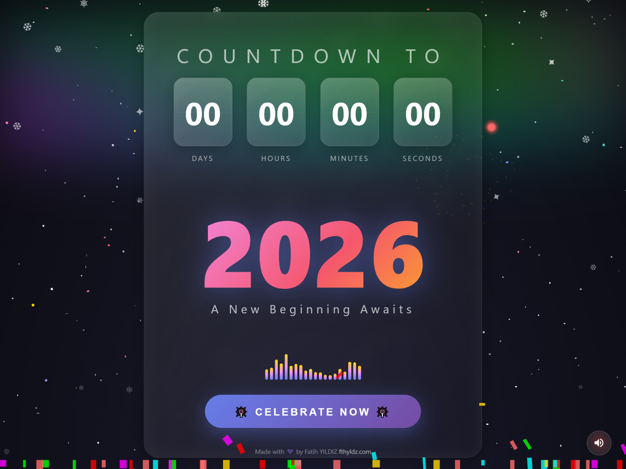
This guide will teach you how to create a captivating Happy New Year animation using HTML and CSS. It also includes dynamic JavaScript elements. The animation features a countdown, fireworks, a starfield, and even a custom cursor. This combination makes your New Year’s message truly special and engaging. It provides a festive, interactive experience for anyone who visits your page.
Create the HTML Structure
First, set up the basic HTML elements. These elements form the foundation of our animation. They include containers for the cursor, starfield, aurora, snow, floating particles, fireworks, neon ring, celebration message, and the main countdown area.
<!-- Custom Cursor -->
	<div class="cursor" id="cursor"></div>

	<!-- Starfield -->
	<div class="starfield" id="starfield"></div>

	<!-- Aurora Effect -->
	<div class="aurora">
		<div class="aurora-band"></div>
		<div class="aurora-band"></div>
		<div class="aurora-band"></div>
	</div>

	<!-- Snow -->
	<div class="snow-container" id="snow"></div>

	<!-- Floating Particles -->
	<div class="floating-particles" id="floatingParticles"></div>

	<!-- Fireworks Container -->
	<div class="fireworks-container" id="fireworks"></div>

	<!-- Neon Ring -->
	<div class="neon-ring" id="neonRing"></div>

	<!-- Celebration Message -->
	<div class="message" id="message">🎉 HAPPY NEW YEAR! 🎉</div>

	<!-- Main Content -->
	<div class="container">
		<div class="glass-card">
			<div class="countdown-wrapper">
				<div class="countdown-title">Countdown to</div>
				<div class="countdown" id="countdown">
					<div class="countdown-item">
						<div class="countdown-value" id="days">00</div>
						<div class="countdown-label">Days</div>
					</div>
					<div class="countdown-item">
						<div class="countdown-value" id="hours">00</div>
						<div class="countdown-label">Hours</div>
					</div>
					<div class="countdown-item">
						<div class="countdown-value" id="minutes">00</div>
						<div class="countdown-label">Minutes</div>
					</div>
					<div class="countdown-item">
						<div class="countdown-value" id="seconds">00</div>
						<div class="countdown-label">Seconds</div>
					</div>
				</div>
			</div>

			<div class="year-display">
				<div class="year">2026</div>
				<div class="year-sub">A New Beginning Awaits</div>
			</div>

			<!-- Music Visualizer -->
			<div class="visualizer" id="visualizer"></div>

			<!-- Celebrate Button -->
			<button class="celebrate-btn" id="celebrateBtn">
				🎆 Celebrate Now 🎆
			</button>
		</div>
	</div>

	<!-- Audio Control -->
	<div class="audio-control" id="audioControl">
		<svg viewBox="0 0 24 24" id="audioIcon">
			<path d="M3 9v6h4l5 5V4L7 9H3zm13.5 3c0-1.77-1.02-3.29-2.5-4.03v8.05c1.48-.73 2.5-2.25 2.5-4.02zM14 3.23v2.06c2.89.86 5 3.54 5 6.71s-2.11 5.85-5 6.71v2.06c4.01-.91 7-4.49 7-8.77s-2.99-7.86-7-8.77z" />
		</svg>
	</div>

	<!-- Credits -->
	<div class="credits">
		Made with 💜 by Fatih YILDIZ <a href="http://www.fthyldz.com" target="_blank" title="Fatih YILDIZ - fthyldz.com">fthyldz.com</a>
	</div>
    <script  src="./script.js"></script>
Style with CSS
Next, apply CSS styles to bring the HTML elements to life. This section covers the visual design of each component. It includes animations for stars, aurora, snow, and the countdown elements. It also defines the look of the glass card and the interactive button.
* {
	margin: 0;
	padding: 0;
	box-sizing: border-box;
}

body {
	min-height: 100vh;
	background: radial-gradient(ellipse at bottom, #1a1a2e 0%, #0a0a0f 100%);
	overflow: auto;
	font-family: "Segoe UI", Tahoma, Geneva, Verdana, sans-serif;
	cursor: none;
}

/* Custom Cursor - Sparkle Effect */
.cursor {
	position: fixed;
	width: 20px;
	height: 20px;
	border-radius: 50%;
	pointer-events: none;
	z-index: 10000;
	mix-blend-mode: screen;
	transition: transform 0.1s ease;
}

.cursor::before {
	content: "";
	position: absolute;
	width: 100%;
	height: 100%;
	background: radial-gradient(circle, #fff 0%, #ffd700 50%, transparent 70%);
	border-radius: 50%;
	animation: pulse 1s ease-in-out infinite;
}

@keyframes pulse {
	0%,
	100% {
		transform: scale(1);
		opacity: 1;
	}

	50% {
		transform: scale(1.5);
		opacity: 0.7;
	}
}

/* Particle Trail */
.trail {
	position: fixed;
	width: 8px;
	height: 8px;
	border-radius: 50%;
	pointer-events: none;
	z-index: 9999;
	animation: fadeTrail 1s ease-out forwards;
}

@keyframes fadeTrail {
	0% {
		transform: scale(1);
		opacity: 1;
	}

	100% {
		transform: scale(0);
		opacity: 0;
	}
}

/* Starfield Background */
.starfield {
	position: fixed;
	top: 0;
	left: 0;
	width: 100%;
	height: 100%;
	z-index: 0;
}

.star {
	position: absolute;
	background: white;
	border-radius: 50%;
	animation: twinkle var(--duration) ease-in-out infinite;
}

@keyframes twinkle {
	0%,
	100% {
		opacity: var(--opacity);
		transform: scale(1);
	}

	50% {
		opacity: 1;
		transform: scale(1.2);
	}
}

/* Shooting Stars */
.shooting-star {
	position: absolute;
	width: 4px;
	height: 4px;
	background: linear-gradient(90deg, #fff, transparent);
	border-radius: 50%;
	animation: shoot linear infinite;
}

.shooting-star::before {
	content: "";
	position: absolute;
	width: 80px;
	height: 2px;
	background: linear-gradient(90deg, rgba(255, 255, 255, 0.8), transparent);
	transform: translateX(-100%);
}

@keyframes shoot {
	0% {
		transform: translateX(-100px) translateY(-100px);
		opacity: 1;
	}

	70% {
		opacity: 1;
	}

	100% {
		transform: translateX(calc(100vw + 100px)) translateY(calc(100vh + 100px));
		opacity: 0;
	}
}

/* Aurora Effect */
.aurora {
	position: fixed;
	top: 0;
	left: 0;
	width: 100%;
	height: 60%;
	z-index: 1;
	opacity: 0.3;
	filter: blur(60px);
	overflow: hidden;
}

.aurora-band {
	position: absolute;
	width: 200%;
	height: 200px;
	animation: aurora 15s ease-in-out infinite;
}

.aurora-band:nth-child(1) {
	top: 10%;
	background: linear-gradient(90deg, transparent, #00ff87, #60efff, transparent);
	animation-delay: 0s;
}

.aurora-band:nth-child(2) {
	top: 20%;
	background: linear-gradient(90deg, transparent, #ff00ff, #00ffff, transparent);
	animation-delay: -5s;
}

.aurora-band:nth-child(3) {
	top: 5%;
	background: linear-gradient(90deg, transparent, #00ff00, #ff00ff, transparent);
	animation-delay: -10s;
}

@keyframes aurora {
	0%,
	100% {
		transform: translateX(-50%) skewX(-15deg);
	}

	50% {
		transform: translateX(0%) skewX(15deg);
	}
}

/* Main Container */
.container {
	position: relative;
	z-index: 10;
	display: flex;
	flex-direction: column;
	align-items: center;
	justify-content: center;
	min-height: 100vh;
	padding: 20px;
}

/* Countdown Display */
.countdown-wrapper {
	text-align: center;
	margin-bottom: 40px;
}

.countdown-title {
	font-size: clamp(1.5rem, 4vw, 2.5rem);
	color: rgba(255, 255, 255, 0.8);
	text-transform: uppercase;
	letter-spacing: 0.5em;
	margin-bottom: 20px;
	animation: shimmer 3s ease-in-out infinite;
}

@keyframes shimmer {
	0%,
	100% {
		opacity: 0.8;
	}

	50% {
		opacity: 1;
		text-shadow: 0 0 20px rgba(255, 255, 255, 0.5);
	}
}

.countdown {
	display: flex;
	gap: clamp(10px, 3vw, 30px);
	justify-content: center;
	flex-wrap: wrap;
}

.countdown-item {
	display: flex;
	flex-direction: column;
	align-items: center;
}

.countdown-value {
	position: relative;
	width: clamp(70px, 15vw, 120px);
	height: clamp(80px, 18vw, 140px);
	background: linear-gradient(
		145deg,
		rgba(255, 255, 255, 0.1),
		rgba(255, 255, 255, 0.02)
	);
	border-radius: 20px;
	display: flex;
	align-items: center;
	justify-content: center;
	font-size: clamp(2rem, 6vw, 4rem);
	font-weight: 700;
	color: white;
	backdrop-filter: blur(10px);
	border: 1px solid rgba(255, 255, 255, 0.1);
	box-shadow: 0 8px 32px rgba(0, 0, 0, 0.3),
		inset 0 0 20px rgba(255, 255, 255, 0.05);
	overflow: hidden;
}

.countdown-value::before {
	content: "";
	position: absolute;
	top: 0;
	left: 0;
	right: 0;
	height: 50%;
	background: linear-gradient(to bottom, rgba(255, 255, 255, 0.1), transparent);
	border-radius: 20px 20px 0 0;
}

.countdown-value::after {
	content: "";
	position: absolute;
	top: 50%;
	left: 5%;
	right: 5%;
	height: 1px;
	background: rgba(255, 255, 255, 0.1);
}

.countdown-label {
	margin-top: 15px;
	font-size: clamp(0.7rem, 2vw, 0.9rem);
	color: rgba(255, 255, 255, 0.6);
	text-transform: uppercase;
	letter-spacing: 0.2em;
}

/* Year Display */
.year-display {
	margin: 40px 0;
	text-align: center;
}

.year {
	font-size: clamp(4rem, 15vw, 12rem);
	font-weight: 900;
	background: linear-gradient(
		135deg,
		#667eea 0%,
		#764ba2 25%,
		#f093fb 50%,
		#f5576c 75%,
		#ffd700 100%
	);
	background-size: 300% 300%;
	-webkit-background-clip: text;
	-webkit-text-fill-color: transparent;
	background-clip: text;
	animation: gradientFlow 5s ease infinite;
	text-shadow: none;
	filter: drop-shadow(0 0 30px rgba(102, 126, 234, 0.5));
	line-height: 1;
}

@keyframes gradientFlow {
	0% {
		background-position: 0% 50%;
	}

	50% {
		background-position: 100% 50%;
	}

	100% {
		background-position: 0% 50%;
	}
}

.year-sub {
	font-size: clamp(1rem, 3vw, 1.5rem);
	color: rgba(255, 255, 255, 0.7);
	letter-spacing: 0.3em;
	margin-top: 10px;
}

/* Interactive Button */
.celebrate-btn {
	position: relative;
	padding: 20px 60px;
	font-size: clamp(1rem, 2.5vw, 1.3rem);
	font-weight: 600;
	text-transform: uppercase;
	letter-spacing: 0.2em;
	color: white;
	background: linear-gradient(135deg, #667eea 0%, #764ba2 100%);
	border: none;
	border-radius: 50px;
	cursor: pointer;
	overflow: hidden;
	transition: all 0.3s ease;
	box-shadow: 0 10px 40px rgba(102, 126, 234, 0.4);
	z-index: 100;
}

.celebrate-btn::before {
	content: "";
	position: absolute;
	top: 0;
	left: -100%;
	width: 100%;
	height: 100%;
	background: linear-gradient(
		90deg,
		transparent,
		rgba(255, 255, 255, 0.3),
		transparent
	);
	transition: 0.5s;
}

.celebrate-btn:hover::before {
	left: 100%;
}

.celebrate-btn:hover {
	transform: translateY(-5px) scale(1.05);
	box-shadow: 0 20px 60px rgba(102, 126, 234, 0.6);
}

.celebrate-btn:active {
	transform: translateY(-2px) scale(1.02);
}

/* Fireworks */
.fireworks-container {
	position: fixed;
	top: 0;
	left: 0;
	width: 100%;
	height: 100%;
	pointer-events: none;
	z-index: 50;
}

.firework {
	position: absolute;
	width: 6px;
	height: 6px;
	border-radius: 50%;
	animation: fireworkExplode 1.5s ease-out forwards;
}

@keyframes fireworkExplode {
	0% {
		transform: scale(1);
		opacity: 1;
	}

	100% {
		transform: scale(0);
		opacity: 0;
	}
}

.firework-particle {
	position: absolute;
	width: 4px;
	height: 4px;
	border-radius: 50%;
	animation: particleFly 1.5s ease-out forwards;
}

@keyframes particleFly {
	0% {
		transform: translate(0, 0) scale(1);
		opacity: 1;
	}

	100% {
		transform: translate(var(--tx), var(--ty)) scale(0);
		opacity: 0;
	}
}

/* Confetti */
.confetti {
	position: fixed;
	width: 10px;
	height: 20px;
	top: -20px;
	z-index: 60;
	animation: confettiFall linear forwards;
}

@keyframes confettiFall {
	0% {
		transform: translateY(0) rotateZ(0deg) rotateY(0deg);
		opacity: 1;
	}

	100% {
		transform: translateY(100vh) rotateZ(720deg) rotateY(360deg);
		opacity: 0.8;
	}
}

/* Floating Particles */
.floating-particles {
	position: fixed;
	top: 0;
	left: 0;
	width: 100%;
	height: 100%;
	z-index: 5;
	pointer-events: none;
}

.floating-particle {
	position: absolute;
	width: 4px;
	height: 4px;
	background: rgba(255, 215, 0, 0.6);
	border-radius: 50%;
	animation: floatUp linear infinite;
}

@keyframes floatUp {
	0% {
		transform: translateY(100vh) rotate(0deg);
		opacity: 0;
	}

	10% {
		opacity: 1;
	}

	90% {
		opacity: 1;
	}

	100% {
		transform: translateY(-100px) rotate(720deg);
		opacity: 0;
	}
}

/* Snow Effect */
.snow-container {
	position: fixed;
	top: 0;
	left: 0;
	width: 100%;
	height: 100%;
	z-index: 3;
	pointer-events: none;
}

.snowflake {
	position: absolute;
	top: -10px;
	color: white;
	font-size: 1rem;
	opacity: 0.8;
	animation: snowfall linear infinite;
}

@keyframes snowfall {
	0% {
		transform: translateY(0) rotate(0deg);
		opacity: 0.8;
	}

	100% {
		transform: translateY(100vh) rotate(360deg);
		opacity: 0.2;
	}
}

/* Glass Morphism Card */
.glass-card {
	display: flex;
	flex-direction: column;
	align-items: center;
	background: linear-gradient(
		135deg,
		rgba(255, 255, 255, 0.1),
		rgba(255, 255, 255, 0.02)
	);
	backdrop-filter: blur(20px);
	border-radius: 30px;
	border: 1px solid rgba(255, 255, 255, 0.1);
	padding: 60px;
	box-shadow: 0 8px 32px rgba(0, 0, 0, 0.3),
		inset 0 0 30px rgba(255, 255, 255, 0.05);
}

/* Music Visualizer */
.visualizer {
	display: flex;
	align-items: flex-end;
	justify-content: center;
	gap: 4px;
	height: 60px;
	margin: 30px 0;
}

.bar {
	width: 6px;
	background: linear-gradient(to top, #667eea, #f093fb, #ffd700);
	border-radius: 3px;
	animation: equalize 0.8s ease-in-out infinite;
}

@keyframes equalize {
	0%,
	100% {
		height: var(--min-height, 10px);
	}

	50% {
		height: var(--max-height, 50px);
	}
}

/* Celebration Message */
.message {
	position: fixed;
	top: 50%;
	left: 50%;
	transform: translate(-50%, -50%) scale(0);
	font-size: clamp(2rem, 8vw, 5rem);
	font-weight: 900;
	color: white;
	text-align: center;
	z-index: 1000;
	pointer-events: none;
	text-shadow: 0 0 20px rgba(255, 255, 255, 0.8),
		0 0 40px rgba(102, 126, 234, 0.8), 0 0 60px rgba(240, 147, 251, 0.6);
	animation: none;
}

.message.show {
	animation: messagePopup 2s ease-out forwards;
}

@keyframes messagePopup {
	0% {
		transform: translate(-50%, -50%) scale(0) rotate(-10deg);
		opacity: 0;
	}

	50% {
		transform: translate(-50%, -50%) scale(1.2) rotate(5deg);
		opacity: 1;
	}

	70% {
		transform: translate(-50%, -50%) scale(0.95) rotate(-2deg);
	}

	100% {
		transform: translate(-50%, -50%) scale(1) rotate(0deg);
		opacity: 1;
	}
}

/* Neon Ring Effect */
.neon-ring {
	position: fixed;
	top: 50%;
	left: 50%;
	transform: translate(-50%, -50%);
	width: 0;
	height: 0;
	border-radius: 50%;
	border: 3px solid transparent;
	z-index: 40;
	pointer-events: none;
}

.neon-ring.active {
	animation: ringExpand 1s ease-out forwards;
}

@keyframes ringExpand {
	0% {
		width: 0;
		height: 0;
		border-color: rgba(102, 126, 234, 1);
		opacity: 1;
	}

	100% {
		width: 200vmax;
		height: 200vmax;
		border-color: rgba(102, 126, 234, 0);
		opacity: 0;
	}
}

/* Responsive */
@media (max-width: 768px) {
	.glass-card {
		padding: 30px 20px;
		margin: 10px;
	}

	.countdown {
		gap: 10px;
	}
}

/* Audio Control */
.audio-control {
	position: fixed;
	bottom: 30px;
	right: 30px;
	width: 50px;
	height: 50px;
	border-radius: 50%;
	background: rgba(255, 255, 255, 0.1);
	backdrop-filter: blur(10px);
	border: 1px solid rgba(255, 255, 255, 0.2);
	display: flex;
	align-items: center;
	justify-content: center;
	cursor: pointer;
	z-index: 100;
	transition: all 0.3s ease;
}

.audio-control:hover {
	background: rgba(255, 255, 255, 0.2);
	transform: scale(1.1);
}

.audio-control svg {
	width: 24px;
	height: 24px;
	fill: white;
}

/* Credits */
.credits {
	position: fixed;
	bottom: 20px;
	left: 50%;
	transform: translateX(-50%);
	padding: 10px;
	color: rgba(255, 255, 255, 0.4);
	font-size: 0.8rem;
	z-index: 100;
}

.credits a {
	color: rgba(255, 255, 255, 0.6);
	text-decoration: none;
	transition: color 0.3s ease;
}

.credits a:hover {
	color: #ffbb00;
}
Add Interactivity with JavaScript
Finally, implement the JavaScript code. This script handles all the dynamic effects. It manages the custom cursor, creates the starfield and snow. It also controls the countdown timer, triggers celebration effects like fireworks, and adds audio functionality.
// THE GRAND FINALE 2026

class GrandFinale {
	constructor() {
		this.cursor = document.getElementById("cursor");
		this.fireworksContainer = document.getElementById("fireworks");
		this.neonRing = document.getElementById("neonRing");
		this.message = document.getElementById("message");
		this.celebrateBtn = document.getElementById("celebrateBtn");
		this.audioControl = document.getElementById("audioControl");

		this.isCelebrating = false;
		this.audioContext = null;
		this.isAudioPlaying = false;

		this.init();
	}

	init() {
		this.createStarfield();
		this.createSnow();
		this.createFloatingParticles();
		this.createVisualizer();
		this.initCursor();
		this.initCountdown();
		this.initEventListeners();
	}

	// ===== STARFIELD =====
	createStarfield() {
		const starfield = document.getElementById("starfield");
		const starCount = 200;

		for (let i = 0; i < starCount; i++) {
			const star = document.createElement("div");
			star.className = "star";
			star.style.cssText = `
            left: ${Math.random() * 100}%;
            top: ${Math.random() * 100}%;
            width: ${Math.random() * 3 + 1}px;
            height: ${Math.random() * 3 + 1}px;
            --duration: ${Math.random() * 3 + 2}s;
            --opacity: ${Math.random() * 0.5 + 0.3};
            animation-delay: ${Math.random() * 3}s;
          `;
			starfield.appendChild(star);
		}

		// Add shooting stars
		this.createShootingStars();
	}

	createShootingStars() {
		setInterval(() => {
			if (Math.random() > 0.7) {
				const starfield = document.getElementById("starfield");
				const shootingStar = document.createElement("div");
				shootingStar.className = "shooting-star";
				shootingStar.style.cssText = `
              left: ${Math.random() * 50}%;
              top: ${Math.random() * 30}%;
              animation-duration: ${Math.random() * 1 + 0.5}s;
            `;
				starfield.appendChild(shootingStar);

				setTimeout(() => shootingStar.remove(), 2000);
			}
		}, 2000);
	}

	//  SNOW
	createSnow() {
		const snowContainer = document.getElementById("snow");
		const snowflakes = ["❄", "❅", "❆", "✧", "✦"];

		setInterval(() => {
			const snowflake = document.createElement("div");
			snowflake.className = "snowflake";
			snowflake.textContent =
				snowflakes[Math.floor(Math.random() * snowflakes.length)];
			snowflake.style.cssText = `
            left: ${Math.random() * 100}%;
            font-size: ${Math.random() * 1 + 0.5}rem;
            animation-duration: ${Math.random() * 5 + 5}s;
            animation-delay: ${Math.random() * 2}s;
          `;
			snowContainer.appendChild(snowflake);

			setTimeout(() => snowflake.remove(), 12000);
		}, 200);
	}

	//  FLOATING PARTICLES
	createFloatingParticles() {
		const container = document.getElementById("floatingParticles");
		const colors = ["#ffd700", "#ff6b6b", "#4ecdc4", "#a29bfe", "#fd79a8"];

		for (let i = 0; i < 30; i++) {
			const particle = document.createElement("div");
			particle.className = "floating-particle";
			particle.style.cssText = `
            left: ${Math.random() * 100}%;
            width: ${Math.random() * 4 + 2}px;
            height: ${Math.random() * 4 + 2}px;
            background: ${colors[Math.floor(Math.random() * colors.length)]};
            animation-duration: ${Math.random() * 10 + 10}s;
            animation-delay: ${Math.random() * 10}s;
          `;
			container.appendChild(particle);
		}
	}

	//  VISUALIZER
	createVisualizer() {
		const visualizer = document.getElementById("visualizer");
		const barCount = 20;

		for (let i = 0; i < barCount; i++) {
			const bar = document.createElement("div");
			bar.className = "bar";
			bar.style.cssText = `
            --min-height: ${Math.random() * 10 + 5}px;
            --max-height: ${Math.random() * 40 + 20}px;
            animation-delay: ${i * 0.05}s;
          `;
			visualizer.appendChild(bar);
		}
	}

	//  CURSOR
	initCursor() {
		const trailColors = ["#ffd700", "#ff6b6b", "#4ecdc4", "#a29bfe", "#fd79a8"];
		let colorIndex = 0;

		document.addEventListener("mousemove", (e) => {
			this.cursor.style.left = e.clientX - 10 + "px";
			this.cursor.style.top = e.clientY - 10 + "px";

			// Create trail
			if (Math.random() > 0.5) {
				const trail = document.createElement("div");
				trail.className = "trail";
				trail.style.cssText = `
              left: ${e.clientX - 4}px;
              top: ${e.clientY - 4}px;
              background: ${trailColors[colorIndex]};
              box-shadow: 0 0 10px ${trailColors[colorIndex]};
            `;
				document.body.appendChild(trail);

				colorIndex = (colorIndex + 1) % trailColors.length;

				setTimeout(() => trail.remove(), 1000);
			}
		});
	}

	//  COUNTDOWN
	initCountdown() {
		const targetDate = new Date("January 1, 2026 00:00:00").getTime();

		const updateCountdown = () => {
			const now = new Date().getTime();
			const distance = targetDate - now;

			if (distance > 0) {
				const days = Math.floor(distance / (1000 * 60 * 60 * 24));
				const hours = Math.floor(
					(distance % (1000 * 60 * 60 * 24)) / (1000 * 60 * 60)
				);
				const minutes = Math.floor((distance % (1000 * 60 * 60)) / (1000 * 60));
				const seconds = Math.floor((distance % (1000 * 60)) / 1000);

				this.animateValue("days", days);
				this.animateValue("hours", hours);
				this.animateValue("minutes", minutes);
				this.animateValue("seconds", seconds);
			} else {
				// It's 2026!
				this.triggerCelebration();
			}
		};

		updateCountdown();
		setInterval(updateCountdown, 1000);
	}

	animateValue(id, value) {
		const element = document.getElementById(id);
		const currentValue = element.textContent;
		const newValue = value.toString().padStart(2, "0");

		if (currentValue !== newValue) {
			element.style.transform = "scale(1.1)";
			element.textContent = newValue;
			setTimeout(() => {
				element.style.transform = "scale(1)";
			}, 150);
		}
	}

	//  EVENT LISTENERS
	initEventListeners() {
		this.celebrateBtn.addEventListener("click", () => this.triggerCelebration());

		this.audioControl.addEventListener("click", () => this.toggleAudio());

		// Click anywhere for mini fireworks
		document.addEventListener("click", (e) => {
			if (
				e.target !== this.celebrateBtn &&
				!this.celebrateBtn.contains(e.target)
			) {
				this.createFirework(e.clientX, e.clientY, 20);
			}
		});
	}

	//  CELEBRATION
	triggerCelebration() {
		if (this.isCelebrating) return;
		this.isCelebrating = true;

		// Show message
		this.message.classList.add("show");

		// Neon ring effect
		this.neonRing.classList.add("active");

		// Launch multiple fireworks
		this.launchFireworksShow();

		// Create confetti
		this.createConfetti(150);

		// Play celebration sound
		this.playCelebrationSound();

		// Reset after animation
		setTimeout(() => {
			this.message.classList.remove("show");
			this.neonRing.classList.remove("active");
			this.isCelebrating = false;
		}, 5000);
	}

	//  FIREWORKS
	createFirework(x, y, particleCount = 30) {
		const colors = [
			"#ff0000",
			"#ffd700",
			"#00ff00",
			"#00ffff",
			"#ff00ff",
			"#ff6b6b",
			"#4ecdc4",
			"#a29bfe"
		];
		const color = colors[Math.floor(Math.random() * colors.length)];

		for (let i = 0; i < particleCount; i++) {
			const particle = document.createElement("div");
			particle.className = "firework-particle";

			const angle = (i / particleCount) * Math.PI * 2;
			const velocity = Math.random() * 100 + 50;
			const tx = Math.cos(angle) * velocity;
			const ty = Math.sin(angle) * velocity;

			particle.style.cssText = `
            left: ${x}px;
            top: ${y}px;
            background: ${color};
            box-shadow: 0 0 6px ${color}, 0 0 12px ${color};
            --tx: ${tx}px;
            --ty: ${ty}px;
          `;

			this.fireworksContainer.appendChild(particle);

			setTimeout(() => particle.remove(), 1500);
		}
	}

	launchFireworksShow() {
		const duration = 5000;
		const interval = 200;
		let elapsed = 0;

		const fireworkInterval = setInterval(() => {
			const x = Math.random() * window.innerWidth;
			const y = Math.random() * (window.innerHeight * 0.6);
			this.createFirework(x, y, Math.floor(Math.random() * 30 + 20));

			elapsed += interval;
			if (elapsed >= duration) {
				clearInterval(fireworkInterval);
			}
		}, interval);
	}

	//  CONFETTI
	createConfetti(count) {
		const colors = [
			"#ff0000",
			"#ffd700",
			"#00ff00",
			"#00ffff",
			"#ff00ff",
			"#ff6b6b"
		];

		for (let i = 0; i < count; i++) {
			setTimeout(() => {
				const confetti = document.createElement("div");
				confetti.className = "confetti";
				confetti.style.cssText = `
              left: ${Math.random() * 100}%;
              background: ${colors[Math.floor(Math.random() * colors.length)]};
              width: ${Math.random() * 10 + 5}px;
              height: ${Math.random() * 15 + 10}px;
              animation-duration: ${Math.random() * 2 + 2}s;
              animation-delay: ${Math.random() * 0.5}s;
            `;
				document.body.appendChild(confetti);

				setTimeout(() => confetti.remove(), 4000);
			}, Math.random() * 500);
		}
	}

	//  AUDIO
	toggleAudio() {
		if (!this.audioContext) {
			this.audioContext = new (window.AudioContext || window.webkitAudioContext)();
		}

		this.isAudioPlaying = !this.isAudioPlaying;

		if (this.isAudioPlaying) {
			this.playBackgroundMusic();
			document.getElementById("audioIcon").style.opacity = "1";
		} else {
			if (this.oscillator) {
				this.oscillator.stop();
				this.oscillator = null;
			}
			document.getElementById("audioIcon").style.opacity = "0.5";
		}
	}

	playBackgroundMusic() {
		// Simple synthesized celebration melody
		const melody = [
			523.25,
			587.33,
			659.25,
			698.46,
			783.99,
			698.46,
			659.25,
			587.33
		];
		let noteIndex = 0;

		const playNote = () => {
			if (!this.isAudioPlaying) return;

			this.oscillator = this.audioContext.createOscillator();
			const gainNode = this.audioContext.createGain();

			this.oscillator.connect(gainNode);
			gainNode.connect(this.audioContext.destination);

			this.oscillator.frequency.value = melody[noteIndex];
			this.oscillator.type = "sine";

			gainNode.gain.setValueAtTime(0.1, this.audioContext.currentTime);
			gainNode.gain.exponentialRampToValueAtTime(
				0.01,
				this.audioContext.currentTime + 0.5
			);

			this.oscillator.start();
			this.oscillator.stop(this.audioContext.currentTime + 0.5);

			noteIndex = (noteIndex + 1) % melody.length;

			setTimeout(playNote, 500);
		};

		playNote();
	}

	playCelebrationSound() {
		if (!this.audioContext) {
			this.audioContext = new (window.AudioContext || window.webkitAudioContext)();
		}

		// Create a celebration sound effect
		const oscillator = this.audioContext.createOscillator();
		const gainNode = this.audioContext.createGain();

		oscillator.connect(gainNode);
		gainNode.connect(this.audioContext.destination);

		oscillator.frequency.setValueAtTime(400, this.audioContext.currentTime);
		oscillator.frequency.exponentialRampToValueAtTime(
			800,
			this.audioContext.currentTime + 0.1
		);
		oscillator.frequency.exponentialRampToValueAtTime(
			600,
			this.audioContext.currentTime + 0.2
		);

		gainNode.gain.setValueAtTime(0.3, this.audioContext.currentTime);
		gainNode.gain.exponentialRampToValueAtTime(
			0.01,
			this.audioContext.currentTime + 0.3
		);

		oscillator.start();
		oscillator.stop(this.audioContext.currentTime + 0.3);
	}
}

// Initialize when DOM is ready
document.addEventListener("DOMContentLoaded", () => {
	new GrandFinale();
});
That’s all! Hopefully, you have successfully created a Happy New Year animation using HTML and CSS. If you have any questions or suggestions, feel free to comment below.