

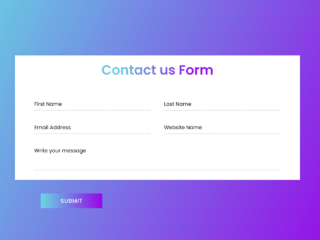
This tutorial will guide you through creating a simple yet stylish contact us page design. This design is responsive and will adapt to various screen sizes, making it accessible to users on desktops, tablets, and mobile phones. We’ll use HTML for structure, CSS for styling, and a bit of JavaScript for form submission handling.
Step 1: Include Header Assets
First, add the necessary header assets to your HTML document. These include links to external CSS stylesheets and JavaScript libraries that provide the foundation for our design.
<link href='https://fonts.googleapis.com/css?family=Lato:400,100,300' rel='stylesheet' type='text/css'>
<link href="https://fonts.googleapis.com/css?family=Raleway:100,400,700" rel="stylesheet">
<link href="https://fonts.googleapis.com/css?family=Oswald:200,400,700" rel="stylesheet">
<link rel="stylesheet" href="https://maxcdn.bootstrapcdn.com/font-awesome/4.5.0/css/font-awesome.min.css">

<script src="https://use.fontawesome.com/20ab91acc4.js"></script>
<meta name="viewport" content="width=device-width, initial-scale=1"><link rel='stylesheet' href='//maxcdn.bootstrapcdn.com/bootstrap/3.3.5/css/bootstrap.min.css'>
Step 2: Create the HTML Structure
Next, let’s build the HTML structure of the contact page. This includes the main container, form elements, contact information, and social media links. We’ll use semantic HTML5 elements and classes for better organization and styling.
<section id="contact">
<h1 class="section-header">Contact</h1>
<div class="contact-wrapper">
<!-- Left contact page -->
<form id="contact-form" class="form-horizontal" role="form">
<div class="form-group">
<div class="col-sm-12">
<input type="text" class="form-control" id="name" placeholder="NAME" name="name" value="" required>
</div>
</div>
<div class="form-group">
<div class="col-sm-12">
<input type="email" class="form-control" id="email" placeholder="EMAIL" name="email" value="" required>
</div>
</div>
<textarea class="form-control" rows="10" placeholder="MESSAGE" name="message" required></textarea>
<button class="btn btn-primary send-button" id="submit" type="submit" value="SEND">
<div class="alt-send-button">
<i class="fa fa-paper-plane"></i><span class="send-text">SEND</span>
</div>
</button>
</form>
<!-- Left contact page -->
<div class="direct-contact-container">
<ul class="contact-list">
<li class="list-item"><i class="fa fa-map-marker fa-2x"><span class="contact-text place">City, State</span></i></li>
<li class="list-item"><i class="fa fa-phone fa-2x"><span class="contact-text phone"><a href="tel:1-212-555-5555" title="Give me a call">(212) 555-2368</a></span></i></li>
<li class="list-item"><i class="fa fa-envelope fa-2x"><span class="contact-text gmail"><a href="mailto:#" title="Send me an email">hitmeup@gmail.com</a></span></i></li>
</ul>
<hr>
<ul class="social-media-list">
<li><a href="#" target="_blank" class="contact-icon">
<i class="fa fa-github" aria-hidden="true"></i></a>
</li>
<li><a href="#" target="_blank" class="contact-icon">
<i class="fa fa-codepen" aria-hidden="true"></i></a>
</li>
<li><a href="#" target="_blank" class="contact-icon">
<i class="fa fa-twitter" aria-hidden="true"></i></a>
</li>
<li><a href="#" target="_blank" class="contact-icon">
<i class="fa fa-instagram" aria-hidden="true"></i></a>
</li>
</ul>
<hr>
<div class="copyright">© ALL OF THE RIGHTS RESERVED</div>
</div>
</div>
</section>
Step 3: Add CSS Styling
Now, let’s add the CSS styles to make the contact page visually appealing. The CSS will handle the layout, fonts, colors, and responsiveness of the page. We’ll target specific elements using classes and IDs defined in the HTML.
body {
  margin: 0;
  padding: 0;
  background-color: #000 !important;
  padding-bottom: 100px;
}

#contact {
  width: 100%;
  height: 100%;
}

.section-header {
  text-align: center;
  margin: 0 auto;
  padding: 40px 0;
  font: 300 60px 'Oswald', sans-serif;
  color: #fff;
  text-transform: uppercase;
  letter-spacing: 6px;
}

.contact-wrapper {
  display: flex;
  flex-direction: row;
  justify-content: space-between;
  margin: 0 auto;
  padding: 20px;
  position: relative;
  max-width: 840px;
}

/* Left contact page */
.form-horizontal {
  /*float: left;*/
  max-width: 400px;
  font-family: 'Lato';
  font-weight: 400;
}

.form-control,
textarea {
  max-width: 400px;
  background-color: #000;
  color: #fff;
  letter-spacing: 1px;
}

.send-button {
  margin-top: 15px;
  height: 34px;
  width: 400px;
  overflow: hidden;
  transition: all .2s ease-in-out;
}

.alt-send-button {
  width: 400px;
  height: 34px;
  transition: all .2s ease-in-out;
}

.send-text {
  display: block;
  margin-top: 10px;
  font: 700 12px 'Lato', sans-serif;
  letter-spacing: 2px;
}

.alt-send-button:hover {
  transform: translate3d(0px, -29px, 0px);
}

/* Begin Right Contact Page */
.direct-contact-container {
  max-width: 400px;
}

/* Location, Phone, Email Section */
.contact-list {
  list-style-type: none;
  margin-left: -30px;
  padding-right: 20px;
}

.list-item {
  line-height: 4;
  color: #aaa;
}

.contact-text {
  font: 300 18px 'Lato', sans-serif;
  letter-spacing: 1.9px;
  color: #bbb;
}

.place {
  margin-left: 62px;
}

.phone {
  margin-left: 56px;
}

.gmail {
  margin-left: 53px;
}

.contact-text a {
  color: #bbb;
  text-decoration: none;
  transition-duration: 0.2s;
}

.contact-text a:hover {
  color: #fff;
  text-decoration: none;
}


/* Social Media Icons */
.social-media-list {
  position: relative;
  font-size: 22px;
  text-align: center;
  width: 100%;
  margin: 0 auto;
  padding: 0;
}

.social-media-list li a {
  color: #fff;
}

.social-media-list li {
  position: relative;
  display: inline-block;
  height: 60px;
  width: 60px;
  margin: 10px 3px;
  line-height: 60px;
  border-radius: 50%;
  color: #fff;
  background-color: rgb(27,27,27);
  cursor: pointer;
  transition: all .2s ease-in-out;
}

.social-media-list li:after {
  content: '';
  position: absolute;
  top: 0;
  left: 0;
  width: 60px;
  height: 60px;
  line-height: 60px;
  border-radius: 50%;
  opacity: 0;
  box-shadow: 0 0 0 1px #fff;
  transition: all .2s ease-in-out;
}

.social-media-list li:hover {
  background-color: #fff;
}

.social-media-list li:hover:after {
  opacity: 1;
  transform: scale(1.12);
  transition-timing-function: cubic-bezier(0.37,0.74,0.15,1.65);
}

.social-media-list li:hover a {
  color: #000;
}

.copyright {
  font: 200 14px 'Oswald', sans-serif;
  color: #555;
  letter-spacing: 1px;
  text-align: center;
}

hr {
  border-color: rgba(255,255,255,.6);
}

/* Begin Media Queries*/
@media screen and (max-width: 850px) {
  .contact-wrapper {
    display: flex;
    flex-direction: column;
  }
  .direct-contact-container, .form-horizontal {
    margin: 0 auto;
  }

  .direct-contact-container {
    margin-top: 60px;
    max-width: 300px;
  }
  .social-media-list li {
    height: 60px;
    width: 60px;
    line-height: 60px;
  }
  .social-media-list li:after {
    width: 60px;
    height: 60px;
    line-height: 60px;
  }
}

@media screen and (max-width: 569px) {

  .direct-contact-container, .form-wrapper {
    float: none;
    margin: 0 auto;
  }
  .form-control, textarea {

    margin: 0 auto;
  }


  .name, .email, textarea {
    width: 280px;
  }

  .direct-contact-container {
    margin-top: 60px;
    max-width: 280px;
  }
  .social-media-list {
    left: 0;
  }
  .social-media-list li {
    height: 55px;
    width: 55px;
    line-height: 55px;
    font-size: 2rem;
  }
  .social-media-list li:after {
    width: 55px;
    height: 55px;
    line-height: 55px;
  }

}

@media screen and (max-width: 410px) {
  .send-button {
    width: 99%;
  }
}
Step 4: Implement JavaScript Functionality
Finally, let’s add a small JavaScript function to handle form submissions. This script will clear the form fields after the user submits the form.
document.querySelector('#contact-form').addEventListener('submit', (e) => {
    e.preventDefault();
    e.target.elements.name.value = '';
    e.target.elements.email.value = '';
    e.target.elements.message.value = '';
  });
Step 5: Include Footer Assets
Include any necessary footer assets here. In this example, we are including Javascript libraries to improve user experience.
<script src='//cdnjs.cloudflare.com/ajax/libs/jquery/2.1.3/jquery.min.js'></script>
<script src='//maxcdn.bootstrapcdn.com/bootstrap/3.3.5/js/bootstrap.min.js'></script>
Congratulations! You’ve successfully created a simple yet effective contact us page design. Remember to replace placeholder content with your actual contact information and social media links.