
Are you looking to enhance user interaction on your website or application? Implementing a dynamic and visually appealing comment section is crucial. This tutorial will guide you through creating an effective Comment Reply UI Design in CSS. With this design, your users can easily engage in threaded discussions, making conversations more organized and intuitive. You will learn how to build a clean and responsive interface for comments and their replies, all styled beautifully with modern CSS techniques.
How to Create Comment Reply UI Design in CSS
Step 1: Prepare Your Document
First, add necessary meta tags to your document’s head section. This ensures proper responsiveness across different devices.
<meta name="viewport" content="width=device-width, initial-scale=1">
Step 2: Build the HTML Structure
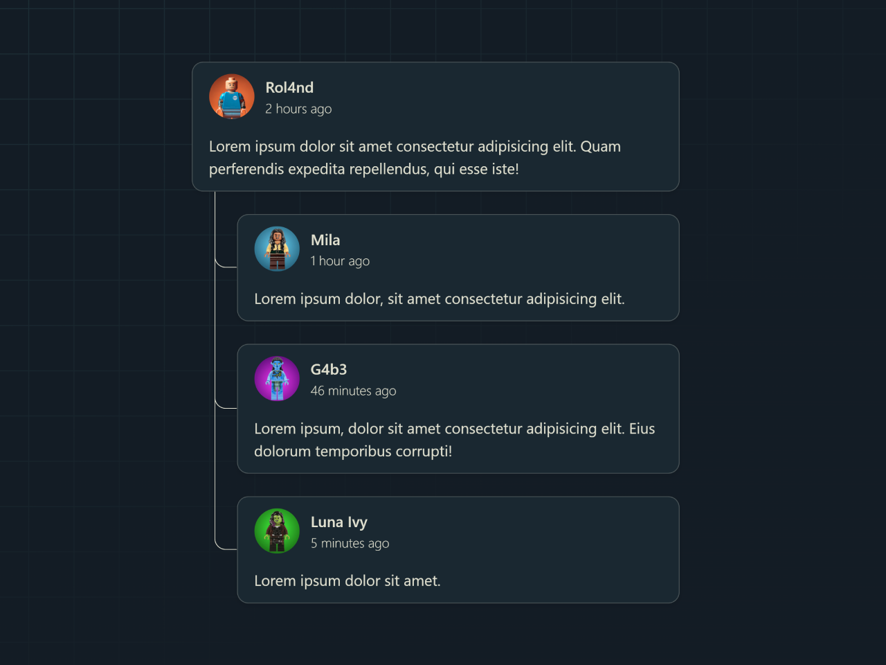
Next, define the core structure for your comments and replies. Use an unordered list to represent the comment thread. This structure allows for clear nesting of replies under parent comments.
<ul class="thread">
  <li>
    <div class="comment">
      <div class="user-info">
        <img src="https://assets.codepen.io/179569/14-Roland-bricked.png" alt="" />
        <div>
          <p class="user-name">Rol4nd</p>
          <p class="time">2 hours ago</p>
        </div>
      </div>
      <p>Lorem ipsum dolor sit amet consectetur adipisicing elit. Quam perferendis expedita repellendus, qui esse iste!</p>
    </div>

    <ul class="replies">
      <li>
        <div class="reply">
          <div class="user-info">
            <img src="https://assets.codepen.io/179569/avatar-3.png" alt="An avatar of Mila" />
            <div>
              <p class="user-name">Mila</p>
              <p class="time">1 hour ago</p>
            </div>
          </div>
          <p>Lorem ipsum dolor, sit amet consectetur adipisicing elit.</p>
        </div>
      </li>
      <li>
        <div class="reply">
          <div class="user-info">
            <img src="https://assets.codepen.io/179569/avatar-2_1.png" alt="An avatar of Gaby" />
            <div>
              <p class="user-name">G4b3</p>
              <p class="time">46 minutes ago</p>
            </div>
          </div>
          <p>Lorem ipsum, dolor sit amet consectetur adipisicing elit. Eius dolorum temporibus corrupti!</p>
        </div>
      </li>
      <li>
        <div class="reply">
          <div class="user-info">
            <img src="https://assets.codepen.io/179569/avatar-1.png" alt="An avatar of Luna Ivy" />
            <div>
              <p class="user-name">Luna Ivy</p>
              <p class="time">5 minutes ago</p>
            </div>
          </div>
          <p>Lorem ipsum dolor sit amet.</p>
        </div>
      </li>
    </ul>
  </li>
</ul>
    <script  src="./script.js"></script>
Step 3: Apply CSS Styling
Now, let’s bring your UI to life with CSS. These styles will create an attractive and readable layout for your comments and replies. We use modern CSS features like @layer for organization and anchor-name for precise positioning to connect replies visually.
@layer --reset, --base, --layout, --demo, --utils;

/* Start coding */
@layer --demo {
  .comment {
    anchor-name: --comment;
  }

  .reply {
    anchor-name: --reply;
    anchor-scope: --reply;

    &::after {
      content: "";
      position: absolute;

      inset-block-start: anchor(--comment end);
      inset-inline-start: calc(anchor(--comment start) + 1.5rem);
      inset-block-end: anchor(--reply center);
      inset-inline-end: anchor(--reply start);

      border: 1px solid var(--text);
      border-block-start-color: transparent;
      border-inline-end-color: transparent;
      border-radius: 0 0 0 0.75rem;
    }
  }

  /* basic styles for nested ul */
  .thread {
    > li {
      display: grid;
      gap: 1.5rem;

      > ul {
        display: grid;
        gap: 1.5rem;
        padding-inline-start: 3rem;
      }
    }

    li > div {
      display: grid;
      gap: 1rem;

      padding-block: 0.5lh;
      padding-inline: 2ch;
      border-radius: 0.75rem;
      background-color: color-mix(in hsl, var(--text), var(--surface) 95%);
      box-shadow: 0 2px 6px #0000001a;
      border: 1px solid hsl(from var(--text) h s l / 0.25);
    }
  }

  /* user-info */
  .user-info {
    display: flex;
    align-items: center;
    gap: 0.75rem;

    > img {
      inline-size: 3rem;
      aspect-ratio: 1;
      border-radius: 100%;
    }

    .user-name {
      font-weight: 600;
    }

    .time {
      font-size: 0.875rem;
      font-weight: 300;
    }
  }
}
/* End coding */

@layer --base {
  :root {
    --color-neutral-100: hsl(60 22% 85%);
    --color-neutral-900: hsl(210 31% 11%);
    --color-primary-400: hsl(338 73% 45%);

    --text: light-dark(var(--color-neutral-900), var(--color-neutral-100));
    --surface: light-dark(var(--color-neutral-100), var(--color-neutral-900));

    /* Grid sizes */
    --gutter: 1.5rem;
    --breakout: 87.5rem;
    --content: 70rem;

    color-scheme: dark light;
  }

  body {
    min-block-size: 100vh;
    margin: 0;
    font-family: system-ui;
    line-height: 1.5;
    color: var(--text);

    display: grid;
    row-gap: 2rem;
    grid-template-columns:
      [fullbleed-start]
      minmax(var(--gutter, 1rem), 1fr)
      [breakout-start]
      minmax(0, calc((var(--breakout) - var(--content)) / 2))
      [content-start]
      min(50% - var(--gutter, 1rem), (var(--content) / 2))
      [midpoint]
      min(50% - var(--gutter, 1rem), (var(--content) / 2))
      [content-end]
      minmax(0, calc((var(--breakout) - var(--content)) / 2))
      [breakout-end]
      minmax(var(--gutter, 1rem), 1fr)
      [fullbleed-end];
    align-items: center;

    > :where(*) {
      grid-column: content;
    }

    &::before,
    &::after {
      content: "";
      z-index: -1;
      position: fixed;
      inset: 0;
    }

    &::before {
      --size: 3rem;
      --offset: calc(var(--size) / 2);
      --line: color-mix(in hsl, var(--text), var(--surface) 90%);

      background-color: var(--surface);
      background-image: linear-gradient(
          90deg,
          var(--line) 1px,
          transparent 1px var(--size)
        ),
        linear-gradient(var(--line) 1px, transparent 1px var(--size));
      background-position: var(--offset) var(--offset);
      background-size: var(--size) var(--size);
      background-attachment: fixed;
    }

    &::after {
      background-image: linear-gradient(
        -35deg,
        var(--surface) 40%,
        transparent
      );
    }
  }

  .thread {
    margin-block: 1.5rem;
    justify-self: center;
    max-inline-size: 60ch;
  }
}

@layer --layout {
  .grid {
    display: grid;
    row-gap: 2rem;
    grid-template-columns:
      [fullbleed-start]
      minmax(var(--gutter, 1rem), 1fr)
      [breakout-start]
      minmax(0, calc((var(--breakout) - var(--content)) / 2))
      [content-start]
      min(50% - var(--gutter, 1rem), (var(--content) / 2))
      [midpoint]
      min(50% - var(--gutter, 1rem), (var(--content) / 2))
      [content-end]
      minmax(0, calc((var(--breakout) - var(--content)) / 2))
      [breakout-end]
      minmax(var(--gutter, 1rem), 1fr)
      [fullbleed-end];

    > :where(*) {
      grid-column: content;
    }

    [data-column="fullbleed"] {
      grid-column: fullbleed;

      display: grid;
      grid-template-columns: subgrid;

      > :where(*) {
        grid-column: content;
      }
    }

    [data-column="breakout"] {
      grid-column: breakout;
    }

    [data-column="content"] {
      grid-column: content;
    }
  }
}

@layer --utils {
  /* the best util class for vertical spacing */
  .flow > *:where(:not(:first-child)) {
    margin-block-start: var(--flow-space, 1em);
  }

  .sr-only {
    position: absolute;
    width: 1px;
    height: 1px;
    padding: 0;
    margin: -1px;
    overflow: hidden;
    clip: rect(0, 0, 0, 0);
    white-space: nowrap;
    border-width: 0;
  }
}

@layer --reset {
  /* Modern reset: https://piccalil.li/blog/a-more-modern-css-reset/ */

  /* Box sizing rules */
  *,
  *::before,
  *::after {
    box-sizing: border-box;
  }

  :root {
    @media (prefers-reduced-motion: no-preference) {
      interpolate-size: allow-keywords;
    }
  }

  /* Prevent font size inflation */
  html {
    -moz-text-size-adjust: none;
    -webkit-text-size-adjust: none;
    text-size-adjust: none;

    scrollbar-gutter: stable;
  }

  /* Remove default margin in favour of better control in authored CSS */
  body,
  h1,
  h2,
  h3,
  h4,
  p,
  figure,
  blockquote,
  dl,
  dd {
    margin-block: 0;
  }

  /* Remove list styles and keep semantic meaning on ul,
   * ol elements with a class on it, which suggests default
   * styling will be removed
   *
   * https://www.matuzo.at/blog/2023/removing-list-styles-without-affecting-semantics
   */
  :is(ul, ol)[class] {
    list-style-type: "";

    margin: 0;
    padding: 0;
  }

  /* Set core body defaults */
  body {
    min-height: 100vh;
    line-height: 1.5;
  }

  /* Set shorter line heights on headings and interactive elements */
  h1,
  h2,
  h3,
  h4,
  button,
  input,
  label {
    line-height: 1.1;
  }

  /* Balance text wrapping on headings */
  h1,
  h2,
  h3,
  h4 {
    text-wrap: balance;
  }

  /* A elements that don't have a class get default styles */
  a:not([class]) {
    text-decoration-skip-ink: auto;
    color: currentColor;
  }

  /**
 * This CSS block is a More Effective CSS Image Reset.
 * It resets the default styles of an image element
 * and adds some additional styles to improve its rendering.
 *
 * The `max-width: 100%;` ensures that the image does not exceed its container's width,
 * while maintaining its aspect ratio with `height: auto;`.
 *
 * The `vertical-align: middle;` aligns the image vertically with the text.
 *
 * The `font-style: italic;` adds a slight italic effect to the image alt text.
 *
 * The `background-repeat: no-repeat;` ensures that the image does not repeat itself.
 *
 * The `background-size: cover;` ensures that the image fills its container without repeating.
 *
 * Finally, the `shape-margin: 1rem;` adds some margin around the image to improve its spacing with other elements.
 */
  img,
  picture {
    max-width: 100%;
    height: auto;
    vertical-align: middle;
    font-style: italic;
    background-repeat: no-repeat;
    background-size: cover;
    shape-margin: 1rem;
  }

  /* Inherit fonts for inputs and buttons */
  input,
  button,
  textarea,
  select {
    font: inherit;
  }

  /* Make sure textareas without a rows attribute are not tiny */
  textarea:not([rows]) {
    min-height: 10em;
  }

  /* Anything that has been anchored to should have extra scroll margin */
  :target {
    scroll-margin-block: 5ex;
  }
}
Step 4: Include JavaScript (Optional)
Finally, include the JavaScript code. For this particular UI, the JavaScript is minimal but can be extended for interactive functionalities in the future.
"use strict";
// Nothing to see here 🙈
Step 5: Link Footer Assets
Ensure your JavaScript file is linked correctly at the end of your HTML document, typically just before the closing </body> tag. This helps with page load performance.
You have successfully created a beautiful Comment Reply UI Design in CSS.