
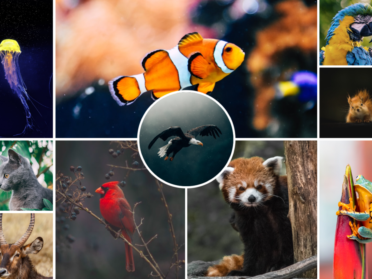
Do you want to display your images in a stunning and unique way? This tutorial shows you how to build a dynamic and eye-catching CSS image grid with a circle inside. It is perfect for photographers, designers, or anyone who wants to showcase their visual content creatively. With this setup, your images will look modern and engaging. You will learn to arrange multiple images in a grid layout. Additionally, one image will stand out, beautifully shaped as a circle within the grid.
How to Create a CSS Image Grid with a Circle Inside
1. Set Up the HTML Structure
First, you need to create the basic HTML elements. These elements will hold your images. Each `<img>` tag points to an image source. Copy the following code into your HTML file.
<img src="https://images.unsplash.com/photo-1540968221243-29f5d70540bf?w=800"/>
<img src="https://images.unsplash.com/photo-1535591273668-578e31182c4f?w=800"/>
<img src="https://images.unsplash.com/photo-1452570053594-1b985d6ea890?w=800"/>
<img src="https://images.unsplash.com/photo-1504006833117-8886a355efbf?w=800"/>
<img src="https://images.unsplash.com/photo-1581300134629-4c3a06a31948?w=800"/>
<img src="https://images.unsplash.com/photo-1520808663317-647b476a81b9?w=800"/>
<img src="https://images.unsplash.com/photo-1542880696-78ba55200f0f?w=800"/>
<img src="https://images.unsplash.com/photo-1579380656108-f98e4df8ea62?w=800"/>
<img src="https://images.unsplash.com/photo-1603696861164-61e45fae5ac7?w=800"/>
<img src="https://images.unsplash.com/photo-1611689342806-0863700ce1e4?w=800"/>
2. Apply CSS Styling
Next, apply the CSS styles to transform your plain images into a grid. This CSS also creates the unique circle shape for one image. It handles the layout and responsiveness. Place the following CSS rules into your stylesheet.
html, body { display: grid }
html { min-height: 100% }

body {
	--gap: 6px;
	display: grid;
	grid-gap: var(--gap);
	grid-template-rows:
		repeat(2, var(--row-rep, 7fr 3fr 7fr));
	margin: 0
}

img {
	/* prevent from overflowing its grid-area */
	contain: size;
	/* stretch across its grid-area */
	place-self: stretch;
	object-fit: cover;

	&:nth-child(1) {
		grid-column: 1/ span 2;
		object-position: 50% 35%
	}

	&:nth-child(2) { grid-area: 3/ 1/ span 1/ span 2 }

	&:nth-child(3) {
		grid-row: 5;
		object-position: 50% 40%
	}

	&:nth-child(4) { grid-row: 6 }

	&:nth-child(5) { grid-area: 2/ 2 }

	&:nth-child(6) { grid-area: 4/ 1 }

	&:nth-child(7) { grid-area: 4/ 2 }

	&:nth-child(8) { grid-row: 5/ span 2 }

	&:nth-child(9) { object-position: 50% 57.5% }

	&:last-child {
		--span: / span 2/ span 2;
		grid-area: 3/ 1 var(--span);
		place-self: center;
		border: solid var(--gap) #fff;
		width: 9em;
		aspect-ratio: 1;
		object-position: 50% 35%;
		border-radius: 50%
	}
}

@media (min-width: 600px) {
	body { --row-rep: 1fr 1fr }

	img {
		&:nth-child(1) { grid-area: 1/ 1/ span 2 }

		&:nth-child(2) { grid-area: 1/ 2/ span 2/ span 2 }

		&:nth-child(3) { grid-area: 1/ 4 }

		&:nth-child(4) { grid-area: 2/ 4 }

		&:nth-child(5) { grid-area: 3/ 1 }

		&:nth-child(6) { grid-area: 3/ 2/ span 2 }

		&:nth-child(7) { grid-area: 3/ 3/ span 2 }

		&:nth-child(8) { grid-area: 3/ 4/ span 2 }

		&:last-child {
			grid-area: 2/ 2 var(--span);
			width: 15em
		}
	}
}
You have successfully learned how to build an engaging CSS image grid. This design technique adds a professional touch to any web project. Feel free to adjust the grid and circle styles to match your specific needs.