
If you are looking to create a modern and interactive navigation menu for your website, this HTML CSS Navbar Code is perfect for you. A well-designed navigation bar is crucial for user experience. This guide will help you build a stylish navbar using only HTML, CSS, and a small amount of JavaScript.
How to Create an HTML CSS Navbar with Code
Step 1: Build the HTML Structure
First, you need to create the basic layout for your navbar. This HTML code sets up the main container and the navigation links.
<div class="nav-wrap">
<div class="bubble active"></div>
<div class="bubble hover"></div>
<nav class="nav">
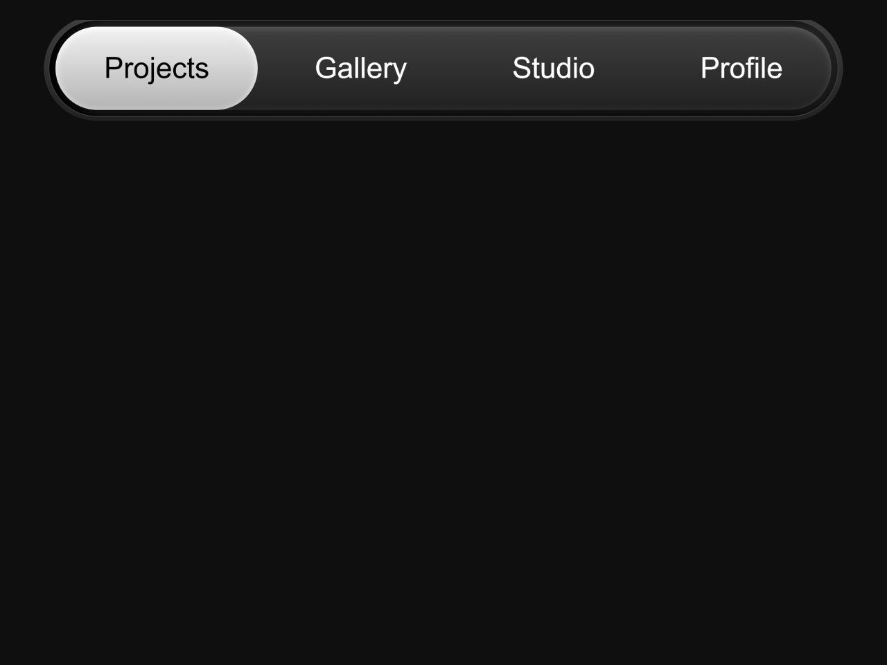
<a class="active" href="#">Projects</a>
<a href="#">Gallery</a>
<a href="#">Studio</a>
<a href="#">Profile</a>
</nav>
</div>
<script>
const links = document.querySelectorAll("nav a");
links.forEach((link) => {
link.addEventListener("click", () => {
links.forEach((l) => l.classList.remove("active"));
link.classList.add("active");
});
});
</script>
Step 2: Add Interactivity with JavaScript
Next, include a small JavaScript snippet. This script handles the ‘active’ state for your navigation links. It ensures that clicking a link updates its appearance.
Step 3: Style the Navbar with CSS
Finally, apply these CSS styles to make your navbar visually appealing. This CSS code defines the look, feel, and dynamic bubble effects of the navigation.
:root {
  --black: #0f0f0f;
  --gray: #3f3f3f;
  --white: #fff;
}

.nav-wrap {
  border: 1px solid var(--gray);
  width: fit-content;
  margin: 0 auto;
  border-radius: 500px;
  position: relative;
  box-shadow: inset 10px 0 10px black;
  background: linear-gradient(0deg, #141414, #242424);
  &:after {
    content: "";
    display: block;
    position: absolute;
    inset: -5px;
    background: linear-gradient(180deg, var(--gray), #212121);
    border-radius: 500px;
    z-index: -1;
  }
}
.nav {
  width: fit-content;
  anchor-name: --nav;
  margin: 6.7px;
  a {
    z-index: 10;
    position: relative;
    display: inline-block;
    padding: 20px 50px;
    color: white;
    text-decoration: none;
    &:before {
      content: "";
      display: block;
      position: absolute;
      inset: 0;
      opacity: 0.2;
    }
    &.active {
      anchor-name: --active;
      color: black;
    }
    &:hover:before {
      anchor-name: --nav;
    }
  }
}

.bubble {
  background: white;
  /* z-index: 5; */
  top: anchor(top);
  right: anchor(right);
  bottom: anchor(bottom);
  left: anchor(left);
  position: absolute;
  transition: all 0.2s;
  border-radius: 500px;
  &.active {
    position-anchor: --active;
    z-index: 2;
    background: linear-gradient(180deg, #f2f2f2, #b3b3b3);
    box-shadow: inset 0 2px 7px #fff;
  }
  &.hover {
    z-index: 1;
    background: linear-gradient(180deg, var(--gray), #212121);
    box-shadow: inset 0 2px 7px #ffffff29;
    position-anchor: --nav;
  }
}

.target {
  position: relative;
  z-index: -1;
}

/* 1. Use a more-intuitive box-sizing model */
*,
*::before,
*::after {
  box-sizing: border-box;
}

/* 2. Remove default margin */
* {
  margin: 0;
}

/* 3. Enable keyword animations */
@media (prefers-reduced-motion: no-preference) {
  html {
    interpolate-size: allow-keywords;
  }
}

body {
  /* 4. Add accessible line-height */
  line-height: 1.5;
  /* 5. Improve text rendering */
  -webkit-font-smoothing: antialiased;
}

/* 6. Improve media defaults */
img,
picture,
video,
canvas,
svg {
  display: block;
  max-width: 100%;
}

/* 7. Inherit fonts for form controls */
input,
button,
textarea,
select {
  font: inherit;
}

/* 8. Avoid text overflows */
p,
h1,
h2,
h3,
h4,
h5,
h6 {
  overflow-wrap: break-word;
}

/* 9. Improve line wrapping */
p {
  text-wrap: pretty;
}
h1,
h2,
h3,
h4,
h5,
h6 {
  text-wrap: balance;
}

/*
  10. Create a root stacking context
*/
#root,
#__next {
  isolation: isolate;
}

body {
  background: #0f0f0f;
  font-family: "Geist Sans", sans-serif;
  color: #fff;
  font-size: 30px;
}
You have now successfully created a dynamic and stylish HTML CSS Navbar. This navbar enhances user interaction on your website.