
Are you looking to add a touch of dynamic elegance to your web application? Creating an interactive user experience often involves subtle, engaging animations. This tutorial will guide you through building a stunning Macos Dock Animation CSS effect. This effect makes icons enlarge and shift as the mouse hovers over them, similar to the iconic macOS dock. It is perfect for enhancing navigation menus or toolbars, providing a familiar and visually appealing interaction for your users.
Setting Up Your HTML Document
First, you need to link a stylesheet in the head section of your HTML document. This stylesheet provides some base styles.
<link rel='stylesheet' href='https://codepen.io/GreenSock/pen/xxmzBrw.css'>
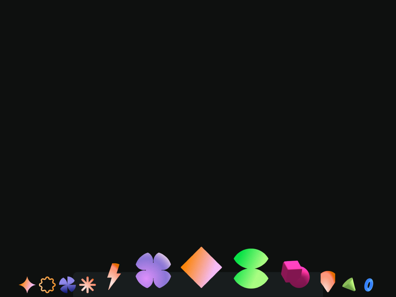
Next, create the basic HTML structure. This structure will hold the dock icons.
<!-- forked from the amazing Blake bowen for posterity 💚 -->
<!-- https://codepen.io/osublake/pen/GYzqjL -->
<div class="wrapper">
  <ul class="toolbar">
    <li class="toolbarItem">
      <a class="toolbarLink" href="#!">
        <img class="toolbarImg" src="https://assets.codepen.io/16327/2D-star.png" alt="">
      </a>
    </li>
    <li class="toolbarItem">
      <a class="toolbarLink" href="#!">
        <img class="toolbarImg" src="https://assets.codepen.io/16327/2D-wobble.png" alt="">
      </a>
    </li>
    <li class="toolbarItem">
      <a class="toolbarLink" href="#!">
        <img class="toolbarImg" src="https://assets.codepen.io/16327/2D-windmill.png" alt="">
      </a>
    </li>
    <li class="toolbarItem">
      <a class="toolbarLink" href="#!">
        <img class="toolbarImg" src="https://assets.codepen.io/16327/2D-sparkle.png" alt="">
      </a>
    </li>
    <li class="toolbarItem">
      <a class="toolbarLink" href="#!">
        <img class="toolbarImg" src="https://assets.codepen.io/16327/2D-lightning.png" alt="">
      </a>
    </li>
    <li class="toolbarItem">
      <a class="toolbarLink" href="#!">
        <img class="toolbarImg" src="https://assets.codepen.io/16327/2D-flower.png" alt="">
      </a>
    </li>
    <li class="toolbarItem">
      <a class="toolbarLink" href="#!">
        <img class="toolbarImg" src="https://assets.codepen.io/16327/2D-diamond.png" alt="">
      </a>
    </li>
    <li class="toolbarItem">
      <a class="toolbarLink" href="#!">
        <img class="toolbarImg" src="https://assets.codepen.io/16327/2D-keyframe.png" alt="">
      </a>
    </li>
    <li class="toolbarItem">
      <a class="toolbarLink" href="#!">
        <img class="toolbarImg" src="https://assets.codepen.io/16327/3D-combo.png" alt="">
      </a>
    </li>
    <li class="toolbarItem">
      <a class="toolbarLink" href="#!">
        <img class="toolbarImg" src="https://assets.codepen.io/16327/2D-label.png" alt="">
      </a>
    </li>
    <li class="toolbarItem">
      <a class="toolbarLink" href="#!">
        <img class="toolbarImg" src="https://assets.codepen.io/16327/3D-cone.png" alt="">
      </a>
    </li>
    <li class="toolbarItem">
      <a class="toolbarLink" href="#!">
        <img class="toolbarImg" src="https://assets.codepen.io/16327/3D-hoop.png" alt="">
      </a>
    </li>
  </ul>
</div>
    <script src='https://unpkg.co/gsap@3/dist/gsap.min.js'></script><script  src="./script.js"></script>
Then, include the necessary JavaScript libraries just before the closing </body> tag. These scripts will power the animation.
Applying Styles with CSS
Now, add the following CSS rules. These styles will position and design your dock, giving it a sleek appearance.
body {
  width: 100%;
  margin: 0;
}

.wrapper {
  position: fixed;
  bottom: 0;
  left: 50%;
  transform: translate(-50%);
  display: flex;
  justify-content: center;
}

.toolbar {
  display: inline-flex;
  justify-content: center;
  align-items: flex-end;
  height: 40px;
  border-top-left-radius: 10px;
  border-top-right-radius: 10px;
  margin: 0;
  padding: 10px;
  background-color: rgba(55, 66, 77, 0.25);
  list-style: none;
}

.toolbarItem {
  width: 40px;
  height: 40px;
  margin: 0 4px;
}

.toolbarLink {
  display: block;
  height: 100%;
}

.toolbarImg {
  display: block;
  width: 100%;
  height: 100%;
  object-fit: contain;
  border-radius: 50%;
}
Adding Interactivity with JavaScript
Finally, implement the JavaScript code. This script uses GSAP to handle the hover animations, making the icons grow and move dynamically.
console.clear();

let icons = document.querySelectorAll(".toolbarItem");
let dock = document.querySelector(".toolbar");
let firstIcon = icons[0];

let min = 48; // 40 + margin
let max = 120;
let bound = min * Math.PI;

gsap.set(icons, {
  transformOrigin: "50% 120%",
  height: 40
});

gsap.set(dock, {
  position: "relative",
  height: 60
});

dock.addEventListener("mousemove", (event) => {

  let offset = dock.getBoundingClientRect().left + firstIcon.offsetLeft;
  updateIcons(event.clientX - offset);
});

dock.addEventListener("mouseleave", (event) => {

  gsap.to(icons, {
    duration: 0.3,
    scale: 1,
    x: 0
  });
});

function updateIcons(pointer) {

  for (let i = 0; i < icons.length; i++) {

    let icon = icons[i];
    let distance = (i * min + min / 2) - pointer;
    let x = 0;
    let scale = 1;

    if (-bound < distance && distance < bound) {

      let rad = distance / min * 0.5;
      scale = 1 + (max / min - 1) * Math.cos(rad);
      x = 2 * (max - min) * Math.sin(rad);

    } else {

      x = (-bound < distance ? 2 : -2) * (max - min);
    }

    gsap.to(icon, {
      duration: 0.3,
      x: x,
      scale: scale
    });
  }
}
You have now successfully created a Macos Dock Animation CSS effect.