

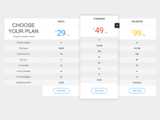
If you need to present your product or service pricing plans clearly and effectively to your visitors, regardless of the device they use, then creating a responsive website pricing chart is essential. This tutorial will guide you through building a clean and adaptable pricing chart. It ensures your offers look great and are easy to read whether viewed on a large desktop screen or a small mobile device.
Creating Your Responsive Website Pricing Chart
To begin, we will set up the basic structure for our pricing chart using HTML. Then, we will add styling with CSS to make it responsive and visually appealing.
1. Set Up the HTML Structure
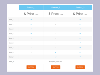
First, you need to create the main HTML elements. This structure defines a container for the entire chart, a heading, and then individual offer boxes. Each offer box has sections for the plan name and price, features list, and a call-to-action button.
<div class="container">
  <h1>Get amazing offer</h1>
  <div class="offer-container">
    <div class="offer offer-1">
      <div class="col-1">
        <p>Free</p>
        <p>$0.00</p>
      </div>
      <div class="col-2">
        <ul>
          <li>The quick</li>
          <li>Brown fox</li>
          <li>Jumps over</li>
          <li>The lazy</li>
        </ul>
      </div>
      <div class="col-3">
        <p>Get this offer</p>
      </div>
    </div>
    <div class="offer offer-2">
      <div class="col-1">
        <p>Standard</p>
        <p>$89.99</p>
      </div>
      <div class="col-2">
        <ul>
          <li>The quick</li>
          <li>Brown fox</li>
          <li>Jumps over</li>
          <li>The lazy</li>
        </ul>
      </div>
      <div class="col-3">
        <p>Get this offer</p>
      </div>
    </div>
    <div class="offer offer-3">
      <div class="col-1">
        <p>Premium</p>
        <p>$199.99</p>
      </div>
      <div class="col-2">
        <ul>
          <li>The quick</li>
          <li>Brown fox</li>
          <li>Jumps over</li>
          <li>The lazy</li>
        </ul>
      </div>
      <div class="col-3">
        <p>Get this offer</p>
      </div>
    </div>
  </div>
</div>
2. Apply CSS Styling
Next, we will add CSS to style the HTML elements. This CSS will make the pricing chart responsive. It will also ensure a modern look. We use Flexbox for layout and media queries for responsiveness on different screen sizes.
* {
  margin: 0;
  padding: 0;
  box-sizing: border-box;
  font-family: "poppins", sans-serif;
  font-weight: 500;
}

:root {
  --blue: #007ACC;
}

html {
  font-size: 10px;
}

body {
  font-size: 1.6rem;
  min-height: 100vh;
}

.container {
  margin-top: 5rem;
  display: flex;
  flex-direction: column;
  gap: 10rem;
}

.container h1 {
  font-size: 3.9rem;
  color: var(--blue);
  text-align: center;
  position: relative;
}

@media screen and (max-width: 500px) {
  .container h1 {
    font-size: 3rem;
  }
}

.container h1::before {
  position: absolute;
  content: "";
  width: 20rem;
  height: .3rem;
  left: 50%;
  right: 0;
  bottom: -2rem;
  transform: translateX(-50%);
  background-color: var(--blue);
}

.offer-container {
  display: flex;
  gap: 1rem;
  width: 90%;
  max-width: 80rem;
  margin-inline: auto;
}

@media screen and (max-width: 700px) {
  .offer-container {
    flex-direction: column;
    max-width: 30rem;
  }
}


.offer-container > * {
  flex-grow: 1;
}

.offer {
  display: flex;
  flex-direction: column;
  background-color: var(--blue);
  color: white;
}

.col-1, .col-2, .col-3 {
  display: flex;
  flex-direction: column;
  justify-content: center;
  align-items: center;
}

.col-1 {
  padding-block: 4.5rem;
  gap: .25rem;
  border-bottom: .2rem solid white;
}

.col-1 p:nth-child(1) {
  font-size: 2rem;
}

.col-1 p:nth-child(2) {
  font-size: 3.9rem;
}

.col-2 {
  align-items: flex-start;
  padding-block: 4.5rem;
}

.col-2 ul {
  margin-left: 4rem;
}

.col-3 {
  padding-block: 2rem;
  background-color: #0066AB;
  cursor: pointer;
}
This tutorial helps you build a clean and fully functional responsive website pricing chart. Hopefully, you have successfully created your responsive pricing chart.