
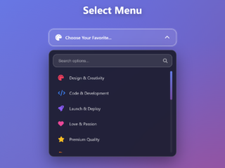
Are you looking to upgrade the default look of your HTML select boxes? Many web designs need more than just a plain dropdown. This tutorial will show you how to create a beautiful and functional CSS Custom Select Dropdown with Icons. It gives your users clear visual cues, making selection easier and your interface more modern. This solution combines HTML, CSS, and JavaScript for a fully interactive experience.
1. Add Header Assets
First, include the necessary external stylesheets. These links provide normalization, custom styles, and fonts for a consistent look and feel. Place them inside the `<head>` section of your HTML document.
<link rel="stylesheet" href="https://public.codepenassets.com/css/normalize-5.0.0.min.css">
<link rel='stylesheet' href='https://codepen.io/simeydotme/pen/jEOaeNd/63809857734821de257097bf620e7121.css'>
<link rel='stylesheet' href='https://fonts.bunny.net/css?family=asap:200,300i,400,400i,500,500i,600,600i,700,700i,900,900i||asap-condensed:200,300i,400,400i,600,600i,700,700i,900,900i|kode-mono:400,500,600,700'>
2. Create the HTML Structure
Next, set up the HTML for your custom select dropdown. This includes the main container, the label, the native `<select>` element (which will be hidden), a custom button, and a `<menu>` element containing the styled list items with SVG icons and descriptions.
<main id="app">
<section class="field menu">
<label for="sharing" id="sharing-label">Share with</label>
<div class="control">
<select id="sharing" required>
<option selected disabled hidden>Select an option</option>
<option data-option=public>Public</option>
<option data-option=limited>Limited to workspace</option>
<option data-option=private>Private</option>
</select>
<button id="sharing-toggle" hidden aria-hidden aria-described-by="sharing-label" aria-controls="sharing-menu" aria-expanded=false>
Select an option
</button>
<menu id="sharing-menu">
<li data-option=public tabindex=0 role=button>
<svg xmlns="http://www.w3.org/2000/svg" width="24" height="24" viewBox="0 0 24 24">
<g fill="none" fill-rule="evenodd">
<path d="m12.593 23.258l-.011.002l-.071.035l-.02.004l-.014-.004l-.071-.035q-.016-.005-.024.005l-.004.01l-.017.428l.005.02l.01.013l.104.074l.015.004l.012-.004l.104-.074l.012-.016l.004-.017l-.017-.427q-.004-.016-.017-.018m.265-.113l-.013.002l-.185.093l-.01.01l-.003.011l.018.43l.005.012l.008.007l.201.093q.019.005.029-.008l.004-.014l-.034-.614q-.005-.018-.02-.022m-.715.002a.02.02 0 0 0-.027.006l-.006.014l-.034.614q.001.018.017.024l.015-.002l.201-.093l.01-.008l.004-.011l.017-.43l-.003-.012l-.01-.01z" />
<path fill="currentColor" fill-rule="nonzero" d="M12 2c5.523 0 10 4.477 10 10s-4.477 10-10 10S2 17.523 2 12S6.477 2 12 2m2 11.4l-1.564 1.251a.5.5 0 0 0-.041.744l1.239 1.239a2 2 0 0 1 .508.864l.175.613a1.8 1.8 0 0 0 1.017 1.163a8 8 0 0 0 2.533-1.835l-.234-1.877a2 2 0 0 0-1.09-1.54l-1.47-.736A1 1 0 0 0 14 13.4M12 4a7.99 7.99 0 0 0-6.335 3.114l-.165.221V9.02a3 3 0 0 0 1.945 2.809l.178.06l1.29.395c1.373.42 2.71-.697 2.577-2.096l-.019-.145l-.175-1.049a1 1 0 0 1 .656-1.108l.108-.03l.612-.14a2.667 2.667 0 0 0 1.989-3.263A8 8 0 0 0 12 4" />
</g>
</svg>
<h3>Public</h3>
<p>Shared with anyone who has the link</p>
</li>
<li data-option=limited tabindex=0 role=button>
<svg xmlns="http://www.w3.org/2000/svg" width="24" height="24" viewBox="0 0 24 24">
<g fill="none" stroke="currentColor" stroke-linecap="round" stroke-linejoin="round" stroke-width="2">
<path d="M15 21H7a2 2 0 0 1-2-2v-6a2 2 0 0 1 2-2h10c.265 0 .518.052.75.145" />
<path d="M11 16a1 1 0 1 0 2 0a1 1 0 0 0-2 0m-3-5V7a4 4 0 1 1 8 0v4m3 11v.01M19 19a2.003 2.003 0 0 0 .914-3.782a1.98 1.98 0 0 0-2.414.483" />
</g>
</svg>
<h3>Limited to workspace</h3>
<p>Shared with anyone in your workspace</p>
</li>
<li data-option=private tabindex=0 role=button>
<svg xmlns="http://www.w3.org/2000/svg" width="24" height="24" viewBox="0 0 24 24">
<path fill="currentColor" d="M12 2a5 5 0 0 1 5 5v3a3 3 0 0 1 3 3v6a3 3 0 0 1-3 3H7a3 3 0 0 1-3-3v-6a3 3 0 0 1 3-3V7a5 5 0 0 1 5-5m0 12a2 2 0 0 0-1.995 1.85L10 16a2 2 0 1 0 2-2m0-10a3 3 0 0 0-3 3v3h6V7a3 3 0 0 0-3-3" />
</svg>
<h3>Private</h3>
<p>Only accessible to you</p>
</li>
</menu>
</div>
</section>
<aside class="explainer small">
<p>
A fun little menu UI design.
This is styled like a <code><select></code> but it is actually a <code><menu></code>, because the element
is performing actions instead of changing a value.
</p>
<p>
Based on the design/concept <a href="https://x.com/CJfromJBW/status/1968657017666515318" target="_blank">by <strong>CJ <em>(@CJfromJBW)</em></strong>
from her tweet.</a> <br>I also added light/dark modes.
</p>
<p>
I'm using Javascript to sync the <code><button></code> & <code><menu></code> with a hidden <code><select></code> element.
And using <em>ARIA</em> for accessibility. <em>(Although I haven't fully tested, so it might not be complete for this demo)</em>
</p>
</aside>
<div class="inline-ranges">
<input type=range id="hue" min=0 max=360 value=210 title="play with the colors!" />
<div>
<button type="button" id="reset" title="reset the select box to default state">reset</button>
<button type="button" id="toggle" title="toggle showing the hidden <select> element">show select</button>
</div>
</div>
</main>
<!--
-->
<!--
theme toggle
-->
<div class="group theme-toggle" title="toggle theme">
<label for="theme-toggle">
<span class="sr-only">Light Theme</span>
<svg xmlns="http://www.w3.org/2000/svg" width="24" height="24" viewBox="0 0 24 24">
<g fill="none">
<path d="M17 12a5 5 0 1 1-10 0a5 5 0 0 1 10 0Z" />
<path stroke-linecap="round" d="M12 2c-.377.333-.905 1.2 0 2m0 16c.377.333.906 1.2 0 2m7.5-17.497c-.532-.033-1.575.22-1.496 1.495M5.496 17.5c.033.532-.22 1.575-1.496 1.496M5.003 4.5c-.033.532.22 1.576 1.497 1.497M18 17.503c.532-.032 1.575.208 1.496 1.414M22 12c-.333-.377-1.2-.905-2 0m-16-.5c-.333.377-1.2.906-2 0" />
</g>
</svg>
</label>
<input type="checkbox" class="toggle dual" id="theme-toggle" name="theme">
<label for="theme-toggle">
<svg xmlns="http://www.w3.org/2000/svg" width="24" height="24" viewBox="0 0 24 24">
<path fill="none" stroke-linecap="round" stroke-linejoin="round" d="M21.5 14.078A8.557 8.557 0 0 1 9.922 2.5C5.668 3.497 2.5 7.315 2.5 11.873a9.627 9.627 0 0 0 9.627 9.627c4.558 0 8.376-3.168 9.373-7.422" />
</svg>
<span class="sr-only">Dark Theme</span>
</label>
</div>
<!--
social
-->
<a class="social-icon codepen" href="https://codepen.io/simeydotme" title="view my codepens">
Made by Simey
</a>
<a class="social-icon twitter" href="https://twitter.com/simeydotme">
<svg viewBox="0 0 24 24">
<path stroke="none" d="M0 0h24v24H0z" fill="none"></path>
<path d="M22 4.01c-1 .49 -1.98 .689 -3 .99c-1.121 -1.265 -2.783 -1.335 -4.38 -.737s-2.643 2.06 -2.62 3.737v1c-3.245 .083 -6.135 -1.395 -8 -4c0 0 -4.182 7.433 4 11c-1.872 1.247 -3.739 2.088 -6 2c3.308 1.803 6.913 2.423 10.034 1.517c3.58 -1.04 6.522 -3.723 7.651 -7.742a13.84 13.84 0 0 0 .497 -3.753c-.002 -.249 1.51 -2.772 1.818 -4.013z"></path>
</svg>
</a>
<a class="social-icon github" href="https://github.com/simeydotme">
<svg viewBox="0 0 24 24">
<path stroke="none" d="M0 0h24v24H0z" fill="none"></path>
<path d="M9 19c-4.3 1.4 -4.3 -2.5 -6 -3m12 5v-3.5c0 -1 .1 -1.4 -.5 -2c2.8 -.3 5.5 -1.4 5.5 -6a4.6 4.6 0 0 0 -1.3 -3.2a4.2 4.2 0 0 0 -.1 -3.2s-1.1 -.3 -3.5 1.3a12.3 12.3 0 0 0 -6.2 0c-2.4 -1.6 -3.5 -1.3 -3.5 -1.3a4.2 4.2 0 0 0 -.1 3.2a4.6 4.6 0 0 0 -1.3 3.2c0 4.6 2.7 5.7 5.5 6c-.6 .6 -.6 1.2 -.5 2v3.5"></path>
</svg>
</a>
<script src="./script.js"></script>
3. Apply CSS Styles
Now, add the CSS to style your custom dropdown. These styles will transform the basic HTML elements into an appealing and interactive component. This CSS also handles responsiveness, hover states, and the icon display.
body {

    /* vars */

    --radius: 12px;

    --bg-light: hsl(220, 22%, 97%);
    --bg-dark: hsl(222, 16%, 16%);
    --bg-light2: hsl(212, 60%, 95%);
    --bg-dark2: hsl(222, 20%, 18%);
    --fg-light: hsl(212 46% 34%);
    --fg-dark: hsl(222, 39%, 95%);
    --link-light: hsl(222, 95%, 60%);
    --link-dark: hsl(222, 95%, 70%);
    --link-light-hover: hsl(150, 90%, 50%);
    --link-dark-hover: hsl(150, 95%, 70%);

    /* color-scheme */
    --bg: light-dark( var(--bg-light), var(--bg-dark) );
    --bg2: light-dark( var(--bg-light2), var(--bg-dark2) );
    --fg: light-dark( var(--fg-light), var(--fg-dark) ) ;
    --link: light-dark( var(--link-light), var(--link-dark) );
    --linkh: light-dark( var(--link-light-hover), var(--link-dark-hover) );

    --active-color: hsl(var(--hue, 210) 69% 59%);
    --main-color: light-dark( hsl( from var(--active-color) h 20% 40% ), hsl( from var(--active-color) h 12% 70% ));
    --hover-color: light-dark( hsl( from var(--active-color) h 85% 50% ), hsl( from var(--active-color) h s 70% ) );
    --selected-color: light-dark( hsl( from var(--active-color) h 85% 40% ), hsl( from var(--active-color) h s 70% ) );

    --lighter-color: light-dark( hsl( from var(--active-color) h 10% 75% ), hsl( from var(--active-color) h 10% 35% ));
    --middle-color: hsl( from var(--active-color) h 10% 60% );
    --darker-color: light-dark( hsl( from var(--active-color) h 10% 30% ), hsl( from var(--active-color) h 42% 82% ));
    --shadow-color: hsl( from var(--bg2) h s calc( l - 20 ) );

    --tint: hsl( from var(--active-color) h 80% 50% );
    --tint2: hsl( from var(--active-color) h 60% 80% );
    --input-bg-light: hsl(from var(--bg-light) h 15% 100%);
    --input-bg-dark: hsl(from var(--bg-dark) h 15% 10%);
    --input-border-light: hsl(from var(--bg-light) h 15% 85%);
    --input-border-dark: hsl(from var(--bg-light) h 15% 35%);
    --labels-light: hsl(from var(--fg-light) h 20% 55%);
    --labels-dark: hsl(from var(--fg-dark) h 20% 55%);

    --fg: var(--main-color);
    --labels: light-dark( var(--labels-light), var(--labels-dark) );  /* form labels */
    --b: light-dark( var(--input-bg-light), var(--input-bg-dark) ); /* form element backgrounds */
    --bor: light-dark( var(--input-border-light), var(--input-border-dark) ); /* form element shadows */


    /* ease */
    --cubic: cubic-bezier(0.66, 0, 0.34, 1);
    --cubic-in: cubic-bezier(0.32, 0, 0.67, 0);
    --cubic-out: cubic-bezier(0.33, 1, 0.68, 1);
    --spring: linear(0, 0.008 1.1%, 0.034 2.3%, 0.134 4.9%, 0.264 7.3%, 0.683 14.3%, 0.797 16.5%, 0.89 18.6%, 0.967 20.7%, 1.027 22.8%, 1.073 25%, 1.104 27.3%, 1.123 30.6%, 1.119 34.3%, 1.018 49.5%, 0.988 58.6%, 0.985 65.2%, 1 84.5%, 1);


}

.field.menu {

    font-family: Asap, system-ui, sans-serif;
    min-width: 320px;

    label {
        text-transform: none;
    }

}

.field.menu .control {
    position: relative;
}

.field.menu select,
.field.menu button,
.field.menu option {
    color: var(--main-color);
}

.field.menu select,
.field.menu button {

    font-size: 1rem;
    text-transform: unset;
    text-align: start;
    border-radius: var(--radius);
    padding: calc( var(--pads) * 0.9 );
    -webkit-padding-end: calc( var(--pads) * 3 );
            padding-inline-end: calc( var(--pads) * 3 );
    width: 100%;
    transition: all 0.3s var(--cubic-out);

    background: var(--b);
    background-image: url("data:image/svg+xml,%3Csvg xmlns='http://www.w3.org/2000/svg' viewBox='0 0 24 24'%3E%3Cpath fill='%2355527a' fill-rule='evenodd' d='M7 9a1 1 0 0 0-.707 1.707l5 5a1 1 0 0 0 1.414 0l5-5A1 1 0 0 0 17 9z' clip-rule='evenodd'/%3E%3C/svg%3E");
    background-size: 1.6em;
    background-position: calc(100% - 1em) 50%;
    background-repeat: no-repeat;

    &:open,
    &[aria-expanded=true] {
        background-image: url("data:image/svg+xml,%3Csvg xmlns='http://www.w3.org/2000/svg' viewBox='0 0 24 24'%3E%3Cpath fill='%2355527a' fill-rule='evenodd' d='M17 15a1 1 0 0 0 .707-1.707l-5-5a1 1 0 0 0-1.414 0l-5 5A1 1 0 0 0 7 15z' clip-rule='evenodd'/%3E%3C/svg%3E");
    }

    box-shadow:
        hsl( from var(--shadow-color) h s l / 0.02 ) 0px 1px 1px -0.5px,
        hsl( from var(--shadow-color) h s l / 0.03 ) 0px 2px 2px -1px,
        hsl( from var(--shadow-color) h s l / 0.03 ) 0px 3px 3px -1.5px,
        hsl( from var(--shadow-color) h s l / 0.02 ) 0px 5px 5px -2.5px;

}

.field.menu menu {

    background: var(--b);
    padding: calc( var(--pads) / 2 );
    margin: 0;
    border-radius: calc( var(--radius) * 1.5 );
    display: flex;
    flex-direction: column;
    gap:  calc( var(--pads) / 4 );

    position: absolute;
    top: calc( 100% + var(--pads) / 2 );
    width: 100%;
    min-width: 100%;

    box-shadow:
        hsl( from var(--shadow-color) h s l /0.03) 0px 1px 1px -0.5px,
        hsl( from var(--shadow-color) h s l /0.04) 0px 2px 2px -1px,
        hsl( from var(--shadow-color) h s l /0.04) 0px 3px 3px -1.5px,
        hsl( from var(--shadow-color) h s l /0.03) 0px 5px 5px -2.5px,
        hsl( from var(--shadow-color) h s l /0.03) 0px 10px 10px -5px,
        hsl( from var(--shadow-color) h s l /0.03) 0px 24px 24px -8px;

}

.field.menu menu li {

    display: grid;
    -webkit-appearance: none;
       -moz-appearance: none;
            appearance: none;
    grid-template:
      "icon name" auto
      "icon description" auto / -webkit-min-content 1fr;
    grid-template:
      "icon name" auto
      "icon description" auto / min-content 1fr;
    -moz-column-gap: calc(var(--pads) / 1.75);
         column-gap: calc(var(--pads) / 1.75);
    row-gap: calc(var(--pads) / 5);

    padding: calc( var(--pads) / 2 );
    -webkit-padding-end: calc( var(--pads) * 2 );
            padding-inline-end: calc( var(--pads) * 2 );
    border-radius: var(--radius);
    cursor: default;
    -webkit-user-select: none;
       -moz-user-select: none;
        -ms-user-select: none;
            user-select: none;

}

.field.menu menu li > * {
    margin: 0;
    padding: 0;
    font-size: 1em;
    text-wrap: auto;
    text-wrap: pretty;
}


.field.menu menu li > svg {
    height: 20px;
    color: var(--middle-color);
    opacity: 0.8;
}

.field.menu menu li > h3 {
    color: var(--darker-color);
    padding-top: calc(var(--pads) / 8);
    font-weight: 500;
}

.field.menu menu li > :last-child {
    color: var(--middle-color);
    grid-area: description;
}


.field.menu menu li {

    &:hover,
    &:focus,
    &:focus-within {
        background: hsl( from var(--active-color) h s l / 6% );
        > svg, > h3 {
            color: var(--hover-color);
            opacity: 1;
        }

    }

    &.selected {
        background: hsl( from var(--active-color) h s l / 8% );
        > svg, > h3 {
            color: var(--selected-color);
            opacity: 1;
        }
    }

    &.selected {
        &:hover,
        &:focus,
        &:focus-within {
            background: hsl( from var(--active-color) h s l / 12% );
        }
    }

}


.field.menu menu {
    transition-property: scale, translate, opacity, display;
    transition-timing-function: var(--spring);
    transition-duration: 0.66s;
    transition-behavior: allow-discrete;

    opacity: 0;
    scale: 1 0.25;
    translate: 0 calc(var(--pads) * -2);
    display: none;
    transform-origin: center top;
    transform: translate3d(0, 0, 0.01px);
    z-index: 1;
}

.field.menu.open menu {
    opacity: 1;
    scale: 1 1;
    translate: 0 0;
    display: flex;
}

.field.menu menu li {
    transition-property: translate, opacity;
    transition-timing-function: var(--spring);
    transition-duration: 0.75s;
    transition-delay: 0.05s;
    transition-behavior: allow-discrete;

    transform-origin: center top;
    translate: 0 20%;
    opacity: 0;
    transform: translate3d(0, 0, 0.01px);
}

.field.menu.open menu li {
    translate: 0 0;
    opacity: 1;
}
.field.menu menu li:nth-child(2) {
    transition-delay: 0.1s;
}
.field.menu menu li:nth-child(3) {
    transition-delay: 0.15s;
}

@starting-style {
    .field.menu.open menu {
        opacity: 0;
        scale: 1 0.25;
        translate: 0 calc(var(--pads) * -2);
        display: flex;
    }
    .field.menu.open menu li {
        translate: 0 20%;
        opacity: 0;
    }
}


.field.menu:has([data-option]:checked) select {
    text-indent: calc( var(--pads) );
}
.field.menu:has([data-option]:checked) button {
    text-indent: calc( var(--pads) * 2 );
}

.field:has(:disabled:checked) select,
.field:has(:disabled:checked) button {
    color: var(--lighter-color);
}

.field.menu .control::before {
    content: "";
    position: absolute;
    top: 50%;
    left: 0.66em;
    translate: -50% -50%;
    width: 24px;
    height: 24px;
    z-index: 1;
    opacity: 0;
    transition: all 0.3s var(--cubic-out) 0.1s;
    background-color: var(--fg);
    -webkit-mask-image: linear-gradient(0deg, transparent 0% 100% );
            mask-image: linear-gradient(0deg, transparent 0% 100% );
}

.field.menu .control:has([data-option]:checked)::before {
    translate: 0 -50%;
    opacity: 0.66;
}

.field.menu .control:has([data-option=public]:checked)::before {
    -webkit-mask-image: url("data:image/svg+xml,%3Csvg xmlns='http://www.w3.org/2000/svg' viewBox='0 0 24 24'%3E%3Cg fill='none' fill-rule='evenodd'%3E%3Cpath d='m12.593 23.258l-.011.002l-.071.035l-.02.004l-.014-.004l-.071-.035q-.016-.005-.024.005l-.004.01l-.017.428l.005.02l.01.013l.104.074l.015.004l.012-.004l.104-.074l.012-.016l.004-.017l-.017-.427q-.004-.016-.017-.018m.265-.113l-.013.002l-.185.093l-.01.01l-.003.011l.018.43l.005.012l.008.007l.201.093q.019.005.029-.008l.004-.014l-.034-.614q-.005-.018-.02-.022m-.715.002a.02.02 0 0 0-.027.006l-.006.014l-.034.614q.001.018.017.024l.015-.002l.201-.093l.01-.008l.004-.011l.017-.43l-.003-.012l-.01-.01z'/%3E%3Cpath fill='%23808080' fill-rule='nonzero' d='M12 2c5.523 0 10 4.477 10 10s-4.477 10-10 10S2 17.523 2 12S6.477 2 12 2m2 11.4l-1.564 1.251a.5.5 0 0 0-.041.744l1.239 1.239a2 2 0 0 1 .508.864l.175.613a1.8 1.8 0 0 0 1.017 1.163a8 8 0 0 0 2.533-1.835l-.234-1.877a2 2 0 0 0-1.09-1.54l-1.47-.736A1 1 0 0 0 14 13.4M12 4a7.99 7.99 0 0 0-6.335 3.114l-.165.221V9.02a3 3 0 0 0 1.945 2.809l.178.06l1.29.395c1.373.42 2.71-.697 2.577-2.096l-.019-.145l-.175-1.049a1 1 0 0 1 .656-1.108l.108-.03l.612-.14a2.667 2.667 0 0 0 1.989-3.263A8 8 0 0 0 12 4'/%3E%3C/g%3E%3C/svg%3E");
            mask-image: url("data:image/svg+xml,%3Csvg xmlns='http://www.w3.org/2000/svg' viewBox='0 0 24 24'%3E%3Cg fill='none' fill-rule='evenodd'%3E%3Cpath d='m12.593 23.258l-.011.002l-.071.035l-.02.004l-.014-.004l-.071-.035q-.016-.005-.024.005l-.004.01l-.017.428l.005.02l.01.013l.104.074l.015.004l.012-.004l.104-.074l.012-.016l.004-.017l-.017-.427q-.004-.016-.017-.018m.265-.113l-.013.002l-.185.093l-.01.01l-.003.011l.018.43l.005.012l.008.007l.201.093q.019.005.029-.008l.004-.014l-.034-.614q-.005-.018-.02-.022m-.715.002a.02.02 0 0 0-.027.006l-.006.014l-.034.614q.001.018.017.024l.015-.002l.201-.093l.01-.008l.004-.011l.017-.43l-.003-.012l-.01-.01z'/%3E%3Cpath fill='%23808080' fill-rule='nonzero' d='M12 2c5.523 0 10 4.477 10 10s-4.477 10-10 10S2 17.523 2 12S6.477 2 12 2m2 11.4l-1.564 1.251a.5.5 0 0 0-.041.744l1.239 1.239a2 2 0 0 1 .508.864l.175.613a1.8 1.8 0 0 0 1.017 1.163a8 8 0 0 0 2.533-1.835l-.234-1.877a2 2 0 0 0-1.09-1.54l-1.47-.736A1 1 0 0 0 14 13.4M12 4a7.99 7.99 0 0 0-6.335 3.114l-.165.221V9.02a3 3 0 0 0 1.945 2.809l.178.06l1.29.395c1.373.42 2.71-.697 2.577-2.096l-.019-.145l-.175-1.049a1 1 0 0 1 .656-1.108l.108-.03l.612-.14a2.667 2.667 0 0 0 1.989-3.263A8 8 0 0 0 12 4'/%3E%3C/g%3E%3C/svg%3E");
}

.field.menu .control:has([data-option=limited]:checked)::before {
    -webkit-mask-image: url("data:image/svg+xml,%3Csvg xmlns='http://www.w3.org/2000/svg' viewBox='0 0 24 24'%3E%3Cg fill='none' stroke='%23808080' stroke-linecap='round' stroke-linejoin='round' stroke-width='2'%3E%3Cpath d='M15 21H7a2 2 0 0 1-2-2v-6a2 2 0 0 1 2-2h10c.265 0 .518.052.75.145'/%3E%3Cpath d='M11 16a1 1 0 1 0 2 0a1 1 0 0 0-2 0m-3-5V7a4 4 0 1 1 8 0v4m3 11v.01M19 19a2.003 2.003 0 0 0 .914-3.782a1.98 1.98 0 0 0-2.414.483'/%3E%3C/g%3E%3C/svg%3E");
            mask-image: url("data:image/svg+xml,%3Csvg xmlns='http://www.w3.org/2000/svg' viewBox='0 0 24 24'%3E%3Cg fill='none' stroke='%23808080' stroke-linecap='round' stroke-linejoin='round' stroke-width='2'%3E%3Cpath d='M15 21H7a2 2 0 0 1-2-2v-6a2 2 0 0 1 2-2h10c.265 0 .518.052.75.145'/%3E%3Cpath d='M11 16a1 1 0 1 0 2 0a1 1 0 0 0-2 0m-3-5V7a4 4 0 1 1 8 0v4m3 11v.01M19 19a2.003 2.003 0 0 0 .914-3.782a1.98 1.98 0 0 0-2.414.483'/%3E%3C/g%3E%3C/svg%3E");
}

.field.menu .control:has([data-option=private]:checked)::before {
    -webkit-mask-image: url("data:image/svg+xml,%3Csvg xmlns='http://www.w3.org/2000/svg' viewBox='0 0 24 24'%3E%3Cpath fill='%23808080' d='M12 2a5 5 0 0 1 5 5v3a3 3 0 0 1 3 3v6a3 3 0 0 1-3 3H7a3 3 0 0 1-3-3v-6a3 3 0 0 1 3-3V7a5 5 0 0 1 5-5m0 12a2 2 0 0 0-1.995 1.85L10 16a2 2 0 1 0 2-2m0-10a3 3 0 0 0-3 3v3h6V7a3 3 0 0 0-3-3'/%3E%3C/svg%3E");
            mask-image: url("data:image/svg+xml,%3Csvg xmlns='http://www.w3.org/2000/svg' viewBox='0 0 24 24'%3E%3Cpath fill='%23808080' d='M12 2a5 5 0 0 1 5 5v3a3 3 0 0 1 3 3v6a3 3 0 0 1-3 3H7a3 3 0 0 1-3-3v-6a3 3 0 0 1 3-3V7a5 5 0 0 1 5-5m0 12a2 2 0 0 0-1.995 1.85L10 16a2 2 0 1 0 2-2m0-10a3 3 0 0 0-3 3v3h6V7a3 3 0 0 0-3-3'/%3E%3C/svg%3E");
}


.inline-ranges {

    --bg: var(--light);
    --fg: var(--dark);

    display: flex;
    flex-wrap: wrap;
    align-items: center;
    justify-content: center;
    margin-top: auto;
    padding-inline: 2em;
    gap: 1em;

    & input {
        margin: 0!important;
        --input-shadow: light-dark( hsl( from var(--bg2) h s calc( l - 5 ) ), hsl( from var(--bg2) h s calc( l + 5 ) ) );
        box-shadow: 0 3px 2px -2px var(--input-shadow);
    }

    & button {
        padding: calc(var(--pads)/1.5) var(--pads);
    }

    & > div {
        display: flex;
        gap: 1em;
    }

    & #hue {
        --tint: hsl( var(--hue) 50% 75% / 100% );
        --tint2: hsl( var(--hue) 50% 75% / 100% );
        width: 320px;
        &:not(:focus) {
            --fg: var(--active-color);
        }
    }

    opacity: 0;
    transition: opacity 1.2s var(--cubic);
    &.show {
        opacity: 0.5;
    }
    &:hover {
        opacity: 1;
        transition-duration: 0.3s;
    }

}


/** extra stuff **/

body, html, #app {
    display: grid;
    min-height: 100%;
    justify-content: center;
    width: 100svw;
}

body {
    --dot-color: light-dark(
        hsl( from var(--bg) h s calc(l - 7) / 90%),
        hsl( from var(--bg2) h s calc(l + 2) / 90%)
    );
    --bg-fade: light-dark(
        var(--bg2),
        var(--bg)
    );

    background-color: var(--bg2);
    background-image:
        radial-gradient( var(--dot-color) 1.25px, transparent 0px ),
        linear-gradient(160deg, var(--bg), var(--bg-fade));
    background-repeat: repeat, no-repeat;
    background-size: 24px 24px, cover;
    background-position: center;
}

#app {
    max-width: 520px;
    align-self: center;
    justify-self: center;
    grid-template-rows: auto -webkit-max-content -webkit-max-content;
    grid-template-rows: auto max-content max-content;
    padding: var(--pads);
}

.field.menu {
    max-width: 300px;
    justify-self: center;
    align-self: center;
}

.explainer {
    font-family: 'Asap Condensed', sans-serif;
    text-align: center;
    text-wrap: balance;
    color: light-dark( var(--fg-light), var(--fg-dark) );
    opacity: 0.5;
    transition: opacity 1s var(--cubic);
    &:nth-of-type(1) {
        margin-top: 3em;
    }
    &:hover {
        opacity: 1;
        transition-duration: 0.2s;
    }
}
.small {
    font-size: 0.875em;
}
4. Add JavaScript Functionality
Finally, implement the JavaScript to control the dropdown’s behavior. This script manages opening and closing the menu, syncing selected values, handling keyboard navigation, and enhancing accessibility.
const $field = document.querySelector('.field.menu');
const $sharingSelect = $field.querySelector('#sharing');
const $sharingLabel = $field.querySelector('#sharing-label');
const $sharingButton = $field.querySelector('#sharing-toggle');
const $menu = $field.querySelector('#sharing-menu');
const $options = $menu.querySelectorAll('li');


let initialValue = $sharingSelect.value;

const toggleMenu = () => {
    if ( $field.classList.contains('open') ) {
        return closeMenu();
    }
    return openMenu();
}
const closeMenu = () => {
    $field.classList.remove('open');
    $sharingButton.setAttribute( 'aria-expanded', false );
}
const openMenu = () => {
    $field.classList.add('open');
    $sharingButton.setAttribute( 'aria-expanded', true );
    initialValue = $sharingSelect.value;
}
const resetMenu = () => {
    closeMenu();
    $sharingSelect.selectedIndex = 0;
    initialValue = $sharingSelect.value;
    syncValues();
}

document.body.addEventListener( 'click', (e) => {
    const $target = e.target;
    if ( $target === $sharingButton ) {
        toggleMenu();
    } else  {
        closeMenu();
    }
});

$sharingButton.addEventListener( 'keydown', (e) => {
    const isOpen =  $field.classList.contains('open');
    if ( e.key === 'ArrowDown' ) {
        e.preventDefault();
        if ( isOpen ) {
            const $firstOption = [...$options].at(0);
            $firstOption.focus();
            setOption($firstOption);
        } else {
            openMenu();
        }
    } else if ( e.key === 'Escape' ) {
        e.preventDefault();
        closeMenu();
    }
});

const syncValues = () => {
    const value = $sharingSelect.value;
    $sharingButton.innerText = value;
}

const resetValues = () => {
    const value = initialValue;
    $sharingButton.innerText = value;
    $sharingSelect.value = value;
}

const setOption = ($optionEl) => {
    const option = $optionEl.dataset.option;
    const value = $sharingSelect.querySelector(`[data-option=${option}]`).innerText;
    $sharingSelect.value = value;

    const $selectedOption = [...$options].filter((el) => el.dataset.option === option);
    $options.forEach(el => el.classList.remove('selected'));
    $selectedOption.at(0)?.classList.add('selected');

    syncValues();
}

const nextOption = ($optionEl) => {
    const $next = $optionEl.nextElementSibling;
    if ( $next ) {
        setOption( $next );
        $next.focus();
    }
};

const prevOption = ($optionEl) => {
    const $prev = $optionEl.previousElementSibling;
    if ( $prev ) {
        setOption( $prev );
        $prev.focus();
    }
};

$options.forEach(($el) => {

    $el.addEventListener( 'click', (e) => {
        setOption($el);
        $sharingButton.focus();
    });

    $el.addEventListener( 'keydown', (e) => {

        let shouldClose = false;

        if (e.key === 'Enter' || e.key === ' ') {
            setOption($el);
            shouldClose = true;
            e.preventDefault();
        } else if ( e.key === 'ArrowLeft' || e.key === 'ArrowUp' ) {
            prevOption($el);
            e.preventDefault();
        } else if ( e.key === 'ArrowRight' || e.key === 'ArrowDown' ) {
            nextOption($el);
            e.preventDefault();
        } else if ( e.key === 'Tab' ) {
            const index =  [...$options].indexOf($el);
            const length = $options.length;
            if ( index === length - 1 && !e.shiftKey ) {
                shouldClose = true;
            } else if ( index === 0 && e.shiftKey ) {
                shouldClose = true;
            }
        } else if ( e.key === 'Escape' ) {
            shouldClose = true;
            resetValues();
        }

        if ( shouldClose ) {
            closeMenu();
            $sharingButton.focus();
        }
    });

});

/* open for preview pane */

setTimeout(() => {
    openMenu();
    $sharingButton.focus();
}, 1000 );


// ----------------------------------------
// change colors as the slider moves
// ----------------------------------------

const $hue = document.querySelector('#hue');
$hue.addEventListener( 'input', event => {
    requestAnimationFrame(() => {
        document.body.style.setProperty('--hue', event.target.value );
    })
});

setTimeout(() => {
    document.querySelector('.inline-ranges').classList.add('show');
}, 2000);


// ----------------------------------------
// reset button function
// ----------------------------------------

const $reset = document.querySelector('#reset');
$reset.addEventListener( 'click', event => {
    document.body.style.setProperty('--hue', 210 );
    $hue.value = 210;
    resetMenu();
});


// ----------------------------------------
// toggle select/button function
// ----------------------------------------

const $toggleSelect = document.querySelector('#toggle');
let isReplaced = false;

const toggleSelect = () => {
    isReplaced = !isReplaced;
    syncValues();
    $sharingSelect.toggleAttribute('hidden');
    $sharingSelect.setAttribute('aria-hidden', isReplaced);
    $sharingButton.toggleAttribute('hidden');
    $sharingButton.setAttribute('aria-hidden', !isReplaced);
    $sharingLabel.setAttribute('for', 'sharing-toggle');
    if ( !isReplaced ) {
        $toggleSelect.innerText = 'show custom';
    } else {
        $toggleSelect.innerText = 'show select';
    }
}
toggleSelect();

$toggleSelect.addEventListener( 'click', event => {
    toggleSelect();
});

// ----------------------------------------
// toggle theme
// ----------------------------------------

const darkMode = window.matchMedia('(prefers-color-scheme: dark)');
const $themeToggle = document.querySelector('#theme-toggle');
$themeToggle.checked = darkMode.matches;
document.body.classList.add('themed');
5. Include Footer Assets
Ensure your JavaScript file is linked before the closing `</body>` tag. This allows the HTML elements to load completely before the script tries to interact with them.
That’s all! Hopefully, you have successfully created a CSS Custom Select Dropdown with Icons. If you have any questions or suggestions, feel free to comment below.