
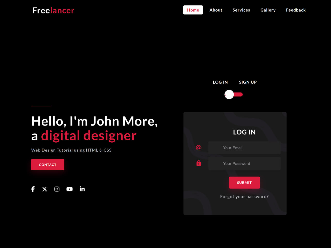
This tutorial will guide you through creating a stylish and responsive login/signup screen UI design using HTML and CSS. This design is perfect for websites and applications needing a modern and user-friendly login system.
Step 1: Include Header Assets
First, add these lines within the <head> section of your HTML document to link necessary CSS libraries for fonts and icons:
<link rel="stylesheet" href="https://cdnjs.cloudflare.com/ajax/libs/font-awesome/6.7.2/css/all.min.css">
<link rel="stylesheet" href="https://cdn.jsdelivr.net/npm/material-icons@1.13.12/iconfont/material-icons.min.css">
Step 2: Create the HTML Structure
This step involves building the basic HTML for the navigation bar, main content area (with sections for login and signup forms), and styling elements.
 <nav class="navbar">
        <div class="container">
            <div class="row justify-content-between align-items-center">
                <div class="logo">Free<span>lancer</span></div>
                <input type="checkbox" name="" id="click">
                <label for="click" class="menu-btn">
                    <i class="material-icons">menu</i>
                </label>
                <ul>
                    <li><a href="#" class="active">Home</a></li>
                    <li><a href="#">About</a></li>
                    <li><a href="#">Services</a></li>
                    <li><a href="#">Gallery</a></li>
                    <li><a href="#">Feedback</a></li>
                </ul>
            </div>
        </div>
    </nav>

    <section>
        <div class="container">
            <div class="row full-screen align-items-center">
                <div class="left">
                    <span class="line"></span>
                    <h2>Hello, I'm John More, <br> a <span>digital designer</span></h2>
                    <p>Web Design Tutorial using HTML & CSS</p>
                    <a href="#" class="btn">Contact</a>

                    <div class="social-media">
                        <a href="#"><i class="fa-brands fa-facebook-f"></i></a>
                        <a href="#"><i class="fa-brands fa-x-twitter"></i></a>
                        <a href="#"><i class="fa-brands fa-instagram"></i></a>
                        <a href="#"><i class="fa-brands fa-youtube"></i></a>
                        <a href="#"><i class="fa-brands fa-linkedin-in"></i></a>
                    </div>
                </div>
                <div class="right">
                    <div class="form">
                        <div class="text-center">
                            <h6><span>Log In</span> <span>Sign Up</span></h6>
                            <input type="checkbox" class="checkbox" id="reg-log">
                            <label for="reg-log"></label>
                            <div class="card-3d-wrap">
                                <div class="card-3d-wrapper">
                                    <div class="card-front">
                                        <div class="center-wrap">
                                            <h4 class="heading">Log In</h4>
                                            <div class="form-group">
                                                <input type="email" class="form-style" placeholder="Your Email" autocomplete="off">
                                                <i class="input-icon material-icons">alternate_email</i>
                                            </div>

                                            <div class="form-group">
                                                <input type="password" class="form-style" placeholder="Your Password" autocomplete="off">
                                                <i class="input-icon material-icons">lock</i>
                                            </div>

                                            <a href="#" class="btn">Submit</a>
                                            <p class="text-center"><a href="#" class="link">Forgot your password?</a></p>
                                        </div>
                                    </div>

                                    <div class="card-back">
                                        <div class="center-wrap">
                                            <h4 class="heading">Sign Up</h4>
                                            <div class="form-group">
                                                <input type="text" class="form-style" placeholder="Your Name" autocomplete="off">
                                                <i class="input-icon material-icons">perm_identity</i>
                                            </div>

                                            <div class="form-group">
                                                <input type="email" class="form-style" placeholder="Your Email" autocomplete="off">
                                                <i class="input-icon material-icons">alternate_email</i>
                                            </div>

                                            <div class="form-group">
                                                <input type="password" class="form-style" placeholder="Your Password" autocomplete="off">
                                                <i class="input-icon material-icons">lock</i>
                                            </div>

                                            <a href="#" class="btn">Submit</a>
                                        </div>
                                    </div>
                                </div>
                            </div>
                        </div>
                    </div>
                </div>
            </div>
        </div>
    </section>
Step 3: Add CSS Styles
Now, let’s style our HTML elements using CSS. This CSS code will handle the layout, colors, responsiveness, and overall visual appeal of the login/signup screen.
@import url('https://fonts.googleapis.com/css2?family=Lato:ital,wght@0,100;0,300;0,400;0,700;0,900;1,100;1,300;1,400;1,700;1,900&display=swap');

:root {
    --mainColor: crimson;
    --black: #000000;
    --white: #FFFFFF;
    --whiteSmoke: #C4C3CA;
    --shadow: 0px 4px 8px 0 rgba(21, 21, 21, .2);
}

* { margin: 0; padding: 0; box-sizing: border-box; }

::before, ::after { box-sizing: border-box; }

body{
    font-family: 'Lato', sans-serif;
    font-size: 16px;
    letter-spacing: 1px;
    font-weight: normal;
    background-color: var(--black) !important;
   position: relative;
}

a { text-decoration: none; }
ul { list-style: none; }
.container { max-width: 1080px; margin: auto; }
.row { display: flex; flex-wrap: wrap; }
.justify-content-between { justify-content: space-between; }
.align-items-center { align-items: center; }
.full-screen { min-height: 100vh; padding: 80px 0 0; }
.text-center { text-align: center; }

/*NAV*/

nav {
    width: 100%;
    background-color: var(--black);
    position: fixed;
    z-index: 999;
    padding: 25px;
   top: 0;
   left: 0;
}

    nav .logo { color: var(--white); font-size: 32px; font-weight: 600; text-transform: capitalize; }
        nav .logo span { color: var(--mainColor); }
    nav .container { padding: 0 25px; }
    nav .menu-btn i { color: var(--white); font-size: 28px; cursor: pointer; display: none; }
    nav ul { display: flex; flex-wrap: wrap; }
        nav ul li { margin: 0 5px; }
            nav ul li a {
                color: var(--white);
                font-size: 16px;
                font-weight: 600;
                padding: 8px 15px;
                border-radius: 5px;
                transition: all .3s ease;
            }
                nav ul li a.active, nav ul li a:hover { color: var(--mainColor); background: var(--white); }

/*MAIN*/

.left,
.right {
  flex: 0 0 calc(50% - 40px); /* 50% width minus both side paddings (20px + 20px) */
  max-width: calc(50% - 40px);
  padding: 20px;
}

    .left .line { width: 15%; height: 2px; background-color: var(--mainColor); display: inline-block; }
    .left h2 { margin-top: 25px; font-size: 50px; color: var(--white); line-height: 55px; }
        .left h2 span { color: var(--mainColor); font-size: 52px; }
    .left p { color: var(--whiteSmoke); font-size: 16px; margin-top: 20px; margin-bottom: 10px; }

.btn {
    height: 44px;
    padding: 0px 30px;
    background-color: var(--mainColor);
    border-radius: 4px;
    font-size: 13px;
    font-weight: 600;
    text-transform: uppercase;
    display: inline-flex;
    justify-content: center;
    align-items: center;
    color: var(--white);
    letter-spacing: 1px;
    border: none;
    margin-top: 15px;
    box-shadow: 0px 8px 24px 0 rgba(228, 10, 57, .2);
    transition: all .2s linear;
}

    .btn:hover { background-color: var(--white); color: var(--mainColor); box-shadow: 0 8px 24px 0 rgba(138, 140, 146, .2); }

.social-media { margin-top: 60px; }
    .social-media a {
        color: var(--white);
        margin-right: 22px;
        font-size: 22px;
        text-decoration: none;
        transition: all .2s linear;
    }

        .social-media a:hover { color: var(--mainColor); }

.form {width: 100%; display: flex; justify-content: center; }
.right h4 { font-weight: 600; color: var(--white); }
.right h6 { color: var(--white); margin-bottom: 30px; }
    .right h6 span { padding: 0 20px; text-transform: uppercase; font-weight: 700; font-size: 16px; }

input[type="checkbox"] { display: none; }
.checkbox:checked + label, .checkbox:not(:checked) + label {
    position: relative;
    display: block;
    text-align: center;
    width: 60px;
    height: 16px;
    border-radius: 8px;
    background-color: var(--mainColor);
    padding: 0;
    margin: 10px auto;
    cursor: pointer;
}

    .checkbox:checked + label::before, .checkbox:not(:checked) + label::before {
        position: absolute;
        display: block;
        width: 36px;
        height: 36px;
        border-radius: 50%;
        color: var(--mainColor);
        background-color: var(--white);
        font-family: 'Material Icons';
        content: '\f1e2';
        z-index: 20;
        top: -10px;
        left: -10px;
        line-height: 36px;
        text-align: center;
        font-size: 24px;
        transition: all .5s ease;
    }

        .checkbox:checked + label::before { transform: translateX(44px) rotate(-270deg); }

.link { color: var(--whiteSmoke); margin-top: 20px; display: block; }
    .link:hover { color: var(--mainColor); }

.card-3d-wrap {
    position: relative;
    width: 400px;
    max-width: 100%;
    height: 400px;
    margin-top: 60px;
    transform-style: preserve-3d;
    perspective: 800px;
}

.card-3d-wrapper {
    width: 100%;
    height: 100%;
    position: absolute;
    top: 0;
    left: 0;
    transform-style: preserve-3d;
    transition: all .6s ease-out;
}

    .checkbox:checked ~ .card-3d-wrap .card-3d-wrapper { transform: rotateY(180deg); }

.card-front, .card-back {
    width: 100%;
    height: 100%;
    background-color: #1B1B1B;
    background-image: url('https://i.postimg.cc/4dnZCH03/background.png');
    background-position: bottom center;
    background-repeat: no-repeat;
    background-size: 300%;
    position: absolute;
    border-radius: 6px;
    left: 0;
    top: 0;
    transform-style: preserve-3d;
}

    .card-back { transform: rotateY(180deg); }

.center-wrap {
    position: absolute;
    width: 100%;
    padding: 0 35px;
    top: 50%;
    left: 0;
    transform: translate3d(0, -50%, 35px) perspective(100px);
    display: block;
    z-index: 20;
}

.heading { margin-bottom: 20px; font-size: 24px; text-transform: uppercase; }
.form-group { position: relative; display: block; margin-bottom: 10px; }
    .form-group input::placeholder { color: var(--whiteSmoke); opacity: .7; transition: all .2s linear; }
        .form-group input:focus::placeholder { opacity: 0; transition: all .2s linear; }

.form-style {
    padding: 13px 20px;
    padding-left: 55px;
    height: 48px;
    width: 100%;
    font-weight: 500;
    border-radius: 4px;
    font-size: 14px;
    line-height: 22px;
    letter-spacing: 0.5px;
    outline: none;
    color: var(--whiteSmoke);
    background-color: #242323;
    border: none;
    box-shadow: var(--shadow);
}

    .form-style:focus, .form-style:active { border: none; outline: none; box-shadow: var(--shadow); }

.input-icon {
    position: absolute;
    top: 12px;
    left: 18px;
    height: 48px;
    font-size: 24px;
    text-align: left;
    color: var(--mainColor);
    transition: all .2s linear;
}

/*MEDIA QUERIES*/

@media (max-width: 992px) {
    nav .menu-btn i { display: block; }
    nav .container { padding: 0; }
    nav ul {
        position: fixed;
        top: 85px;
        left: -100%;
        background-color: #1B1B1B;
        height: 320px;
        width: 100%;
        display: block;
        text-align: center;
        transition: all .3s ease;
    }

    #click:checked ~ ul { left: 0; }
        nav ul li { margin: 20px 0; }
            nav ul li a { display: block; font-size: 20px; }
                nav ul li a.active, nav ul li a:hover { background: none; color: var(--mainColor); }

    .left h2 { font-size: 40px; }
        .left h2 span { font-size: 42px; }
    .left p { font-size: 14px; }
    .card-3d-wrap { width: 350px; }
}

@media (max-width: 768px) {
    .left, .right { flex: 0 0 100%; max-width: 100%; }
        .left { display: grid; place-items: center; order: 2;}
        .right { order: 1; }
            .left h2 { text-align: center; }
}

@media (max-width: 400px) {
    .left h2 { font-size: 28px; }
        .left h2 span { font-size: 30px; }
    .card-3d-wrap { width: 300px; }
}
Congratulations! You’ve successfully created a login/signup screen UI design.
