
Do you struggle with displaying wide tables on smaller screens without sacrificing readability? Often, achieving a responsive Bootstrap 5 table column width fit content can be challenging, as columns tend to overflow or compress unreadably. This tutorial provides a practical solution to make your Bootstrap 5 tables highly responsive. It ensures that your table content is always presentable, adapting gracefully to different screen sizes. Instead of merely shrinking columns, this method transforms your table into a mobile-friendly stacked layout on smaller devices. This way, each piece of data remains clear and easy to read, ensuring an optimal user experience.
Setting Up Your Responsive Table
Including Bootstrap 5 CSS
First, you need to link the Bootstrap 5 CSS stylesheet. Place the following code within the
<head>
section of your HTML document. This provides all the necessary Bootstrap styling.
<link rel='stylesheet' href='https://cdn.jsdelivr.net/npm/bootstrap@5.3.0-alpha1/dist/css/bootstrap.min.css'>
Crafting the Table Structure
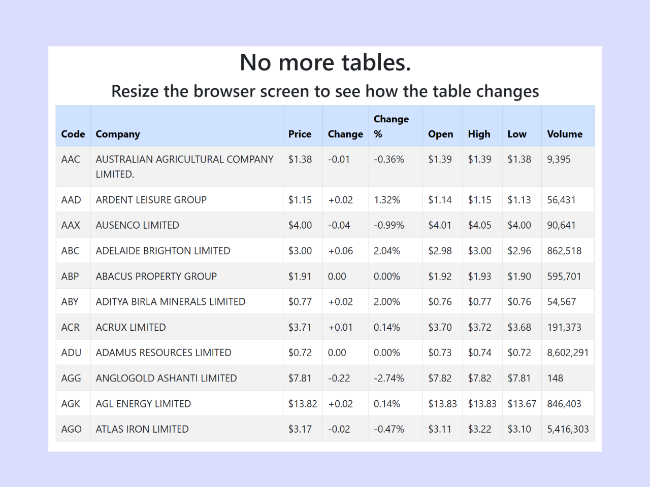
Next, create the HTML structure for your responsive table. This includes a container, a row, and a table with header and body sections. Each table data cell also includes a
data-title
attribute. This attribute is crucial for displaying column headers on small screens.
<div class="container">
    <div class="row">
        <div class="col-md-12">
            <h1 class="text-center">
                No more tables.
            </h1>
            <h3 class="text-center">
                Resize the browser screen to see how the table changes
            </h3>
        </div>
        <div id="no-more-tables">
            <table class="col-md-12 table table-bordered table-striped table-condensed">
        		<thead class="table-primary">
        			<tr>
        				<th>Code</th>
        				<th>Company</th>
        				<th class="numeric">Price</th>
        				<th class="numeric">Change</th>
        				<th class="numeric">Change %</th>
        				<th class="numeric">Open</th>
        				<th class="numeric">High</th>
        				<th class="numeric">Low</th>
        				<th class="numeric">Volume</th>
        			</tr>
        		</thead>
        		<tbody>
        			<tr>
        				<td data-title="Code">AAC</td>
        				<td data-title="Company">AUSTRALIAN AGRICULTURAL COMPANY LIMITED.</td>
        				<td data-title="Price" class="numeric">$1.38</td>
        				<td data-title="Change" class="numeric">-0.01</td>
        				<td data-title="Change %" class="numeric">-0.36%</td>
        				<td data-title="Open" class="numeric">$1.39</td>
        				<td data-title="High" class="numeric">$1.39</td>
        				<td data-title="Low" class="numeric">$1.38</td>
        				<td data-title="Volume" class="numeric">9,395</td>
        			</tr>
        			<tr>
        				<td data-title="Code">AAD</td>
        				<td data-title="Company">ARDENT LEISURE GROUP</td>
        				<td data-title="Price" class="numeric">$1.15</td>
        				<td data-title="Change" class="numeric">+0.02</td>
        				<td data-title="Change %" class="numeric">1.32%</td>
        				<td data-title="Open" class="numeric">$1.14</td>
        				<td data-title="High" class="numeric">$1.15</td>
        				<td data-title="Low" class="numeric">$1.13</td>
        				<td data-title="Volume" class="numeric">56,431</td>
        			</tr>
        			<tr>
        				<td data-title="Code">AAX</td>
        				<td data-title="Company">AUSENCO LIMITED</td>
        				<td data-title="Price" class="numeric">$4.00</td>
        				<td data-title="Change" class="numeric">-0.04</td>
        				<td data-title="Change %" class="numeric">-0.99%</td>
        				<td data-title="Open" class="numeric">$4.01</td>
        				<td data-title="High" class="numeric">$4.05</td>
        				<td data-title="Low" class="numeric">$4.00</td>
        				<td data-title="Volume" class="numeric">90,641</td>
        			</tr>
        			<tr>
        				<td data-title="Code">ABC</td>
        				<td data-title="Company">ADELAIDE BRIGHTON LIMITED</td>
        				<td data-title="Price" class="numeric">$3.00</td>
        				<td data-title="Change" class="numeric">+0.06</td>
        				<td data-title="Change %" class="numeric">2.04%</td>
        				<td data-title="Open" class="numeric">$2.98</td>
        				<td data-title="High" class="numeric">$3.00</td>
        				<td data-title="Low" class="numeric">$2.96</td>
        				<td data-title="Volume" class="numeric">862,518</td>
        			</tr>
        			<tr>
        				<td data-title="Code">ABP</td>
        				<td data-title="Company">ABACUS PROPERTY GROUP</td>
        				<td data-title="Price" class="numeric">$1.91</td>
        				<td data-title="Change" class="numeric">0.00</td>
        				<td data-title="Change %" class="numeric">0.00%</td>
        				<td data-title="Open" class="numeric">$1.92</td>
        				<td data-title="High" class="numeric">$1.93</td>
        				<td data-title="Low" class="numeric">$1.90</td>
        				<td data-title="Volume" class="numeric">595,701</td>
        			</tr>
        			<tr>
        				<td data-title="Code">ABY</td>
        				<td data-title="Company">ADITYA BIRLA MINERALS LIMITED</td>
        				<td data-title="Price" class="numeric">$0.77</td>
        				<td data-title="Change" class="numeric">+0.02</td>
        				<td data-title="Change %" class="numeric">2.00%</td>
        				<td data-title="Open" class="numeric">$0.76</td>
        				<td data-title="High" class="numeric">$0.77</td>
        				<td data-title="Low" class="numeric">$0.76</td>
        				<td data-title="Volume" class="numeric">54,567</td>
        			</tr>
        			<tr>
        				<td data-title="Code">ACR</td>
        				<td data-title="Company">ACRUX LIMITED</td>
        				<td data-title="Price" class="numeric">$3.71</td>
        				<td data-title="Change" class="numeric">+0.01</td>
        				<td data-title="Change %" class="numeric">0.14%</td>
        				<td data-title="Open" class="numeric">$3.70</td>
        				<td data-title="High" class="numeric">$3.72</td>
        				<td data-title="Low" class="numeric">$3.68</td>
        				<td data-title="Volume" class="numeric">191,373</td>
        			</tr>
        			<tr>
        				<td data-title="Code">ADU</td>
        				<td data-title="Company">ADAMUS RESOURCES LIMITED</td>
        				<td data-title="Price" class="numeric">$0.72</td>
        				<td data-title="Change" class="numeric">0.00</td>
        				<td data-title="Change %" class="numeric">0.00%</td>
        				<td data-title="Open" class="numeric">$0.73</td>
        				<td data-title="High" class="numeric">$0.74</td>
        				<td data-title="Low" class="numeric">$0.72</td>
        				<td data-title="Volume" class="numeric">8,602,291</td>
        			</tr>
        			<tr>
        				<td data-title="Code">AGG</td>
        				<td data-title="Company">ANGLOGOLD ASHANTI LIMITED</td>
        				<td data-title="Price" class="numeric">$7.81</td>
        				<td data-title="Change" class="numeric">-0.22</td>
        				<td data-title="Change %" class="numeric">-2.74%</td>
        				<td data-title="Open" class="numeric">$7.82</td>
        				<td data-title="High" class="numeric">$7.82</td>
        				<td data-title="Low" class="numeric">$7.81</td>
        				<td data-title="Volume" class="numeric">148</td>
        			</tr>
        			<tr>
        				<td data-title="Code">AGK</td>
        				<td data-title="Company">AGL ENERGY LIMITED</td>
        				<td data-title="Price" class="numeric">$13.82</td>
        				<td data-title="Change" class="numeric">+0.02</td>
        				<td data-title="Change %" class="numeric">0.14%</td>
        				<td data-title="Open" class="numeric">$13.83</td>
        				<td data-title="High" class="numeric">$13.83</td>
        				<td data-title="Low" class="numeric">$13.67</td>
        				<td data-title="Volume" class="numeric">846,403</td>
        			</tr>
        			<tr>
        				<td data-title="Code">AGO</td>
        				<td data-title="Company">ATLAS IRON LIMITED</td>
        				<td data-title="Price" class="numeric">$3.17</td>
        				<td data-title="Change" class="numeric">-0.02</td>
        				<td data-title="Change %" class="numeric">-0.47%</td>
        				<td data-title="Open" class="numeric">$3.11</td>
        				<td data-title="High" class="numeric">$3.22</td>
        				<td data-title="Low" class="numeric">$3.10</td>
        				<td data-title="Volume" class="numeric">5,416,303</td>
        			</tr>
        		</tbody>
        	</table>
        </div>
    </div>

</div>
Adding Responsive Styling
Finally, apply custom CSS styles to make your table responsive. This CSS uses a media query to apply specific styles only when the screen width is 800px or less. It transforms the table into a stacked card-like layout on smaller devices. This ensures that each column’s content is displayed clearly.
@media only screen and (max-width: 800px) {

    /* Force table to not be like tables anymore */
	#no-more-tables table,
	#no-more-tables thead,
	#no-more-tables tbody,
	#no-more-tables th,
	#no-more-tables td,
	#no-more-tables tr {
		display: block;
	}

	/* Hide table headers (but not display: none;, for accessibility) */
	#no-more-tables thead tr {
		position: absolute;
		top: -9999px;
		left: -9999px;
	}

	#no-more-tables tr { border: 1px solid #ccc; }

	#no-more-tables td {
		/* Behave  like a "row" */
		border: none;
		position: relative;
		padding-left: 50%;
		white-space: normal;
		text-align:left;
	}

	#no-more-tables td:before {
		/* Now like a table header */
		position: absolute;
		/* Top/left values mimic padding */
		top: 6px;
		left: 6px;
		width: 45%;
		padding-right: 10px;
		white-space: nowrap;
		text-align:left;
		font-weight: bold;
	}

	/*
	Label the data
	*/
	#no-more-tables td:before { content: attr(data-title); }
}

.table .table-dark th{
  background-color:#00f;
  color:#fff;
}
a{
  color:#00f;
}
By following these steps, you have successfully created a responsive Bootstrap 5 table that elegantly handles various screen sizes. This approach ensures optimal Bootstrap 5 table column width fit content, enhancing user experience across all devices.