

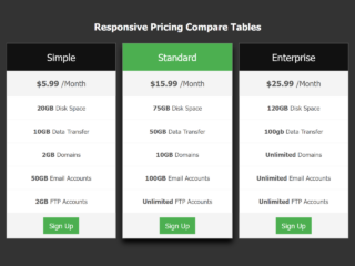
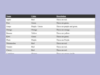
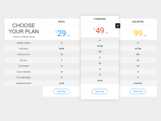
This tutorial will guide you through creating a CSS responsive table with horizontal scroll functionality. This is particularly useful when dealing with tables containing a large number of columns that may not fit on smaller screens.
Step 1: Setting up the HTML Structure
First, we need to create the basic HTML structure for our table. This involves creating a container for the table and adding table headers (<th>) and table data (<td>) elements.
<h2>Responsive Table</h2>
<div class="table-wrapper">
    <table class="fl-table">
        <thead>
        <tr>
            <th>Header 1</th>
            <th>Header 2</th>
            <th>Header 3</th>
            <th>Header 4</th>
            <th>Header 5</th>
        </tr>
        </thead>
        <tbody>
        <tr>
            <td>Content 1</td>
            <td>Content 1</td>
            <td>Content 1</td>
            <td>Content 1</td>
            <td>Content 1</td>
        </tr>
        <tr>
            <td>Content 2</td>
            <td>Content 2</td>
            <td>Content 2</td>
            <td>Content 2</td>
            <td>Content 2</td>
        </tr>
        <tr>
            <td>Content 3</td>
            <td>Content 3</td>
            <td>Content 3</td>
            <td>Content 3</td>
            <td>Content 3</td>
        </tr>
        <tr>
            <td>Content 4</td>
            <td>Content 4</td>
            <td>Content 4</td>
            <td>Content 4</td>
            <td>Content 4</td>
        </tr>
        <tr>
            <td>Content 5</td>
            <td>Content 5</td>
            <td>Content 5</td>
            <td>Content 5</td>
            <td>Content 5</td>
        </tr>
        <tr>
            <td>Content 6</td>
            <td>Content 6</td>
            <td>Content 6</td>
            <td>Content 6</td>
            <td>Content 6</td>
        </tr>
        <tr>
            <td>Content 7</td>
            <td>Content 7</td>
            <td>Content 7</td>
            <td>Content 7</td>
            <td>Content 7</td>
        </tr>
        <tr>
            <td>Content 8</td>
            <td>Content 8</td>
            <td>Content 8</td>
            <td>Content 8</td>
            <td>Content 8</td>
        </tr>
        <tr>
            <td>Content 9</td>
            <td>Content 9</td>
            <td>Content 9</td>
            <td>Content 9</td>
            <td>Content 9</td>
        </tr>
        <tr>
            <td>Content 10</td>
            <td>Content 10</td>
            <td>Content 10</td>
            <td>Content 10</td>
            <td>Content 10</td>
        </tr>
        <tbody>
    </table>
</div>
Step 2: Styling with CSS
Now, let’s add some CSS to style our table and make it responsive. The CSS will handle the table’s appearance, and the crucial media query will enable horizontal scrolling on smaller screens.
*{
    box-sizing: border-box;
    -webkit-box-sizing: border-box;
    -moz-box-sizing: border-box;
}
body{
    font-family: Helvetica;
    -webkit-font-smoothing: antialiased;
    background: rgba( 71, 147, 227, 1);
}
h2{
    text-align: center;
    font-size: 18px;
    text-transform: uppercase;
    letter-spacing: 1px;
    color: white;
    padding: 30px 0;
}

/* Table Styles */

.table-wrapper{
    margin: 10px 70px 70px;
    box-shadow: 0px 35px 50px rgba( 0, 0, 0, 0.2 );
}

.fl-table {
    border-radius: 5px;
    font-size: 12px;
    font-weight: normal;
    border: none;
    border-collapse: collapse;
    width: 100%;
    max-width: 100%;
    white-space: nowrap;
    background-color: white;
}

.fl-table td, .fl-table th {
    text-align: center;
    padding: 8px;
}

.fl-table td {
    border-right: 1px solid #f8f8f8;
    font-size: 12px;
}

.fl-table thead th {
    color: #ffffff;
    background: #4FC3A1;
}


.fl-table thead th:nth-child(odd) {
    color: #ffffff;
    background: #324960;
}

.fl-table tr:nth-child(even) {
    background: #F8F8F8;
}

/* Responsive */

@media (max-width: 767px) {
    .fl-table {
        display: block;
        width: 100%;
    }
    .table-wrapper:before{
        content: "Scroll horizontally >";
        display: block;
        text-align: right;
        font-size: 11px;
        color: white;
        padding: 0 0 10px;
    }
    .fl-table thead, .fl-table tbody, .fl-table thead th {
        display: block;
    }
    .fl-table thead th:last-child{
        border-bottom: none;
    }
    .fl-table thead {
        float: left;
    }
    .fl-table tbody {
        width: auto;
        position: relative;
        overflow-x: auto;
    }
    .fl-table td, .fl-table th {
        padding: 20px .625em .625em .625em;
        height: 60px;
        vertical-align: middle;
        box-sizing: border-box;
        overflow-x: hidden;
        overflow-y: auto;
        width: 120px;
        font-size: 13px;
        text-overflow: ellipsis;
    }
    .fl-table thead th {
        text-align: left;
        border-bottom: 1px solid #f7f7f9;
    }
    .fl-table tbody tr {
        display: table-cell;
    }
    .fl-table tbody tr:nth-child(odd) {
        background: none;
    }
    .fl-table tr:nth-child(even) {
        background: transparent;
    }
    .fl-table tr td:nth-child(odd) {
        background: #F8F8F8;
        border-right: 1px solid #E6E4E4;
    }
    .fl-table tr td:nth-child(even) {
        border-right: 1px solid #E6E4E4;
    }
    .fl-table tbody td {
        display: block;
        text-align: center;
    }
}
Congratulations! You’ve successfully created a responsive table with horizontal scrolling using only CSS. Now your table will gracefully adapt to different screen sizes, ensuring readability across all devices.