
Are you looking to create a visually appealing and functional administrative interface for your web application? This tutorial will guide you through building a Simple Admin Dashboard in Bootstrap 5. A well-structured admin dashboard is crucial for managing your application’s data and users efficiently. Using Bootstrap 5, we can leverage its responsive grid system and pre-styled components to quickly assemble a modern and user-friendly backend panel, saving you valuable development time. This guide will cover everything from setting up the layout with a fixed sidebar and collapsible content area to integrating interactive charts, making it a perfect starting point for your admin needs.
Setting Up Your HTML Document
To begin, you need to link the necessary external libraries in the head section of your HTML file. These links provide the styling for Font Awesome icons and the core Bootstrap 5 framework.
<link rel='stylesheet' href='https://cdnjs.cloudflare.com/ajax/libs/font-awesome/5.15.4/css/all.min.css'>
<link rel='stylesheet' href='https://cdn.jsdelivr.net/npm/bootstrap@5.3.3/dist/css/bootstrap.min.css'>
<link rel='stylesheet' href='https://cdn.jsdelivr.net/npm/bootstrap@5.1.3/dist/css/bootstrap.min.css'>
<link rel='stylesheet' href='https://stackpath.bootstrapcdn.com/bootstrap/4.1.0/css/bootstrap.min.css'>
Creating the HTML Structure
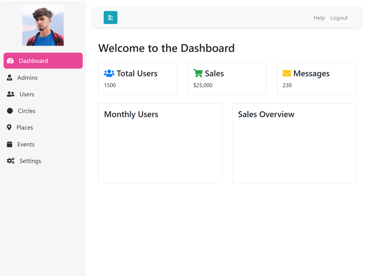
Next, establish the fundamental layout of your dashboard. This includes a main wrapper, a fixed sidebar for navigation, and a content area that will house your dashboard elements and expand/collapse functionality.
<div class="wrapper">
  <!-- Sidebar  -->
  <nav id="sidebar">
    <div class="sidebar-header">
      <img src="https://assets.codepen.io/11549074/internal/avatars/users/default.png?fit=crop&format=auto&height=512&version=1732775501&width=512" alt="Logo" class="sidebar-logo">
    </div>

    <ul class="list-unstyled components">
      <li>
        <a href="#dashboard" class="active">
          <i class="fas fa-tachometer-alt"></i>
          Dashboard
        </a>
      </li>
      <li>
        <a href="#admins">
          <i class="fas fa-user-tie"></i>
          Admins
        </a>
      </li>
      <li>
        <a href="#users">
          <i class="fas fa-user-friends"></i>
          Users
        </a>
      </li>
      <li>
        <a href="#circles">
          <i class="fas fa-circle"></i>
          Circles
        </a>
      </li>
      <li>
        <a href="#places">
          <i class="fas fa-map-marker-alt"></i>
          Places
        </a>
      </li>
      <li>
        <a href="#events">
          <i class="fas fa-calendar"></i>
          Events
        </a>
      </li>
      <li>
        <a href="#settings">
          <i class="fas fa-cogs"></i>
          Settings
        </a>
      </li>

    </ul>
  </nav>

  <!-- Page Content  -->
  <div id="content">
    <nav class="navbar navbar-expand-lg navbar-light bg-light">
      <div class="container-fluid">
        <button type="button" id="sidebarCollapse" class="btn btn-info">
          <i class="fas fa-align-left"></i>
        </button>

        <button class="btn btn-dark d-inline-block d-lg-none ml-auto" type="button" data-toggle="collapse" data-target="#navbarSupportedContent" aria-controls="navbarSupportedContent" aria-expanded="false" aria-label="Toggle navigation">
          <i class="fas fa-align-justify"></i>
        </button>

        <div class="collapse navbar-collapse" id="navbarSupportedContent">
          <ul class="nav navbar-nav ml-auto">
            <li class="nav-item">
              <a class="nav-link" href="#">Help</a>
            </li>
            <!-- Trigger logout function -->
            <li class="nav-item">
              <a class="nav-link" (click)="logout()">Logout</a>
            </li>
          </ul>
        </div>
      </div>
    </nav>
<div class="container">
        <h2 class="mb-4">Welcome to the Dashboard</h2>

        <!-- Row 1: Dashboard Cards -->
        <div class="row">
          <div class="col-md-4 mb-4">
            <div class="card dashboard-card p-3">
              <h4><i class="fas fa-users text-primary"></i> Total Users</h4>
              <p class="mb-0">1500</p>
            </div>
          </div>
          <div class="col-md-4 mb-4">
            <div class="card dashboard-card p-3">
              <h4><i class="fas fa-shopping-cart text-success"></i> Sales</h4>
              <p class="mb-0">$25,000</p>
            </div>
          </div>
          <div class="col-md-4 mb-4">
            <div class="card dashboard-card p-3">
              <h4><i class="fas fa-envelope text-warning"></i> Messages</h4>
              <p class="mb-0">230</p>
            </div>
          </div>
        </div>

        <!-- Row 2: Custom Charts -->
        <div class="row">
        <div class="col-md-6 mb-4">
          <div class="card p-3">
            <h4>Monthly Users</h4>
            <canvas id="usersChart" height="150"></canvas>
          </div>
        </div>
        <div class="col-md-6 mb-4">
          <div class="card p-3">
            <h4>Sales Overview</h4>
            <canvas id="salesChart" height="150"></canvas>
          </div>
        </div>
      </div>
    </div>
      </div>
    </div>
      </div>
    </div>
Styling the Dashboard with CSS
To give your dashboard a polished and organized look, apply the following custom CSS styles. These styles define the appearance of the sidebar, content area, navigation, and various components to ensure a consistent and modern design.
a,
a:hover,
a:focus {
  color: #e84697;
  text-decoration: none;
  transition: all 0.3s;
}

.navbar {
  position: sticky; /* Make navbar fixed */
  top: 0;
  z-index: 1000; /* Ensure it stays on top */
  padding: 15px 10px;
  background: #fff;
  border: none;
  border-radius: 0;
  margin-bottom: 40px;
  box-shadow: 0 2px 10px rgba(0, 0, 0, 0.1);
}
.navbar-btn {
  box-shadow: none;
  outline: none !important;
  border: none;
}

.line {
  width: 100%;
  height: 1px;
  border-bottom: 1px dashed #ccc;
  margin: 40px 0;
}

i,
span {
  display: inline-block;
}

/* ---------------------------------------------------
    SIDEBAR STYLE
----------------------------------------------------- */

.wrapper {
  display: flex;
  align-items: stretch;
}

#sidebar {
  position: fixed; /* Make sidebar fixed */
  height: 100%; /* Full height */
  min-width: 250px;
  max-width: 250px;
  background: #f6f6f6;
  color: #272d38;
  transition: all 0.3s;
  padding: 10px;
  border-radius: 10px 0 0 10px;
    overflow-y: scroll;
    overflow-x: hidden;
    -ms-overflow-style: none;  /* Internet Explorer 10+ */
    scrollbar-width: none;  /* Firefox */
}
#sidebar::-webkit-scrollbar {
    display: none;  /* Safari and Chrome */
}

#sidebar.active {
  min-width: 100px;
  max-width: 100px;
  text-align: center;
}

#sidebar.active .sidebar-header h3,
#sidebar.active .CTAs {
  display: none;
}

/* Optional: Center and resize the logo within the sidebar header */
.sidebar-header .sidebar-logo {
  width: 100%; /* Allows full width within sidebar constraints */
  max-width: 120px; /* Adjust maximum width to ensure it's not too large */
  margin: 0 auto; /* Center the logo */
  display: block;
}

#sidebar.active .sidebar-header strong {
  display: block;
}

#sidebar ul li a {
  text-align: left;
  color: #272d38;
  text-decoration: none;
}

#sidebar.active ul li a {
  padding: 20px 10px;
  text-align: center;
  font-size: 0.85em;
  min-width: 80px;
  max-width: 80px;
}

#sidebar.active ul li a i {
  margin-right: 0;
  display: block;
  font-size: 1.8em;
  margin-bottom: 5px;
}

#sidebar ul li.active > a,
#sidebar ul li a.active,
a[aria-expanded="true"] {
  color: #ffffff; /* Text color */
  background: #e84697; /* Blue background for active links */
  border-radius: 8px;
}

#sidebar ul li a:hover,
#sidebar ul li.active > a {
  background: #0056b3; /* Darker blue for hover */
  color: #ffffff; /* White text for readability */
  border-radius: 8px; /* Smooth border on the left */
}

#sidebar ul li a:hover {
  background: #e84697; /* Keep the blue background on hover */
  color: #272d38; /* White text for readability */
  border-bottom: none; /* Remove any bottom border */
}

#sidebar ul li a i {
  margin-right: 10px;
}

#sidebar .sidebar-header {
  background: #f6f6f6;
}

#sidebar .sidebar-header strong {
  display: none;
  font-size: 1.8em;
}

#sidebar ul.components {
  padding: 20px 0;
  border-bottom: 1px solid #f6f6f6;
}

#sidebar ul li a {
  padding: 10px;
  margin-bottom: 2px;
  font-size: 1.1em;
  display: block;
  color: #272d38;
}

#sidebar ul li.active > a,
a[aria-expanded="true"] {
  color: #ffffff; /* White text for active links */
  background: #e84697; /* Dark background for active state */
  border-radius: 8px;
}

/* Active link styles */
#sidebar ul li a:hover,
#sidebar ul li.active > a {
  background: #e84697; /* Same as active */
  color: #ffffff; /* Ensure text is readable */
  border-bottom: 2px solid #e84697; /* Accent border */
  border-radius: 8px;
}

a[data-toggle="collapse"] {
  position: relative;
}

.dropdown-toggle::after {
  display: block;
  position: absolute;
  top: 50%;
  right: 20px;
  transform: translateY(-50%);
}

ul ul a {
  font-size: 0.9em !important;
  padding-left: 30px !important;
}

ul.CTAs {
  padding: 20px;
}

ul.CTAs a {
  text-align: center;
  font-size: 0.9em !important;
  display: block;
  border-radius: 5px;
  margin-bottom: 5px;
}

a.download {
  background: #fff;
  color: #7386d5;
  border: 1px solid #7386d5;
}

a.article,
a.article:hover {
  background: #f6f6f6 !important;
  color: #ffffff !important;
  border: none;
  border-radius: 5px;
  transition: all 0.3s;
}

/* ---------------------------------------------------
    CONTENT STYLE
----------------------------------------------------- */

#content {
  width: calc(100% - 250px); /* Adjust width to account for sidebar */
  margin-left: 250px; /* Move content to the right */
  padding: 20px;
  min-height: fit-content;
  transition: all 0.3s;
}

#sidebar.active + #content {
  width: calc(100% - 100px); /* Adjust width when sidebar is active */
  margin-left: 100px; /* Move content to the right */
}

/* ---------------------------------------------------
    MEDIAQUERIES
----------------------------------------------------- */

@media (max-width: 768px) {
  #sidebar {
    min-width: 80px;
    max-width: 80px;
    text-align: center;
    margin-left: -80px !important;
  }

  .sidebar-header .sidebar-logo {
    max-width: 80px; /* Smaller max width for mobile screens */
  }

  .dropdown-toggle::after {
    top: auto;
    bottom: 10px;
    right: 50%;
    transform: translateX(50%);
  }

  #sidebar.active {
    margin-left: 0 !important;
  }

  #sidebar .sidebar-header h3,
  #sidebar .CTAs {
    display: none;
  }

  #sidebar .sidebar-header strong {
    display: block;
  }

  #sidebar ul li a {
    padding: 20px 5px;
    text-align: center;
    font-size: 0.85em;
  }

  #sidebar ul li a i {
    margin-right: 0;
    display: block;
    font-size: 1.8em;
    margin-bottom: 5px;
  }

  #sidebar ul ul a {
    padding: 10px !important;
  }

  #sidebar.active ul li a {
    padding: 20px 10px;
    text-align: center;
    font-size: 0.85em;
    min-width: 80px !important;
    max-width: 80px !important;
  }

  #content {
    width: calc(100% - 80px); /* Adjust width for mobile screens */
    margin-left: 0px; /* Move content to the right */
  }

  #sidebar.active + #content {
    width: calc(100% - 80px); /* Adjust width when sidebar is active */
    margin-left: 80px; /* Move content to the right */
  }
}
Adding Interactivity with JavaScript
Finally, incorporate JavaScript to add dynamic behaviors to your dashboard. This includes the functionality to collapse and expand the sidebar, manage active navigation links, and render interactive charts for data visualization.
document.addEventListener('DOMContentLoaded', () => {
    // Sidebar collapse functionality
    const sidebarCollapseButton = document.querySelector('#sidebarCollapse');
    const sidebar = document.querySelector('#sidebar');
    const content = document.querySelector('#content');

    sidebarCollapseButton.addEventListener('click', () => {
        sidebar.classList.toggle('active');
        content.classList.toggle('active');
    });

    // Active state functionality
    const sidebarLinks = document.querySelectorAll('#sidebar .list-unstyled a');

    sidebarLinks.forEach(link => {
        link.addEventListener('click', () => {
            // Remove active class from all links
            sidebarLinks.forEach(link => link.classList.remove('active'));

            // Add active class to the clicked link
            link.classList.add('active');
        });
    });
});


//canvas
const usersCtx = document.getElementById('usersChart').getContext('2d');
new Chart(usersCtx, {
  type: 'line',
  data: {
    labels: ['Jan', 'Feb', 'Mar', 'Apr', 'May'],
    datasets: [
      {
        label: 'Users',
        data: [120, 190, 300, 450, 700],
        backgroundColor: 'rgba(0, 123, 255, 0.5)',
        borderColor: 'rgba(0, 123, 255, 1)',
        borderWidth: 2,
      },
    ],
  },
});

// Chart.js Example for Sales Chart
const salesCtx = document.getElementById('salesChart').getContext('2d');
new Chart(salesCtx, {
  type: 'bar',
  data: {
    labels: ['Jan', 'Feb', 'Mar', 'Apr', 'May'],
    datasets: [
      {
        label: 'Sales ($)',
        data: [5000, 8000, 6000, 10000, 12000],
        backgroundColor: 'rgba(40, 167, 69, 0.5)',
        borderColor: 'rgba(40, 167, 69, 1)',
        borderWidth: 2,
      },
    ],
  },
});
Including Essential JavaScript Libraries
At the end of your HTML document, just before the closing </body> tag, include the Bootstrap 5 JavaScript bundle and the Chart.js library. These are crucial for Bootstrap’s interactive components and for rendering the charts on your dashboard.
<!-- Bootstrap 5 JS -->
<script src="https://cdn.jsdelivr.net/npm/@popperjs/core@2.9.2/dist/umd/popper.min.js" integrity="sha384-IQsoLXl5PILFhosVNubq5LC7Qb9DXgDA9i+tQ8Zj3iwWAwPtgFTxbJ8NT4GN1R8p" crossorigin="anonymous"></script>
<script src="https://cdn.jsdelivr.net/npm/bootstrap@5.0.2/dist/js/bootstrap.min.js" integrity="sha384-cVKIPhGWiC2Al4u+LWgxfKTRIcfu0JTxR+EQDz/bgldoEyl4H0zUF0QKbrJ0EcQF" crossorigin="anonymous"></script>

<!-- Chart JS -->
<script src="https://cdnjs.cloudflare.com/ajax/libs/Chart.js/4.5.0/chart.min.js" integrity="sha512-n/G+dROKbKL3GVngGWmWfwK0yPctjZQM752diVYnXZtD/48agpUKLIn0xDQL9ydZ91x6BiOmTIFwWjjFi2kEFg==" crossorigin="anonymous" referrerpolicy="no-referrer"></script>
This completes the steps to create a simple admin dashboard in Bootstrap 5. You now have a functional and aesthetically pleasing interface.