

Are you looking to present different product features or service plans clearly on your website? A well-designed product comparison table, created using HTML and CSS, is essential for helping your visitors make informed decisions. This tutorial offers a straightforward and responsive solution for creating a visually appealing product comparison table using HTML and CSS, making it easy to display various options side by side with their respective benefits and pricing.
Create a Responsive Product Comparison Table
Step 1: Set Up Your HTML Structure
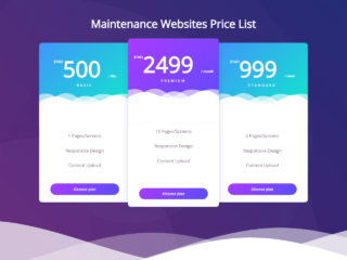
First, you need to create the basic structure for your comparison table. This HTML code uses unordered lists (<ul>) to represent each product or plan. Each list item (<li>) holds the specific details, like pricing and features. The columns class helps arrange these lists side-by-side, and price-box styles each individual plan.
<h2>responsive pricing compare tables</h2>
     <div class="columns">
          <ul class="price-box">
               <li class="header">simple</li>
               <li class="emph"><strong>$5.99</strong> /month</li>
               <li><strong>20GB</strong> disk space</li>
               <li><strong>10GB</strong> data transfer</li>
               <li><strong>2GB</strong> domains</li>
               <li><strong>50GB</strong> email accounts</li>
               <li><strong>2GB</strong> FTP accounts</li>
               <li class="emph"><a href="#" class="button">sign up</a></li>
          </ul>
     </div>
     <div class="columns">
          <ul class="price-box best">
               <li class="header header-green">standard</li>
               <li class="emph"><strong>$15.99</strong> /month</li>
               <li><strong>75GB</strong> disk space</li>
               <li><strong>50GB</strong> data transfer</li>
               <li><strong>10GB</strong> domains</li>
               <li><strong>100GB</strong> email accounts</li>
               <li><strong>unlimited</strong> FTP accounts</li>
               <li class="emph"><a href="#" class="button">sign up</a></li>
          </ul>
     </div>
     <div class="columns">
          <ul class="price-box">
               <li class="header">enterprise</li>
               <li class="emph"><strong>$25.99</strong> /month</li>
               <li><strong>120GB</strong> disk space</li>
               <li><strong>100gb</strong> data transfer</li>
               <li><strong>unlimited</strong> domains</li>
               <li><strong>unlimited</strong> email accounts</li>
               <li><strong>unlimited</strong> FTP accounts</li>
               <li class="emph"><a href="#" class="button">sign up</a></li>
          </ul>
     </div>
Step 2: Style Your Table with CSS
Next, apply CSS styles to make your comparison table visually appealing and responsive. This CSS code defines the layout, colors, fonts, and responsiveness for different screen sizes. It ensures the table looks good on both desktop and mobile devices. Styles are applied to headers, pricing, features, and the “Sign Up” buttons.
body {
     font-family: 'Tahoma',sans-serif;
     background-color: #333;
     color: #fff;
}
h2 {
     text-align: center;
     text-transform: capitalize;
}
.columns {
     float: left;
     width: 33.3%;
     padding: 8px;
     box-sizing: border-box;
}
.columns .price-box {
     background-color: #fff;
     color: #555;
     list-style-type: none;
     border: 1px solid #555;
     margin: 0px;
     padding: 0px;
     transition: 0.3s;
}
.columns .price-box:hover,.columns .price-box.best {
     box-shadow: 0px 10px 15px 0px #000;
}
.columns .price-box .header {
     background-color: #111;
     color: #fff;
     font-size: 25px;
}
.columns .price-box .header.header-green {
     background-color: #4CAf50;
}
.columns .price-box li {
     padding: 20px;
     border-bottom: 1px solid #eee;
     text-align: center;
     text-transform: capitalize;
}
.columns .price-box .emph {
     background-color: #f4f4f4;
     font-size: 20px;
}
.columns .price-box .emph .button {
     background-color: #4CAf50;
     border: none;
     color: #fff;
     padding: 10px 15px;
     text-align: center;
     text-decoration: none;
     font-size: 18px;
     transition: 0.3s;
}
.columns .price-box .emph .button:hover {
     box-shadow: 0px 5px 5px 0px #4CAf50;
     border-radius: 5px;
     opacity: 0.7;
}
@media only screen and (max-width:700px){
     .columns {
          width: 100%;
     }
}
You have now successfully created a responsive pricing comparison table using HTML and CSS.