
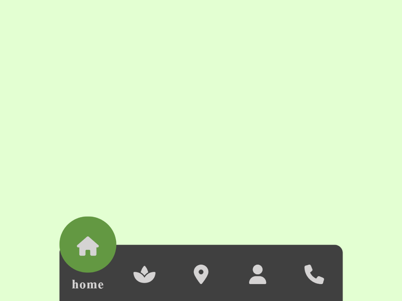
Creating an intuitive and accessible navigation experience is important for any mobile-first website. If you are looking to implement a sleek and functional mobile bottom navigation bar using basic HTML and CSS, this guide is for you. This tutorial provides the necessary code and steps to build a responsive bottom navigation bar that stays fixed at the bottom of the screen, greatly enhancing user experience on mobile devices.
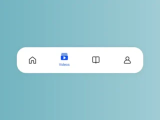
Build a Responsive Mobile Bottom Navigation Bar
Follow these simple steps to create a dynamic and interactive mobile bottom navigation bar.
Add Header Assets
First, include the Font Awesome library in your document’s head section. This provides the icons used in the navigation bar.
<script src="https://kit.fontawesome.com/7cf71bb0b3.js" crossorigin="anonymous"></script>
Create the HTML Structure
Next, define the structure of your navigation bar. This HTML creates a list of navigation items, each with an icon and text, and includes a moving indicator.
 <nav>
    <ul>
      <li class="list active">
        <a href="#">
          <span class="icon"><i class="fa-solid fa-house"></i></span>
          <span class="text">home</span>
        </a>
      </li>
          <li class="list">
        <a href="#">
          <span class="icon"><i class="fa-solid fa-spa"></i></span>
          <span class="text">spa</span>
        </a>
      </li>
          <li class="list">
        <a href="#">
          <span class="icon"><i class="fa-solid fa-location-dot"></i></span>
          <span class="text">location</span>
        </a>
      </li>
          <li class="list">
        <a href="#">
          <span class="icon"><i class="fa-solid fa-user"></i></span>
          <span class="text">profile</span>
        </a>
      </li>
          <li class="list">
        <a href="#">
          <span class="icon"><i class="fa-solid fa-phone"></i></span>
          <span class="text">phone</span>
        </a>
      </li>
      <div class="indicator"></div>
    </ul>
  </na>
Apply CSS Styles
Now, style your navigation bar to achieve its visual appearance and responsive behavior. The CSS controls layout, colors, and the animation of the indicator.
*{
  margin: 0;
  padding: 0;
}

body{
  height: 100vh;
  display: flex;
  justify-content: center;
  align-items: center;
 }


nav{
  position: fixed;
  bottom: 0px;
  height: 70px;
  width: 350px;
  display: flex;
  justify-content: center;
  align-items: center;
  background-color: #404040;
  border-radius: 10px 10px 0 0;
}

nav ul{
  display: flex;
  width: 350px;
}

nav ul li{
  list-style: none;
  width: 20%;
  height: 70px;
  z-index: 1;
}

nav ul li a{
  position: relative;
  display: flex;
  justify-content: center;
  align-items: center;
  flex-direction: column;
  width: 100%;
  text-align: center;
  font-weight: 700;
  color: #D5D3D3;
  text-decoration: none;
}


nav ul li a .icon{
  position: relative;
  display: block;
  line-height: 75px;
  font-size: 1.5em;
  text-align: center;
  transition: 0.5s;
}

nav ul li.active a .icon{
  transform: translateY(-35px)
}

nav ul li a .text{
  position: relative;
  display: block;
  font-weight: 700;
  font size: 0.75em;
  letter-spacing: 0.7px;
  Transition: 0.5s;
  opacity: 0;
}

nav ul li.active a .text{
  opacity: 1;
  transform: translateY(-35px);
}

.indicator{
  position: absolute;
  top: -50%;
  height: 70px;
  width: 70px;
  background-color: #639842;
  border-radius: 50px;
  transition: 0.5s;
}

nav ul li:nth-child(2).active ~ .indicator{
  transform: translateX(calc(20%*5))
}
nav ul li:nth-child(3).active ~ .indicator{
  transform: translatex(calc(20%*10))
}
nav ul li:nth-child(4).active ~ .indicator{
  transform: translatex(calc(20%*15))
}

nav ul li:nth-child(5).active ~ .indicator{
  transform: translatex(calc(20%*20))
}
Implement JavaScript Functionality
Finally, add JavaScript to make the navigation bar interactive. This script handles the active state of each navigation item, allowing the indicator to move and highlight the selected link.
const list = document.querySelectorAll('.list');
function activeLink (){
  list.forEach((item) => item.classList.remove('active'));
  this.classList.add('active');
}
list.forEach((item) =>
item.addEventListener('click', activeLink));
You have successfully created a functional and stylish mobile bottom navigation bar using HTML, CSS, and JavaScript. This element will significantly improve the usability of your mobile web application.