
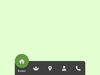
This tutorial will guide you through the process of creating a dynamic Tab Menu With Svg Animated Icon. This type of menu is especially useful for enhancing user experience on websites and applications, offering a visually appealing and intuitive way for users to navigate between different sections or functionalities. The animated SVG icons provide a modern touch and can greatly improve engagement.
Adding Header Assets
Before diving into the structure, let’s add the necessary assets to the <head> of your HTML document. This includes the viewport meta tag and links to external stylesheets like Google Fonts.
<meta name="viewport" content="width=device-width, initial-scale=1, viewport-fit=cover"><link rel='stylesheet' href='https://fonts.googleapis.com/css2?family=Noto+Sans:wght@500&display=swap'>
Creating the HTML Structure
Now, let’s build the HTML structure for the tab menu. This involves creating a navigation bar with a list of tabs, each containing an SVG icon and a text label.
<nav class="tab-bar">
	<ul class="tab-bar__tabs">
		<li class="tab-bar__tab">
			<a class="tab-bar__tab-link" href="#home" aria-current="page">
				<svg class="tab-bar__tab-icon tab-bar__tab-icon--home" viewBox="0 0 24 24" width="24px" height="24px" aria-hidden="true">
					<g class="tab-bar__tab-icon-1" fill="var(--focus-t)" stroke="currentColor" stroke-width="2" stroke-linejoin="round">
						<polygon points="12 1,23 10,23 23,16 23,16 14,8 14,8 23,1 23,1 10" />
					</g>
				</svg>
				<span class="tab-bar__tab-name">Home</span>
			</a>
		</li>
		<li class="tab-bar__tab">
			<a class="tab-bar__tab-link" href="#videos">
				<svg class="tab-bar__tab-icon tab-bar__tab-icon--videos" viewBox="0 0 24 24" width="24px" height="24px" aria-hidden="true">
					<g fill="var(--focus-t)" stroke="currentColor" stroke-width="2" stroke-linecap="round" stroke-linejoin="round">
						<line class="tab-bar__tab-icon-1" x1="3" y1="1" x2="21" y2="1" />
						<line x1="2" y1="5" x2="22" y2="5" />
						<g class="tab-bar__tab-icon-2" transform="translate(1,9)">
							<polygon points="9 3,15 7.5,9 11" />
							<rect rx="2" ry="2" width="22" height="14" />
							<polygon class="tab-bar__tab-icon-3" opacity="0" points="9 3,15 7.5,9 11" />
						</g>
					</g>
				</svg>
				<span class="tab-bar__tab-name">Videos</span>
			</a>
		</li>
		<li class="tab-bar__tab">
			<a class="tab-bar__tab-link" href="#books">
				<svg class="tab-bar__tab-icon tab-bar__tab-icon--books" viewBox="0 0 24 24" width="24px" height="24px" aria-hidden="true">
					<g class="tab-bar__tab-icon-1" fill="var(--focus-t)" stroke="currentColor" stroke-width="2" stroke-linecap="round" stroke-linejoin="round">
						<rect class="tab-bar__tab-icon-2" x="1" y="1" rx="2" ry="2" width="11" height="19" />
						<rect class="tab-bar__tab-icon-3" x="12" y="1" rx="2" ry="2" width="11" height="19" />
						<line x1="12" y1="21" x2="12" y2="23" />
					</g>
				</svg>
				<span class="tab-bar__tab-name">Books</span>
			</a>
		</li>
		<li class="tab-bar__tab">
			<a class="tab-bar__tab-link" href="#profile">
				<svg class="tab-bar__tab-icon tab-bar__tab-icon--profile" viewBox="0 0 24 24" width="24px" height="24px" aria-hidden="true">
					<g fill="var(--focus-t)" stroke="currentColor" stroke-width="2">
						<circle class="tab-bar__tab-icon-1" cx="12" cy="6.5" r="5.5"/>
						<path d="M20.473,23H3.003c-1.276,0-2.228-1.175-1.957-2.422,.705-3.239,3.029-8.578,10.693-8.578s9.987,5.336,10.692,8.575c.272,1.248-.681,2.425-1.959,2.425Z"/>
					</g>
				</svg>
				<span class="tab-bar__tab-name">Profile</span>
			</a>
		</li>
	</ul>
</nav>
    <script  src="./script.js"></script>
Styling with CSS
Next, we will style the tab menu using CSS. This will cover the basic layout, colors, animations, and responsive behavior of the menu.
* {
  border: 0;
  box-sizing: border-box;
  margin: 0;
  padding: 0;
}

:root {
  --hue: 223;
  --bg: hsl(var(--hue),10%,90%);
  --fg: hsl(var(--hue),10%,10%);
  --focus: hsl(var(--hue),90%,50%);
  --focus-t: hsla(var(--hue),90%,50%,0);
  --tab-bar-bg: hsl(0,0%,100%);
  --trans-dur: 0.3s;
  --trans-timing: cubic-bezier(0.65,0,0.35,1);
  font-size: calc(14px + (30 - 14) * (100vw - 280px) / (3840 - 280));
}

body {
  background-color: var(--bg);
  color: var(--fg);
  display: flex;
  font: 1em/1.5 "Noto Sans", sans-serif;
  height: 100vh;
  transition: background-color var(--trans-dur), color var(--trans-dur);
}

.tab-bar {
  background-color: var(--tab-bar-bg);
  border-radius: 2em;
  box-shadow: 0 0 0.75em hsla(var(--hue), 10%, 10%, 0.1);
  margin: auto;
  width: calc(100% - 1.5em);
  max-width: 27em;
  transition: background-color var(--trans-dur), box-shadow var(--trans-dur);
}
.tab-bar__tabs {
  display: flex;
  justify-content: space-between;
  list-style: none;
}
.tab-bar__tab {
  text-align: center;
  width: 100%;
}
.tab-bar__tab-icon, .tab-bar__tab-name {
  display: block;
  pointer-events: none;
  transition: opacity var(--trans-dur) var(--trans-timing), transform var(--trans-dur) var(--trans-timing);
}
.tab-bar__tab-icon {
  margin: auto;
  overflow: visible;
  width: 1.5em;
  height: auto;
}
.tab-bar__tab-icon circle,
.tab-bar__tab-icon path,
.tab-bar__tab-icon polygon,
.tab-bar__tab-icon rect {
  transition: fill calc(var(--trans-dur) / 2) var(--trans-timing), opacity calc(var(--trans-dur) / 2) var(--trans-timing), stroke calc(var(--trans-dur) / 2) var(--trans-timing), transform var(--trans-dur) var(--trans-timing);
}
.tab-bar__tab-icon-1, .tab-bar__tab-icon-2, .tab-bar__tab-icon-3 {
  animation-duration: calc(var(--trans-dur) * 2.5);
  animation-timing-function: cubic-bezier(0.65, 0, 0.35, 1);
}
.tab-bar__tab-icon--home .tab-bar__tab-icon-1 {
  transform-origin: 12px 24px;
}
.tab-bar__tab-icon--videos .tab-bar__tab-icon-3 {
  fill: var(--tab-bar-bg);
  stroke: var(--tab-bar-bg);
}
.tab-bar__tab-icon--books .tab-bar__tab-icon-2, .tab-bar__tab-icon--books .tab-bar__tab-icon-3 {
  transform-origin: 12px 21px;
}
.tab-bar__tab-name {
  font-size: 0.75em;
  font-weight: 500;
  line-height: 1;
  top: calc(100% - 0.5rem);
  opacity: 0;
  overflow: hidden;
  position: absolute;
  text-overflow: ellipsis;
  white-space: nowrap;
  width: 100%;
}
.tab-bar__tab-link {
  color: var(--fg);
  display: flex;
  position: relative;
  text-decoration: none;
  width: 100%;
  height: 5.5em;
  transition: color calc(var(--trans-dur) / 2);
  -webkit-tap-highlight-color: transparent;
}
.tab-bar__tab-link:hover, .tab-bar__tab-link:focus-visible {
  color: var(--focus);
}
.tab-bar__tab-link[aria-current=page] {
  color: var(--focus);
}
.tab-bar__tab-link[aria-current=page] .tab-bar__tab-icon {
  transform: translateY(-50%);
}
.tab-bar__tab-link[aria-current=page] .tab-bar__tab-icon circle,
.tab-bar__tab-link[aria-current=page] .tab-bar__tab-icon path,
.tab-bar__tab-link[aria-current=page] .tab-bar__tab-icon polygon,
.tab-bar__tab-link[aria-current=page] .tab-bar__tab-icon rect {
  fill: var(--focus);
}
.tab-bar__tab-link[aria-current=page] .tab-bar__tab-name {
  opacity: 1;
  transform: translateY(-200%);
}
.tab-bar__tab-link[aria-current=page] .tab-bar__tab-icon--home .tab-bar__tab-icon-1 {
  animation-name: home-bounce;
}
.tab-bar__tab-link[aria-current=page] .tab-bar__tab-icon--videos .tab-bar__tab-icon-1 {
  animation-name: video-move-1;
}
.tab-bar__tab-link[aria-current=page] .tab-bar__tab-icon--videos .tab-bar__tab-icon-2 {
  animation-name: video-move-2;
}
.tab-bar__tab-link[aria-current=page] .tab-bar__tab-icon--videos .tab-bar__tab-icon-3 {
  animation-name: video-fade-slide;
  opacity: 1;
  fill: var(--tab-bar-bg);
}
.tab-bar__tab-link[aria-current=page] .tab-bar__tab-icon--books .tab-bar__tab-icon-1 {
  animation-name: books-move;
}
.tab-bar__tab-link[aria-current=page] .tab-bar__tab-icon--books .tab-bar__tab-icon-2 {
  animation-name: books-scale-left;
}
.tab-bar__tab-link[aria-current=page] .tab-bar__tab-icon--books .tab-bar__tab-icon-3 {
  animation-name: books-scale-right;
}
.tab-bar__tab-link[aria-current=page] .tab-bar__tab-icon--profile .tab-bar__tab-icon-1 {
  animation-name: profile-head-bob;
}
[data-pristine] .tab-bar__tab-icon-1, [data-pristine] .tab-bar__tab-icon-2, [data-pristine] .tab-bar__tab-icon-3 {
  animation-duration: 0s;
}

/* Dark theme */
@media (prefers-color-scheme: dark) {
  :root {
    --bg: hsl(var(--hue),10%,30%);
    --fg: hsl(var(--hue),10%,90%);
    --focus: hsl(var(--hue),90%,60%);
    --focus-t: hsla(var(--hue),90%,60%,0);
    --tab-bar-bg: hsl(var(--hue),10%,10%);
  }

  .tab-bar {
    box-shadow: 0 0 0.75em hsla(var(--hue), 10%, 10%, 0.3);
  }
}
/* Animations */
@media (prefers-reduced-motion) {
  .tab-bar__tab-icon-1, .tab-bar__tab-icon-2, .tab-bar__tab-icon-3 {
    animation-duration: 0s;
  }
}
@keyframes home-bounce {
  from, to {
    transform: scale(1, 1) translateY(0);
  }
  20% {
    transform: scale(1.5, 0.75) translateY(0);
  }
  40% {
    transform: scale(0.8, 1.2) translateY(-4px);
  }
  60% {
    transform: scale(1.1, 0.9) translateY(0);
  }
  80% {
    transform: scale(0.95, 1.05) translateY(0);
  }
}
@keyframes video-move-1 {
  from, to {
    transform: translate(0, 0);
  }
  20%, 80% {
    transform: translate(0, 4px);
  }
}
@keyframes video-move-2 {
  from, to {
    transform: translate(1px, 9px);
  }
  20%, 80% {
    transform: translate(1px, 5px);
  }
}
@keyframes video-fade-slide {
  from {
    animation-timing-function: steps(1, end);
    opacity: 0;
    transform: translate(0, 0);
  }
  40% {
    animation-timing-function: cubic-bezier(0.33, 1, 0.68, 1);
    opacity: 1;
    stroke: rgba(0, 0, 0, 0);
    transform: translate(-4px, 0);
  }
  60%, to {
    opacity: 1;
    stroke: var(--tab-bar-bg);
    transform: translate(0, 0);
  }
}
@keyframes books-move {
  from, 60%, to {
    transform: translateY(0);
  }
  20% {
    transform: translateY(-1px);
  }
  40% {
    transform: translateY(0.5px);
  }
}
@keyframes books-scale-left {
  from, to {
    transform: skewY(0);
  }
  20% {
    transform: skewY(-16deg);
  }
  40% {
    transform: skewY(12deg);
  }
  60% {
    transform: skewY(-8deg);
  }
  80% {
    transform: skewY(4deg);
  }
}
@keyframes books-scale-right {
  from, to {
    transform: skewY(0);
  }
  20% {
    transform: skewY(16deg);
  }
  40% {
    transform: skewY(-12deg);
  }
  60% {
    transform: skewY(8deg);
  }
  80% {
    transform: skewY(-4deg);
  }
}
@keyframes profile-head-bob {
  from, to {
    transform: translateX(0);
  }
  20% {
    transform: translateX(4px);
  }
  40% {
    transform: translateX(-3px);
  }
  60% {
    transform: translateX(2px);
  }
  80% {
    transform: translateX(-1px);
  }
}
Implementing JavaScript Functionality
To make the tab menu interactive, we’ll add JavaScript code to handle tab switching and animation triggers.
"use strict";
window.addEventListener("DOMContentLoaded", () => {
    const tabbar = new TabBar("nav");
});
class TabBar {
    /**
     * @param el CSS selector for the tab bar
     */
    constructor(el) {
        var _a, _b;
        this.el = document.querySelector(el);
        (_a = this.el) === null || _a === void 0 ? void 0 : _a.setAttribute("data-pristine", "true");
        (_b = this.el) === null || _b === void 0 ? void 0 : _b.addEventListener("click", this.switchTab.bind(this));
    }
    /**
     * Make the clicked tab active.
     * @param e Click event
     */
    switchTab(e) {
        var _a, _b;
        // allow animations, which were prevented on load
        (_a = this.el) === null || _a === void 0 ? void 0 : _a.removeAttribute("data-pristine");
        const target = e.target;
        const href = target.getAttribute("href");
        // target should be a link before assigning the “current” state
        if (href) {
            // remove the state from the current page…
            const currentPage = (_b = this.el) === null || _b === void 0 ? void 0 : _b.querySelector(`[aria-current="page"]`);
            if (currentPage) {
                currentPage.ariaCurrent = null;
            }
            // …and apply it to the next
            target.ariaCurrent = "page";
        }
    }
}
That’s all! Hopefully, you have successfully created Tab Menu With Svg Animated Icon. If you have any questions or suggestions, feel free to comment below.