

This tutorial will guide you through creating a simple admin dashboard using Bootstrap. This project is perfect for beginners learning Bootstrap and building responsive web interfaces. You’ll learn how to structure a dashboard with a sidebar, top navigation, and main content area. This tutorial will also cover responsive design aspects to ensure your dashboard looks great on various devices.
Step 1: Add Header Assets
Include necessary CSS and font links within the `<head>` section of your HTML document. This step sets up the styling for your dashboard.
<link rel='stylesheet' href='https://cdn.jsdelivr.net/npm/bootstrap@4.6.0/dist/css/bootstrap.min.css'>
<link rel='stylesheet' href='https://cdn.jsdelivr.net/npm/bootstrap-icons@1.4.1/font/bootstrap-icons.css'>
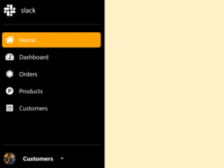
Step 2: Create the HTML Structure
This step involves building the fundamental layout of your admin dashboard using Bootstrap classes. You’ll create the sidebar, navigation bar, and main content area.
<!-- overlay -->
<div id="sidebar-overlay" class="overlay w-100 vh-100 position-fixed d-none"></div>

<!-- sidebar -->
<div class="col-md-3 col-lg-2 px-0 position-fixed h-100 bg-white shadow-sm sidebar" id="sidebar">
  <h1 class="bi bi-bootstrap text-primary d-flex my-4 justify-content-center"></h1>
  <div class="list-group rounded-0">
    <a href="#" class="list-group-item list-group-item-action active border-0 d-flex align-items-center">
      <span class="bi bi-border-all"></span>
      <span class="ml-2">Dashboard</span>
    </a>
    <a href="#" class="list-group-item list-group-item-action border-0 align-items-center">
      <span class="bi bi-box"></span>
      <span class="ml-2">Products</span>
    </a>

    <button class="list-group-item list-group-item-action border-0 d-flex justify-content-between align-items-center" data-toggle="collapse" data-target="#sale-collapse">
      <div>
        <span class="bi bi-cart-dash"></span>
        <span class="ml-2">Sale</span>
      </div>
      <span class="bi bi-chevron-down small"></span>
    </button>
    <div class="collapse" id="sale-collapse" data-parent="#sidebar">
      <div class="list-group">
        <a href="#" class="list-group-item list-group-item-action border-0 pl-5">Customers</a>
        <a href="#" class="list-group-item list-group-item-action border-0 pl-5">Sales</a>
      </div>
    </div>

    <button class="list-group-item list-group-item-action border-0 d-flex justify-content-between align-items-center" data-toggle="collapse" data-target="#purchase-collapse">
      <div>
        <span class="bi bi-cart-plus"></span>
        <span class="ml-2">Purchase</span>
      </div>
      <span class="bi bi-chevron-down small"></span>
    </button>
    <div class="collapse" id="purchase-collapse" data-parent="#sidebar">
      <div class="list-group">
        <a href="#" class="list-group-item list-group-item-action border-0 pl-5">Sellers</a>
        <a href="#" class="list-group-item list-group-item-action border-0 pl-5">Purchases</a>
      </div>
    </div>
  </div>
</div>

<div class="col-md-9 col-lg-10 ml-md-auto px-0 ms-md-auto">
  <!-- top nav -->
  <nav class="w-100 d-flex px-4 py-2 mb-4 shadow-sm">
    <!-- close sidebar -->
    <button class="btn py-0 d-lg-none" id="open-sidebar">
      <span class="bi bi-list text-primary h3"></span>
    </button>
    <div class="dropdown ml-auto">
      <button class="btn py-0 d-flex align-items-center" id="logout-dropdown" data-toggle="dropdown" aria-expanded="false">
        <span class="bi bi-person text-primary h4"></span>
        <span class="bi bi-chevron-down ml-1 mb-2 small"></span>
      </button>
      <div class="dropdown-menu dropdown-menu-right border-0 shadow-sm" aria-labelledby="logout-dropdown">
        <a class="dropdown-item" href="#">Logout</a>
        <a class="dropdown-item" href="#">Settings</a>
      </div>
    </div>
  </nav>

  <!-- main content -->
  <main class="p-4 min-vh-100">
    <section class="row">
      <div class="col-md-6 col-lg-4">
        <!-- card -->
        <article class="p-4 rounded shadow-sm border-left
       mb-4">
          <a href="#" class="d-flex align-items-center">
            <span class="bi bi-box h5"></span>
            <h5 class="ml-2">Products</h5>
          </a>
        </article>
      </div>
      <div class="col-md-6 col-lg-4">
        <article class="p-4 rounded shadow-sm border-left mb-4">
          <a href="#" class="d-flex align-items-center">
            <span class="bi bi-person h5"></span>
            <h5 class="ml-2">Customers</h5>
          </a>
        </article>
      </div>
      <div class="col-md-6 col-lg-4">
        <article class="p-4 rounded shadow-sm border-left mb-4">
          <a href="#" class="d-flex align-items-center">
            <span class="bi bi-person-check h5"></span>
            <h5 class="ml-2">Sellers</h5>
          </a>
        </article>
      </div>
    </section>

    <div class="jumbotron jumbotron-fluid rounded bg-white border-0 shadow-sm border-left px-4">
      <div class="container">
        <h1 class="display-4 mb-2 text-primary">Simple</h1>
        <p class="lead text-muted">Simple Admin Dashboard with Bootstrap.</p>
      </div>
    </div>
  </main>
</div>
Step 3: Add CSS Styles
Here, you’ll add custom CSS to style your dashboard, including responsive adjustments for smaller screens. This enhances the visual appeal and ensures proper functionality across different screen sizes.
@import url('https://fonts.googleapis.com/css2?family=Barlow&display=swap');

body{
  font-family: 'Barlow', sans-serif;
}

a:hover{
  text-decoration: none;
}

.border-left{
  border-left: 2px solid var(--primary) !important;
}


.sidebar{
  top: 0;
  left : 0;
  z-index : 100;
  overflow-y: auto;
}

.overlay{
  background-color: rgb(0 0 0 / 45%);
  z-index: 99;
}

/* sidebar for small screens */
@media screen and (max-width: 767px){

  .sidebar{
    max-width: 18rem;
    transform : translateX(-100%);
    transition : transform 0.4s ease-out;
  }

  .sidebar.active{
    transform : translateX(0);
  }

}
Step 4: Add JavaScript for Sidebar Functionality
This section involves adding JavaScript code to handle the sidebar’s behavior—specifically, its opening and closing on smaller screens.
$(document).ready(()=>{

  $('#open-sidebar').click(()=>{

      // add class active on #sidebar
      $('#sidebar').addClass('active');

      // show sidebar overlay
      $('#sidebar-overlay').removeClass('d-none');

   });


   $('#sidebar-overlay').click(function(){

      // add class active on #sidebar
      $('#sidebar').removeClass('active');

      // show sidebar overlay
      $(this).addClass('d-none');

   });

});
Step 5: Add Footer Assets
Include necessary JavaScript libraries in the footer. This ensures proper loading and functionality of the Bootstrap components and jQuery.
<script src='https://cdnjs.cloudflare.com/ajax/libs/jquery/3.6.0/jquery.min.js'></script>
<script src='https://cdn.jsdelivr.net/npm/popper.js@1.16.1/dist/umd/popper.min.js'></script>
<script src='https://cdn.jsdelivr.net/npm/bootstrap@4.6.0/dist/js/bootstrap.min.js'></script>
That’s it! You’ve successfully created a simple admin dashboard using Bootstrap. Remember to check the browser’s developer tools for any potential issues.