
This code creates a Bootstrap 5 Accordion with Plus Minus icons for a clean toggle effect. It replaces the default arrow with a plus sign when closed and a minus sign when opened. Therefore, it helps users quickly understand the accordion state. In addition, it improves the overall design with smooth transitions. This approach is helpful for building user-friendly and modern web interfaces.
How to Create Bootstrap 5 Accordion With Plus Minus
First of all, load the following assets into the head tag of your HTML document.
<link rel='stylesheet' href='https://cdnjs.cloudflare.com/ajax/libs/bootstrap/5.0.2/css/bootstrap.min.css'>
<link rel='stylesheet' href='https://cdn.jsdelivr.net/npm/bootstrap-icons@1.10.5/font/bootstrap-icons.css'>
Create the HTML structure as follows:
<div class="container">
<div class="accordion" id="accordionExample">
<div class="accordion-item">
<h2 class="accordion-header">
<button class="accordion-button" type="button" data-bs-toggle="collapse" data-bs-target="#collapseOne" aria-expanded="true" aria-controls="collapseOne">
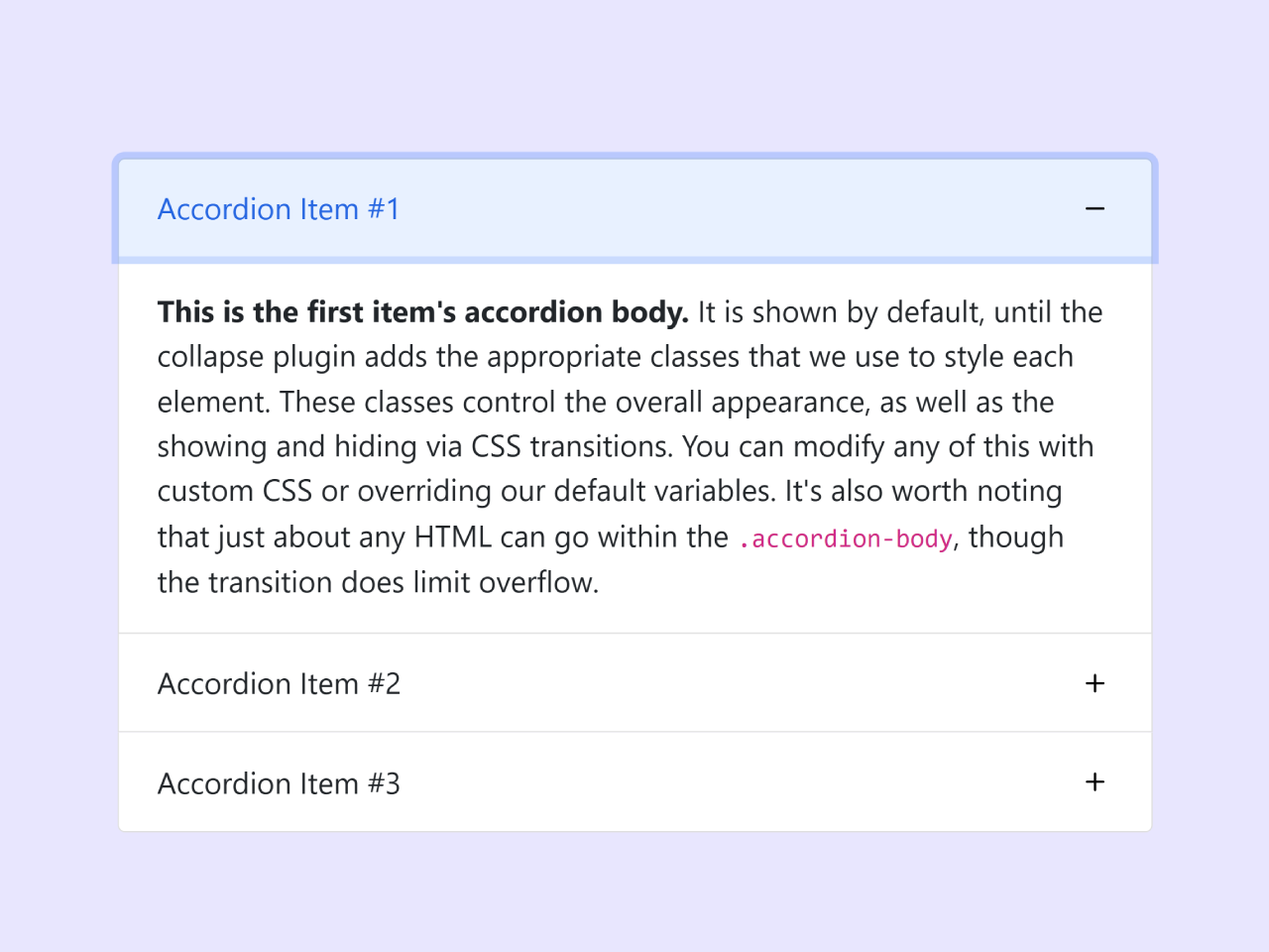
Accordion Item #1
</button>
</h2>
<div id="collapseOne" class="accordion-collapse collapse show" data-bs-parent="#accordionExample">
<div class="accordion-body">
<strong>This is the first item's accordion body.</strong> It is shown by default, until the collapse
plugin adds the appropriate classes that we use to style each element. These classes control the
overall appearance, as well as the showing and hiding via CSS transitions. You can modify any of
this with custom CSS or overriding our default variables. It's also worth noting that just about any
HTML can go within the <code>.accordion-body</code>, though the transition does limit overflow.
</div>
</div>
</div>
<div class="accordion-item">
<h2 class="accordion-header">
<button class="accordion-button collapsed" type="button" data-bs-toggle="collapse" data-bs-target="#collapseTwo" aria-expanded="false" aria-controls="collapseTwo">
Accordion Item #2
</button>
</h2>
<div id="collapseTwo" class="accordion-collapse collapse" data-bs-parent="#accordionExample">
<div class="accordion-body">
<strong>This is the second item's accordion body.</strong> It is hidden by default, until the
collapse plugin adds the appropriate classes that we use to style each element. These classes
control the overall appearance, as well as the showing and hiding via CSS transitions. You can
modify any of this with custom CSS or overriding our default variables. It's also worth noting that
just about any HTML can go within the <code>.accordion-body</code>, though the transition does limit
overflow.
</div>
</div>
</div>
<div class="accordion-item">
<h2 class="accordion-header">
<button class="accordion-button collapsed" type="button" data-bs-toggle="collapse" data-bs-target="#collapseThree" aria-expanded="false" aria-controls="collapseThree">
Accordion Item #3
</button>
</h2>
<div id="collapseThree" class="accordion-collapse collapse" data-bs-parent="#accordionExample">
<div class="accordion-body">
<strong>This is the third item's accordion body.</strong> It is hidden by default, until the
collapse plugin adds the appropriate classes that we use to style each element. These classes
control the overall appearance, as well as the showing and hiding via CSS transitions. You can
modify any of this with custom CSS or overriding our default variables. It's also worth noting that
just about any HTML can go within the <code>.accordion-body</code>, though the transition does limit
overflow.
</div>
</div>
</div>
</div>
</div>
Style using the following CSS styles:
.accordion-button::after {
  background-image: url("data:image/svg+xml,%3Csvg xmlns='http://www.w3.org/2000/svg' width='16' height='16' fill='currentColor' class='bi bi-plus' viewBox='0 0 16 16'%3E%3Cpath d='M8 4a.5.5 0 0 1 .5.5v3h3a.5.5 0 0 1 0 1h-3v3a.5.5 0 0 1-1 0v-3h-3a.5.5 0 0 1 0-1h3v-3A.5.5 0 0 1 8 4z'/%3E%3C/svg%3E") !important;
  transition: all 0.5s;
}
.accordion-button:not(.collapsed)::after {
  background-image: url("data:image/svg+xml,%3Csvg xmlns='http://www.w3.org/2000/svg' width='16' height='16' fill='currentColor' class='bi bi-dash' viewBox='0 0 16 16'%3E%3Cpath d='M4 8a.5.5 0 0 1 .5-.5h7a.5.5 0 0 1 0 1h-7A.5.5 0 0 1 4 8z'/%3E%3C/svg%3E") !important;
}
.accordion-button::after {
  transition: all 0.5s;
}
Load the following scripts before closing the body tag:
<script src='https://cdnjs.cloudflare.com/ajax/libs/bootstrap/5.3.0/js/bootstrap.min.js'></script>
That’s all! hopefully, you have successfully created accordion with plus minus icons. If you have any questions or suggestions, feel free to comment below.