
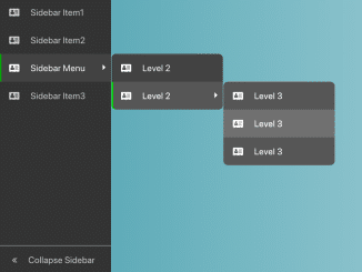
This tutorial will guide you through the process of creating a Bootstrap Collapsible Sidebar With Icons. A collapsible sidebar enhances user experience by providing more screen real estate when the sidebar is not needed. We’ll use Bootstrap for styling, Font Awesome for icons, and jQuery for the interactive functionality.
Step 1: Include Header Assets
Add the necessary CSS stylesheets to your HTML document’s section. These include Bootstrap for the basic layout and styling, and Font Awesome for the icons.
<link rel='stylesheet' href='https://cdnjs.cloudflare.com/ajax/libs/twitter-bootstrap/4.1.2/css/bootstrap.min.css'>
<link rel='stylesheet' href='https://cdnjs.cloudflare.com/ajax/libs/font-awesome/4.7.0/css/font-awesome.min.css'>
Step 2: Create the HTML Structure
The core of our sidebar lies in the HTML structure. The following code sets up the basic layout with a wrapper, sidebar, and main content area.
<div class="wrapper">
  <div class="sidebar">
    <div class="sb-item-list">
      <div class="sb-item"><i class="sb-icon fa fa-address-card"></i><span class="sb-text">Sidebar Item1</span></div>
      <div class="sb-item"><i class="sb-icon fa fa-address-card"></i><span class="sb-text">Sidebar Item2</span></div>
      <div class="sb-item sb-menu"><i class="sb-icon fa fa-address-card"></i><span class="sb-text">Sidebar Menu</span>
        <div class="sb-submenu">
          <div class="sb-item"><i class="sb-icon fa fa-address-card"></i><span class="sb-text">Level 2</span></div>
          <div class="sb-item sb-menu"><i class="sb-icon fa fa-address-card"></i><span class="sb-text">Level 2</span>
            <div class="sb-submenu">
              <div class="sb-item"><i class="sb-icon fa fa-address-card"></i><span class="sb-text">Level 3</span></div>
              <div class="sb-item"><i class="sb-icon fa fa-address-card"></i><span class="sb-text">Level 3</span></div>
              <div class="sb-item"><i class="sb-icon fa fa-address-card"></i><span class="sb-text">Level 3</span></div>
            </div>
          </div>
        </div>
      </div>
      <div class="sb-item"><i class="sb-icon fa fa-address-card"></i><span class="sb-text">Sidebar Item3</span></div>
      <div class="btn-toggle-sidebar sb-item"><i class="sb-icon fa fa-angle-double-left"></i><span class="sb-text">Collapse Sidebar</span><i class="sb-icon fa fa-angle-double-right"></i></div>
    </div>
  </div>
  <div class="main"></div>
</div>
Step 3: Apply CSS Styling
Now, let’s style the sidebar to make it visually appealing and functional. The CSS styles the sidebar, its items, submenus, and the collapse/expand button. It also includes styles for when the sidebar is collapsed.
.wrapper {
  width: 100%;
  padding-left: 200px;
  transition-duration: 0.5s;
}
.wrapper .sidebar {
  width: 200px;
  height: calc(100vh);
  position: absolute;
  left: 0px;
  background: #333;
  white-space: nowrap;
  transition-duration: 0.5s;
  z-index: 1000;
}
.wrapper .sidebar .sb-item-list {
  width: 100%;
  height: calc(100% - 50px);
}
.wrapper .sidebar .sb-item-list > .sb-item > .sb-text {
  position: absolute;
  transition-duration: 0.5s;
}
.wrapper .sidebar .sb-item {
  display: block;
  width: 100%;
  line-height: 50px;
  color: #ccc;
  background: #333;
  cursor: pointer;
  padding-left: 7px;
}
.wrapper .sidebar .sb-item.active {
  border-left: solid 3px green;
  box-sizing: border-box;
}
.wrapper .sidebar .sb-item.active > .sb-icon {
  margin-left: -3px;
}
.wrapper .sidebar .sb-icon {
  padding-left: 10px;
  padding-right: 20px;
}
.wrapper .sidebar .sb-item:hover,
.wrapper .sidebar .sb-item.active {
  filter: brightness(130%);
}

.wrapper .sb-menu {
  position: relative;
}
.wrapper .sb-menu:after {
  content: " ";
  width: 0;
  height: 0;
  display: block;
  float: right;
  margin-top: 19px;
  margin-left: -12px;
  margin-right: 5px;
  border: solid 5px transparent;
  border-left-color: #eee;
}
.wrapper .sb-menu > .sb-submenu {
  display: none;
}
.wrapper .sb-menu:hover > .sb-submenu {
  position: absolute;
  display: block;
  width: 200px;
  top: 0;
  left: calc(100% + 1px);
}

.wrapper .sb-submenu > .sb-item:first-child {
  border-radius: 8px 8px 0px 0px;
}

.wrapper .sb-submenu > .sb-item:last-child {
  border-radius: 0px 0px 8px 8px;
}

.wrapper .btn-toggle-sidebar {
  position: absolute;
  left: 0;
  bottom: 0;
  border-top: 1px solid #aaa;
  user-select: none;
}
.wrapper .btn-toggle-sidebar .sb-icon {
  padding-left: 15px;
}
.wrapper .btn-toggle-sidebar .sb-icon.fa-angle-double-left {
  display: inline-block;
}
.wrapper .btn-toggle-sidebar .sb-icon.fa-angle-double-right {
  display: none;
}

.wrapper.sidebar-collapse {
  padding-left: 60px;
}
.wrapper.sidebar-collapse .sidebar {
  width: 60px;
}
.wrapper.sidebar-collapse .sb-item-list > .sb-item > .sb-text {
  position: absolute;
  transform: translateX(-200%);
  opacity: 0;
}

.wrapper.sidebar-collapse .btn-toggle-sidebar .sb-icon.fa-angle-double-left {
  display: none;
}
.wrapper.sidebar-collapse .btn-toggle-sidebar .sb-icon.fa-angle-double-right {
  display: inline-block;
}
Step 4: Implement JavaScript Functionality
To make the sidebar collapsible and interactive, we use jQuery. The provided JavaScript code handles toggling the sidebar’s collapsed state and marking sidebar items as active when clicked.
$(function(){
    // toggle sidebar collapse
    $('.btn-toggle-sidebar').on('click', function(){
        $('.wrapper').toggleClass('sidebar-collapse');
    });
    // mark sidebar item as active when clicked
    $('.sb-item').on('click', function(){
        if ($(this).hasClass('btn-toggle-sidebar')) {
          return; // already actived
        }
        $(this).siblings().removeClass('active');
        $(this).siblings().find('.sb-item').removeClass('active');
        $(this).addClass('active');
    })
});
Step 5: Include Footer Assets
Include the jQuery in the footer section to handle sidebar collapse.
That concludes our tutorial on creating a Bootstrap Collapsible Sidebar With Icons. By following these steps, you should now have a functional and visually appealing collapsible sidebar in your web application.