
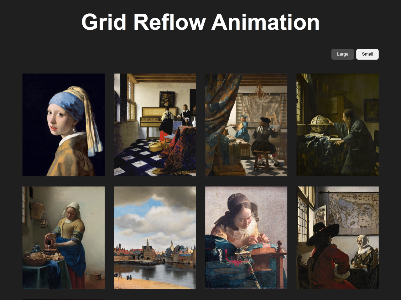
This tutorial will guide you through the process of implementing a CSS Animate Grid Position Change effect. This technique allows you to smoothly transition the layout of a grid container when the size or arrangement of its items changes, enhancing user experience by providing visually appealing and understandable layout updates.
Add Header Assets
Include the Modern Normalize CSS to ensure consistent styling across different browsers.
<link rel='stylesheet' href='https://cdnjs.cloudflare.com/ajax/libs/modern-normalize/3.0.1/modern-normalize.min.css'>
Creating the HTML Structure
Here’s how to structure the HTML for your grid layout and size control buttons.
<main>
  <h1 class="heading__text">Grid Reflow Animation</h1>
  <div class="container">
    <div class="img__size">
      <button class="img-large is-active">Large</button>
      <button class="img-small">Small</button>
    </div>
    <div class="img__list">
      <div class="img__item"><img class="img__src" src="https://assets.codepen.io/204808/Meisje_met_de_parel.jpg" alt="" /></div>
      <div class="img__item"><img class="img__src" src="https://assets.codepen.io/204808/Johannes_Vermeer_-_Lady_at_the_Virginal_with_a_Gentleman%2C_-The_Music_Lesson-_-_Google_Art_Project.jpg" alt="" /></div>
      <div class="img__item"><img class="img__src" src="https://assets.codepen.io/204808/Jan_Vermeer_-_The_Art_of_Painting_-_Google_Art_Project.jpg" alt="" /></div>
      <div class="img__item"><img class="img__src" src="https://assets.codepen.io/204808/Johannes_Vermeer_-_The_Astronomer_-_1668.jpg" alt="" /></div>
      <div class="img__item"><img class="img__src" src="https://assets.codepen.io/204808/Johannes_Vermeer_-_Het_melkmeisje_-_Google_Art_Project.png" alt="" /></div>
      <div class="img__item"><img class="img__src" src="https://assets.codepen.io/204808/960px-Vermeer-view-of-delft.jpg" alt="" /></div>
      <div class="img__item"><img class="img__src" src="https://assets.codepen.io/204808/Johannes_Vermeer_-_The_lacemaker_%28c.1669-1671%29.jpg" alt="" /></div>
      <div class="img__item"><img class="img__src" src="https://assets.codepen.io/204808/Johannes_Vermeer_-_De_Soldaat_en_het_Lachende_Meisje_-_Google_Art_Project.jpg" alt="" /></div>
      <div class="img__item"><img class="img__src" src="https://assets.codepen.io/204808/Vermeer_Lady_Maidservant_Holding_Letter.jpg" alt="" /></div>
    </div>
  </div>
</main>
    <script src='https://unpkg.com/gsap@3/dist/gsap.min.js'></script>
<script src='https://unpkg.com/gsap@3/dist/Flip.min.js'></script><script  src="./script.js"></script>
Styling with CSS
Apply the following CSS rules to create the grid layout and style the size control buttons. This will style the grid and add the base styles for the animation.
:root {
  --color-black: hsla(0, 0%, 12%, 100%);
  --color-white: hsla(0, 0%, 100%, 100%);
  --color-white-20: hsla(0, 0%, 100%, 20%);
  --color-white-50: hsla(0, 0%, 50%, 100%);
  --color-purple: hsla(278, 100%, 75%, 100%);
}

body {
  background-color: var(--color-black);
  color: var(--color-white);
  font-family: "Open Sans", sans-serif;
  font-optical-sizing: auto;
}

main {
  align-items: center;
  display: flex;
  flex-direction: column;
  justify-content: center;
}

.heading__text {
  font-size: 5vw;
  font-weight: 700;
  margin: 6.25rem 0 0;
  text-align: center;
  white-space: nowrap;
}

.container {
  width: 80vw;
}

.img__size {
  display: flex;
  gap: 0.5rem;
  justify-content: flex-end;
  margin: 3.125rem 0;
}
.img__size button {
  border: none;
  border-radius: 0.5rem;
  padding: 0.625rem 1.25rem;
  transition: all 0.3s ease-in-out;
}
.img__size button.is-active {
  background-color: var(--color-white-20);
  color: var(--color-white);
}

.img__list {
  display: grid;
  grid-template-columns: repeat(auto-fill, minmax(300px, 1fr));
  gap: 2rem;
}
.img__list.img--large {
  grid-template-columns: repeat(auto-fill, minmax(300px, 1fr));
}
.img__list.img--small {
  grid-template-columns: repeat(auto-fill, minmax(200px, 1fr));
}

.img__src {
  aspect-ratio: 4/5;
  -o-object-fit: cover;
     object-fit: cover;
  width: 100%;
}
Implementing the Animation with JavaScript
Use the following JavaScript code, incorporating GSAP’s Flip plugin, to animate the grid position change when the size buttons are clicked.
const imgLarge = document.querySelector(".img-large");
const imgSmall = document.querySelector(".img-small");
const imgList = document.querySelector(".img__list");

function animateGridChange(toSmall) {
  // 1. Capture the initial positions
  const state = Flip.getState(".img__item");

  // 2. Toggle class (this changes the grid layout)
  if (toSmall) {
    imgList.classList.add("img--small");
    imgList.classList.remove("img--large");
    imgSmall.classList.add("is-active");
    imgLarge.classList.remove("is-active");
  } else {
    imgList.classList.add("img--large");
    imgList.classList.remove("img--small");
    imgLarge.classList.add("is-active");
    imgSmall.classList.remove("is-active");
  }

  // 3. Animate between states
  Flip.from(state, {
    duration: 0.8,
    ease: "power3.inOut",
    absolute: true,
    // 👇 stagger changes direction depending on layout mode
    stagger: (index, target, list) => {
      return toSmall
        ? index * 0.04 // shrinking → start from FIRST item
        : (list.length - index) * 0.04; // expanding → start from LAST item
    }
  });
}

imgLarge.addEventListener("click", () => animateGridChange(false));
imgSmall.addEventListener("click", () => animateGridChange(true));
Final Touches
Include any necessary scripts for the animation and interactivity.
By following these steps, you’ve successfully implemented a CSS Animate Grid Position Change. This technique can be applied to various scenarios, such as responsive layouts, dynamic content loading, or interactive dashboards.