
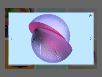
Here’s a tutorial focused on creating a Modal Carousel Slider Using Bootstrap 5. Follow these steps to implement this interactive feature on your website.
Step 1: Include Header Assets
Add the necessary Bootstrap 5 CSS, Font Awesome, and other required CSS libraries to your document’s. These resources provide the styling and icons needed for the carousel and modal.
Step 2: Create the HTML Structure
This involves creating the basic HTML structure for the image gallery, including the modal for displaying the carousel. The modal should contain the close, previous, and next buttons for navigation.
<link href="https://cdn.jsdelivr.net/npm/bootstrap@5.0.2/dist/css/bootstrap.min.css" rel="stylesheet" integrity="sha384-EVSTQN3/azprG1Anm3QDgpJLIm9Nao0Yz1ztcQTwFspd3yD65VohhpuuCOmLASjC" crossorigin="anonymous">

<link rel="stylesheet" href="https://pro.fontawesome.com/releases/v5.10.0/css/all.css" integrity="sha384-AYmEC3Yw5cVb3ZcuHtOA93w35dYTsvhLPVnYs9eStHfGJvOvKxVfELGroGkvsg+p" crossorigin="anonymous" />

<link rel="stylesheet" href="https://cdnjs.cloudflare.com/ajax/libs/font-awesome/5.13.0/css/all.min.css" integrity="sha512-L7MWcK7FNPcwNqnLdZq86lTHYLdQqZaz5YcAgE+5cnGmlw8JT03QB2+oxL100UeB6RlzZLUxCGSS4/++mNZdxw==" crossorigin="anonymous" referrerpolicy="no-referrer" />

<section class="slider my-5">
  <div class="container">
    <div class="row gy-4">
      <div class="col-md-4">
        <div class="item position-relative">
          <div class="img-item">
            <img src="https://i1.sndcdn.com/artworks-YxGUGES6DrzzCUGx-Gx32ZQ-t240x240.jpg" alt="item photo" class="w-100">
          </div>
          <div class="content-item text-center p-2 bg-white position-absolute">
            <h4>item title</h4>
            <p>Lorem ipsum, dolor sit amet consectetur adipisicing.</p>
          </div>
        </div>
      </div>
      <div class="col-md-4">
        <div class="item position-relative">
          <div class="img-item">
            <img src="https://upload-assets.vice.com/files/2016/03/26/1459014592Basketball.png" alt="item photo" class="w-100">
          </div>
          <div class="content-item text-center p-2 bg-white position-absolute">
            <h4>item title</h4>
            <p>Lorem ipsum, dolor sit amet consectetur adipisicing.</p>
          </div>
        </div>
      </div>
      <div class="col-md-4">
        <div class="item position-relative">
          <div class="img-item">
            <img src="https://f4.bcbits.com/img/a2933723780_10.jpg" alt="item photo" class="w-100">
          </div>
          <div class="content-item text-center p-2 bg-white position-absolute">
            <h4>item title</h4>
            <p>Lorem ipsum, dolor sit amet consectetur adipisicing.</p>
          </div>
        </div>
      </div>
      <div class="col-md-4 ">
        <div class="item position-relative">
          <div class="img-item">
            <img src="https://inspgr.id/app/uploads/2016/03/3d-grand-chamaco-08.jpg" alt="item photo" class="w-100">
          </div>
          <div class="content-item text-center p-2 bg-white position-absolute">
            <h4>item title</h4>
            <p>Lorem ipsum, dolor sit amet consectetur adipisicing.</p>
          </div>
        </div>
      </div>
      <div class="col-md-4 ">
        <div class="item position-relative">
          <div class="img-item">
            <img src="https://images.squarespace-cdn.com/content/v1/53b208ace4b0dc3e7be6ec30/1515709148266-LIUT0GA35774NMFJG036/ke17ZwdGBToddI8pDm48kBtpJ0h6oTA_T7DonTC8zFdZw-zPPgdn4jUwVcJE1ZvWQUxwkmyExglNqGp0IvTJZamWLI2zvYWH8K3-s_4yszcp2ryTI0HqTOaaUohrI8PIWkiAYz5ghgEgSGJuDQ4e1ZKXpRdhEMT7SgthRpD0vyIKMshLAGzx4R3EDFOm1kBS/H20Bounce.jpg" alt="item photo" class="w-100">
          </div>
          <div class="content-item text-center p-2 bg-white position-absolute">
            <h4>item title</h4>
            <p>Lorem ipsum, dolor sit amet consectetur adipisicing.</p>
          </div>
        </div>
      </div>
      <div class="col-md-4 ">
        <div class="item position-relative">
          <div class="img-item">
            <img src="https://www.webdesignertrends.com/wp-content/uploads/2015/01/el-grand-chamacon-24.jpg" alt="item photo" class="w-100">
          </div>
          <div class="content-item text-center p-2 bg-white position-absolute">
            <h4>item title</h4>
            <p>Lorem ipsum, dolor sit amet consectetur adipisicing.</p>
          </div>
        </div>
      </div>
    </div>
  </div>
  <div class="modal-layer position-fixed justify-content-center align-items-center">
    <div class="slide-img w-75 h-75 d-flex align-items-center justify-content-between px-4 position-relative">
      <i id="closeBtn" class="far fa-times-circle fa-2x position-absolute end-0 top-0 m-4"></i>
      <i id="prev" class="fas fa-chevron-left fa-2x"></i>
      <i id="next" class="fas fa-chevron-right fa-2x"></i>
    </div>
  </div>
</section>

<script src="https://cdn.jsdelivr.net/npm/bootstrap@5.0.2/dist/js/bootstrap.bundle.min.js" integrity="sha384-MrcW6ZMFYlzcLA8Nl+NtUVF0sA7MsXsP1UyJoMp4YLEuNSfAP+JcXn/tWtIaxVXM" crossorigin="anonymous"></script>
Step 3: Apply Custom CSS Styling
Customize the appearance of your modal carousel slider with custom CSS. This includes styling the modal overlay, image display area, and navigation buttons to match your website’s design.
section .content-item {
  width: 80%;
  left: 10%;
  bottom: 10%;
}
section .modal-layer {
  inset: 0;
  background: rgba(0, 0, 0, 0.6);
  display: none;
}
section .modal-layer .slide-img {
  background-image: url(https://i1.sndcdn.com/artworks-YxGUGES6DrzzCUGx-Gx32ZQ-t240x240.jpg);
  background-size: cover;
  background-position: 50% 50%;
  background-repeat: no-repeat;
}
Step 4: Implement JavaScript Functionality
Write the JavaScript code to handle the modal’s display, image switching, and keyboard navigation. This code should listen for clicks on the images to open the modal, as well as clicks on the navigation buttons to cycle through the images.
// variables
// items & images
let itemsImgs = document.querySelectorAll(".img-item img");
itemsImgsArr = Array.from(itemsImgs);

// pop slider
let popSlider = document.querySelector("section .modal-layer");
let bgSlide = document.querySelector(".modal-layer .slide-img");

// icons/buttons
// close
let closeBtn = document.querySelector("#closeBtn");
closeBtn.style.cssText = `cursor : pointer;`;
// left
let prevBtn = document.querySelector("#prev");
prevBtn.style.cssText = `cursor : pointer;`;
// right
let nextBtn = document.querySelector("#next");
nextBtn.style.cssText = `cursor : pointer;`;

// index of item
let activeIndex;

for (let i = 0; i < itemsImgs.length; i++) {
  itemsImgs[i].addEventListener("click", function (e) {
    popSlider.style.display = "flex";
    let activeSrc = e.target.src;
    bgSlide.style.backgroundImage = `url(${activeSrc})`;
    activeIndex = itemsImgsArr.indexOf(e.target);
  });
}

closeBtn.addEventListener("click", removeSlider);

function removeSlider() {
  popSlider.style.display = "none";
}

nextBtn.addEventListener("click", nextSlider);

function nextSlider() {
  activeIndex++;
  if (activeIndex == itemsImgs.length) {
    activeIndex = 0;
  }
  let imgSrc = itemsImgsArr[activeIndex].src;
  bgSlide.style.backgroundImage = `url(${imgSrc})`;
}

prevBtn.addEventListener("click", prevSlider);

function prevSlider() {
  activeIndex--;
  if (activeIndex < 0) {
    activeIndex = itemsImgs.length - 1;
  }
  let imgSrc = itemsImgsArr[activeIndex].src;
  bgSlide.style.backgroundImage = `url(${imgSrc})`;
}

// keyboard events
document.addEventListener("keydown", function (e) {
  if (e.key == "Escape") {
    removeSlider();
  } else if (e.key == "ArrowRight") {
    nextSlider();
  } else if (e.key == "ArrowLeft") {
    prevSlider();
  }
});
By following these steps, you have successfully integrated a modal carousel slider into your website using Bootstrap 5, enhancing user experience and visual appeal.