
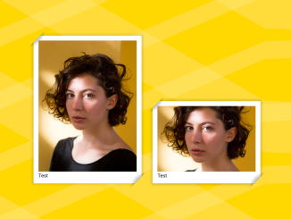
Let’s explore how to create an eye-catching image frame in HTML and CSS. This tutorial will guide you through the process of adding stylish borders and decorative elements to your images using HTML’s structural capabilities and CSS’s styling power. Let’s begin!
HTML Structure
First, you’ll need to set up the basic HTML structure for your image and its frame. We’ll use the and elements to encapsulate the image and provide a caption.
<figure>
  <img src="https://assets.codepen.io/1506195/portrait-woman-unsplash.jpg" />
  <figcaption>Test</figcaption>
</figure>

<figure>
  <img src="https://assets.codepen.io/1506195/portrait-woman-unsplash.jpg" />
  <figcaption>Test</figcaption>
</figure>

<figure>
  <img src="https://assets.codepen.io/1506195/portrait-woman-unsplash.jpg" />
  <figcaption>Test</figcaption>
</figure>
CSS Styling
Now, let’s add some CSS to create the fancy frame around the image. This involves using gradients, `clip-path` for a unique shape, and other properties.
figure {
  --c: 50px;
  --p: 30px;
  --d: 10px;
  background: red;
  display: inline-block;
  padding: var(--p);
  background:
    radial-gradient(farthest-side at 0 0, #000, #0000) 0 0 / var(--c) var(--c),
    radial-gradient(farthest-side at 100% 100%, #000, #0000) 100% 100% / var(--c) var(--c),
    linear-gradient(#fff 0 0) 50% 50% / calc(100% - var(--p)) calc(100% - var(--p)),
    linear-gradient(#0000, #000 25% 75%, #0000) 50% 50% / calc(100% - var(--p)) calc(100% - var(--d)),
    linear-gradient(90deg, #0000, #000 25% 75%, #0000) 50% 50% / calc(100% - var(--d)) calc(100% - var(--p)),
    radial-gradient(farthest-side at 0 100%, #00000018, #0000) calc(100% - var(--d) * 0.5) calc(var(--d) * 0.5) / var(--d) var(--d),
    radial-gradient(farthest-side at 100% 0, #00000018, #0000) calc(var(--d) * 0.5) calc(100% - var(--d) * 0.5) / var(--d) var(--d)
    ;
  background-repeat: no-repeat;
  clip-path: polygon(0 var(--c), var(--c) 0, 100% 0, 100% calc(100% - var(--c)), calc(100% - var(--c)) 100%, 0 100%);
}

/* demo */
figure:nth-of-type(1) img {
  width: 300px;
}

figure:nth-of-type(2) img {
  width: 300px;
  height: 200px;
}

figure:nth-of-type(3) img {
  width: 300px;
  aspect-ratio: 1;
}

body {
  background:
    repeating-linear-gradient(30deg, #fff2 0 10%, #fff0 0 24%),
    repeating-linear-gradient(-23deg, #fff2 0 4%, #fff0 0 14%)
    gold;
}

img {
  object-fit: cover;
}
That’s it! You’ve successfully crafted an image frame in HTML and CSS. You can further customize this code by changing colours and other properties.


