
Here’s a comprehensive guide on how to Toggle Content Visibility Using Pure CSS. This method leverages CSS selectors and the `checkbox` input type to achieve a show/hide functionality without relying on JavaScript. Let’s dive in and create this interactive component!
Setting up the HTML Structure
This step involves crafting the HTML structure that will house your content and the interactive toggle. We’ll use a checkbox to control the visibility of additional content.
<div class="container">
<!-- hidden action-->
<input id="more" type="checkbox"/>
<!-- visible content-->
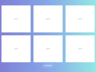
<div class="cards">
<div class="card">
<div>card #1</div>
</div>
<div class="card">
<div>card #2</div>
</div>
<div class="card">
<div>card #3</div>
</div>
<div class="card">
<div>card #4</div>
</div>
<div class="card">
<div>card #5</div>
</div>
<div class="card">
<div>card #6</div>
</div>
</div>
<!-- visible action-->
<div class="show-more-cards">
<label for="more">show more</label>
</div>
<!-- hidden content-->
<div class="cards more">
<div class="card">
<div>card #1</div>
</div>
<div class="card">
<div>card #2</div>
</div>
<div class="card">
<div>card #3</div>
</div>
<div class="card">
<div>card #4</div>
</div>
<div class="card">
<div>card #5</div>
</div>
<div class="card">
<div>card #6</div>
</div>
<div class="card">
<div>card #7</div>
</div>
<div class="card">
<div>card #8</div>
</div>
<div class="card">
<div>card #9</div>
</div>
<div class="card">
<div>card #10</div>
</div>
<div class="card">
<div>card #11</div>
</div>
<div class="card">
<div>card #12</div>
</div>
<div class="card">
<div>card #13</div>
</div>
<div class="card">
<div>card #14</div>
</div>
<div class="card">
<div>card #15</div>
</div>
<div class="card">
<div>card #16</div>
</div>
<div class="card">
<div>card #17</div>
</div>
<div class="card">
<div>card #18</div>
</div>
<div class="card">
<div>card #19</div>
</div>
<div class="card">
<div>card #20</div>
</div>
<div class="card">
<div>card #21</div>
</div>
<div class="card">
<div>card #22</div>
</div>
<div class="card">
<div>card #23</div>
</div>
<div class="card">
<div>card #24</div>
</div>
</div>
</div>
Styling with CSS
Next, we need to define the CSS styles to manage the layout, appearance, and toggle behavior. This includes hiding the extra content by default and revealing it when the checkbox is checked.
html,
body {
	scrollbar-gutter: stable;
}

.container {
	#more {
		display: none;
	}

	.more {
		.card {
			animation: view-cards both linear;
			animation-timeline: view(y 90dvh auto);
		}
	}

	&:not(:has(input[type="checkbox"]:checked)) {
		.more {
			display: none;
		}
	}
}

@keyframes view-cards {
	from {
		opacity: 0;
	}

	to {
		opacity: 1;
	}
}

/*
 *
 * demo
 *
*/
body {
	--stop-color-1: #1e1f26;
	--stop-color-2: #2c303a;

	margin: 0;
	font-family: sans-serif;
	background-color: var(--stop-color-1);
	background-image: radial-gradient(var(--stop-color-2) 15%, transparent 16%),
		repeating-linear-gradient(
			0deg,
			transparent 6.5%,
			var(--stop-color-1) 7%,
			var(--stop-color-1) 9%,
			transparent 10%
		),
		linear-gradient(
			45deg,
			transparent 49%,
			var(--stop-color-2) 49%,
			var(--stop-color-2) 51%,
			transparent 51%
		),
		linear-gradient(
			135deg,
			transparent 49%,
			var(--stop-color-2) 49%,
			var(--stop-color-2) 51%,
			transparent 51%
		);
	background-size: 1rem 1rem;
	background-attachment: fixed;
}

.container {
	max-width: 80vw;
	margin-block: 10vh;
	margin-inline: auto;

	.cards {
		display: grid;
		grid-template-columns: repeat(3, 1fr);
		gap: 2rem;

		.card {
			min-height: 25dvh;
			display: grid;
			place-content: center;
			background-color: var(--stop-color-2);
			color: #fff;
			transition: scale 200ms;

			/* 			img {
				display: block;
				object-fit: cover;
			} */

			&:hover {
				scale: 1.1;
				z-index: 1;
			}
		}
	}

	.show-more-cards {
		margin-block: 1rem;
		text-align: center;

		& label {
			display: inline-flex;
			padding: 0.75rem 1.2rem;
			cursor: pointer;
			text-transform: uppercase;
			font-weight: bold;
			background-color: #ffffff1a;
			color: #fff;
			border: 2px solid #ffffff66;
			border-radius: 0.35rem;
			transition: scale 200ms;

			&:hover {
				scale: 1.4;
			}
		}
	}
}
Enhancements and Considerations
Remember to add any external resources you may require, such as CDN links for fonts or other styling libraries. You can further customize the styling and animations to fit your specific design needs. For accessibility, ensure proper ARIA attributes are used where applicable.
That completes our tutorial on how to toggle content visibility using pure CSS. You’ve learned to use CSS and a checkbox to create an interactive show/hide component, enhancing user experience without the need for JavaScript.