
This tutorial will guide you through creating an OTP (One-Time Password) input field using Bootstrap 5. We’ll build a user-friendly interface that enhances the user experience and ensures secure password entry.
Step 1: Include Bootstrap CSS
First, you need to include the Bootstrap CSS framework. This provides the styling for our OTP input field. Add the following code within the <head> section of your HTML document:
<link rel='stylesheet' href='https://cdnjs.cloudflare.com/ajax/libs/bootstrap/5.0.2/css/bootstrap.min.css'>
Step 2: Create the HTML Structure
Next, let’s create the HTML structure for our OTP input field. This includes the container, card, and individual input fields for each digit of the OTP.
<div class="container height-100 d-flex justify-content-center align-items-center">
<div class="position-relative">
<div class="card p-2 text-center">
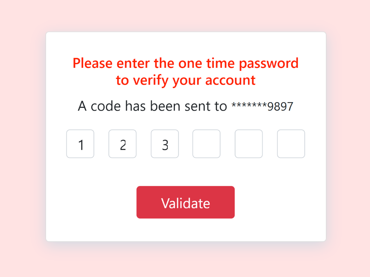
<h6>Please enter the one time password <br> to verify your account</h6>
<div> <span>A code has been sent to</span> <small id="maskedNumber">*******9897</small> </div>
<div id="otp" class="inputs d-flex flex-row justify-content-center mt-2">
<input class="m-2 text-center form-control rounded" type="text" id="first" maxlength="1" />
<input class="m-2 text-center form-control rounded" type="text" id="second" maxlength="1" />
<input class="m-2 text-center form-control rounded" type="text" id="third" maxlength="1" />
<input class="m-2 text-center form-control rounded" type="text" id="fourth" maxlength="1" />
<input class="m-2 text-center form-control rounded" type="text" id="fifth" maxlength="1" />
<input class="m-2 text-center form-control rounded" type="text" id="sixth" maxlength="1" />
</div>
<div class="mt-4">
<button id="validateBtn" class="btn btn-danger px-4 validate">Validate</button>
</div>
</div>
</div>
</div>
Step 3: Add CSS Styling
Now, let’s add some custom CSS styles to enhance the appearance of our OTP input field. This will make it visually appealing and consistent with the Bootstrap theme.
.height-100 {
    height: 100vh
}

.card {
    width: 400px;
    border: none;
    height: 300px;
    box-shadow: 0px 5px 20px 0px #d2dae3;
    z-index: 1;
    display: flex;
    justify-content: center;
    align-items: center
}

.card h6 {
    color: red;
    font-size: 20px
}

.inputs input {
    width: 40px;
    height: 40px
}

input[type=number]::-webkit-inner-spin-button,
input[type=number]::-webkit-outer-spin-button {
    -webkit-appearance: none;
    -moz-appearance: none;
    appearance: none;
    margin: 0
}

.card-2 {
    background-color: #fff;
    padding: 10px;
    width: 350px;
    height: 100px;
    bottom: -50px;
    left: 20px;
    position: absolute;
    border-radius: 5px
}

.card-2 .content {
    margin-top: 50px
}

.card-2 .content a {
    color: red
}

.form-control:focus {
    box-shadow: none;
    border: 2px solid red
}

.validate {
    border-radius: 20px;
    padding: 16px;
    background-color: red;
    border: 1px solid red;
    width: 140px
}
Step 4: Add JavaScript Functionality
Finally, we’ll add some JavaScript code to handle user input and validation. This will ensure that only one digit can be entered in each field and that the entered OTP can be easily retrieved.
document.addEventListener("DOMContentLoaded", function() {
    function OTPInput() {
        const inputs = document.querySelectorAll('#otp > input');
        for (let i = 0; i < inputs.length; i++) {
            inputs[i].addEventListener('input', function() {
                if (this.value.length > 1) {
                    this.value = this.value[0]; //
                }
                if (this.value !== '' && i < inputs.length - 1) {
                    inputs[i + 1].focus(); //
                }
            });

            inputs[i].addEventListener('keydown', function(event) {
                if (event.key === 'Backspace') {
                    this.value = '';
                    if (i > 0) {
                        inputs[i - 1].focus();
                    }
                }
            });
        }
    }

    OTPInput();

    const validateBtn = document.getElementById('validateBtn');
    validateBtn.addEventListener('click', function() {
        let otp = '';
        document.querySelectorAll('#otp > input').forEach(input => otp += input.value);
        alert(`Entered OTP: ${otp}`);
    });
});
Step 5: Include Bootstrap JS (Optional)
While not strictly required for this specific example, including Bootstrap’s JavaScript file can provide additional functionality and ensure better compatibility. Add this code before the closing </body> tag:
<script src='https://cdnjs.cloudflare.com/ajax/libs/bootstrap/5.1.0/js/bootstrap.min.js'></script>
Congratulations! You’ve successfully created an OTP input field using Bootstrap 5.