
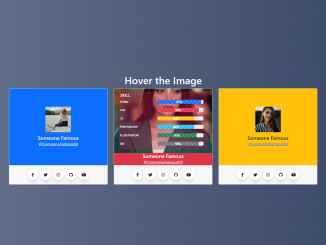
Creating a visually appealing and informative team card is essential for showcasing your team members on your website. This tutorial will guide you through creating a Bootstrap 5 Team Card Template with engaging hover effects, skill bars, and social media links.
Step 1: Include Header Assets
First, you need to include the necessary CSS stylesheets in the section of your HTML document. This includes Bootstrap 5 for styling and Font Awesome for icons.
<link rel='stylesheet' href='https://cdnjs.cloudflare.com/ajax/libs/bootstrap/5.0.2/css/bootstrap.min.css'>
<link rel='stylesheet' href='https://cdnjs.cloudflare.com/ajax/libs/font-awesome/6.2.0/css/all.min.css'>
Step 2: Create the HTML Structure
Next, create the basic HTML structure for the team card template using Bootstrap’s grid system. This structure includes a container, rows, and columns to arrange the team cards. Each card includes a card body for the content and a card footer for social media links.
<div class="container mt-3">
  <div class="row">
    <h1 class="text-white text-center">Hover the Image</h1>
  </div>
  <div class="row">
    <div class="col-lg-4 col-md-6 col-sm-6">
      <div class="card mb-2">
        <div class="card-body bg-primary p-0">
          <div class="box-satu d-flex flex-column justify-content-center align-items-center">
            <div class="avatar position-relative d-flex flex-column justify-content-center align-items-center">
              <div class="teks">
                <h6 class="mt-1">SKILL</h6>
                <div class="row">
                  <div class="col-5">
                    <p>HTML</p>
                  </div>
                  <div class="col-7">
                    <div class="progress">
                      <div class="progress-bar progress-bar-striped progress-bar-animated bg-primary" role="progressbar" aria-label="Default striped example" style="width: 95%" aria-valuenow="95" aria-valuemin="0" aria-valuemax="100"> 95%</div>
                    </div>
                  </div>
                </div>
                <div class="row">
                  <div class="col-5">
                    <p>CSS</p>
                  </div>
                  <div class="col-7">
                    <div class="progress">
                      <div class="progress-bar progress-bar-striped progress-bar-animated bg-danger" role="progressbar" aria-label="Default striped example" style="width: 90%" aria-valuenow="90" aria-valuemin="0" aria-valuemax="100">90%</div>
                    </div>
                  </div>
                </div>
                <div class="row">
                  <div class="col-5">
                    <p>JS</p>
                  </div>
                  <div class="col-7">
                    <div class="progress">
                      <div class="progress-bar progress-bar-striped progress-bar-animated bg-warning" role="progressbar" aria-label="Default striped example" style="width: 80%" aria-valuenow="90" aria-valuemin="0" aria-valuemax="100">80%</div>
                    </div>
                  </div>
                </div>
                <div class="row">
                  <div class="col-5">
                    <p>PHOTOSHOP</p>
                  </div>
                  <div class="col-7">
                    <div class="progress">
                      <div class="progress-bar progress-bar-striped progress-bar-animated bg-info" role="progressbar" aria-label="Default striped example" style="width: 80%" aria-valuenow="90" aria-valuemin="0" aria-valuemax="100">80%</div>
                    </div>
                  </div>
                </div>
                <div class="row">
                  <div class="col-5">
                    <p>ILLUSTRATOR</p>
                  </div>
                  <div class="col-7">
                    <div class="progress">
                      <div class="progress-bar progress-bar-striped progress-bar-animated bg-success" role="progressbar" aria-label="Default striped example" style="width: 85%" aria-valuenow="85" aria-valuemin="0" aria-valuemax="100">85%</div>
                    </div>
                  </div>
                </div>
                <div class="row">
                  <div class="col-5">
                    <p>XD</p>
                  </div>
                  <div class="col-7">
                    <div class="progress">
                      <div class="progress-bar progress-bar-striped progress-bar-animated bg-secondary" role="progressbar" aria-label="Default striped example" style="width: 90%" aria-valuenow="90" aria-valuemin="0" aria-valuemax="100">90%</div>
                    </div>
                  </div>
                </div>
              </div>
            </div>
            <h5 class="mb-0 text-white">Someone Famous</h5>
            <a href="#" class="text-white">@SomeoneFamous69</a>
          </div>

        </div>
        <div class="card-footer">
          <ul class="wrapper d-flex justify-content-center p-0 m-1">
            <li class="icon facebook">
              <span class="tooltip">Facebook</span>
              <span><i class="fab fa-facebook-f"></i></span>
            </li>
            <li class="icon twitter">
              <span class="tooltip">Twitter</span>
              <span><i class="fab fa-twitter"></i></span>
            </li>
            <li class="icon instagram">
              <span class="tooltip">Instagram</span>
              <span><i class="fab fa-instagram"></i></span>
            </li>
            <li class="icon github">
              <span class="tooltip">Github</span>
              <span><i class="fab fa-github"></i></span>
            </li>
            <li class="icon youtube">
              <span class="tooltip">Youtube</span>
              <span><i class="fab fa-youtube"></i></span>
            </li>
          </ul>
        </div>
      </div>
    </div>
    <div class="col-lg-4 col-md-6 col-sm-6">
      <div class="card mb-2">
        <div class="card-body bg-danger p-0">
          <div class="box-satu d-flex flex-column justify-content-center align-items-center">
            <div class="avatar-dua position-relative d-flex flex-column justify-content-center align-items-center">
              <div class="teks" style="background-color: rgba(224, 20, 76, 0.3);">
                <h6 class="mt-1">SKILL</h6>
                <div class="row">
                  <div class="col-5">
                    <p>HTML</p>
                  </div>
                  <div class="col-7">
                    <div class="progress">
                      <div class="progress-bar progress-bar-striped progress-bar-animated bg-primary" role="progressbar" aria-label="Default striped example" style="width: 95%" aria-valuenow="95" aria-valuemin="0" aria-valuemax="100"> 95%</div>
                    </div>
                  </div>
                </div>
                <div class="row">
                  <div class="col-5">
                    <p>CSS</p>
                  </div>
                  <div class="col-7">
                    <div class="progress">
                      <div class="progress-bar progress-bar-striped progress-bar-animated bg-danger" role="progressbar" aria-label="Default striped example" style="width: 90%" aria-valuenow="90" aria-valuemin="0" aria-valuemax="100">90%</div>
                    </div>
                  </div>
                </div>
                <div class="row">
                  <div class="col-5">
                    <p>JS</p>
                  </div>
                  <div class="col-7">
                    <div class="progress">
                      <div class="progress-bar progress-bar-striped progress-bar-animated bg-warning" role="progressbar" aria-label="Default striped example" style="width: 80%" aria-valuenow="90" aria-valuemin="0" aria-valuemax="100">80%</div>
                    </div>
                  </div>
                </div>
                <div class="row">
                  <div class="col-5">
                    <p>PHOTOSHOP</p>
                  </div>
                  <div class="col-7">
                    <div class="progress">
                      <div class="progress-bar progress-bar-striped progress-bar-animated bg-info" role="progressbar" aria-label="Default striped example" style="width: 80%" aria-valuenow="90" aria-valuemin="0" aria-valuemax="100">80%</div>
                    </div>
                  </div>
                </div>
                <div class="row">
                  <div class="col-5">
                    <p>ILLUSTRATOR</p>
                  </div>
                  <div class="col-7">
                    <div class="progress">
                      <div class="progress-bar progress-bar-striped progress-bar-animated bg-success" role="progressbar" aria-label="Default striped example" style="width: 85%" aria-valuenow="85" aria-valuemin="0" aria-valuemax="100">85%</div>
                    </div>
                  </div>
                </div>
                <div class="row">
                  <div class="col-5">
                    <p>XD</p>
                  </div>
                  <div class="col-7">
                    <div class="progress">
                      <div class="progress-bar progress-bar-striped progress-bar-animated bg-secondary" role="progressbar" aria-label="Default striped example" style="width: 90%" aria-valuenow="90" aria-valuemin="0" aria-valuemax="100">90%</div>
                    </div>
                  </div>
                </div>
              </div>
            </div>
            <h5 class="mb-0 text-white">Someone Famous</h5>
            <a href="#" class="text-white">@SomeoneFamous69</a>
          </div>

        </div>
        <div class="card-footer">
          <ul class="wrapper d-flex justify-content-center p-0 m-1">
            <li class="icon facebook">
              <span class="tooltip">Facebook</span>
              <span><i class="fab fa-facebook-f"></i></span>
            </li>
            <li class="icon twitter">
              <span class="tooltip">Twitter</span>
              <span><i class="fab fa-twitter"></i></span>
            </li>
            <li class="icon instagram">
              <span class="tooltip">Instagram</span>
              <span><i class="fab fa-instagram"></i></span>
            </li>
            <li class="icon github">
              <span class="tooltip">Github</span>
              <span><i class="fab fa-github"></i></span>
            </li>
            <li class="icon youtube">
              <span class="tooltip">Youtube</span>
              <span><i class="fab fa-youtube"></i></span>
            </li>
          </ul>
        </div>
      </div>
    </div>
    <div class="col-lg-4 col-md-6 col-sm-6">
      <div class="card mb-2">
        <div class="card-body bg-warning p-0">
          <div class="box-satu d-flex flex-column justify-content-center align-items-center">
            <div class="avatar-tiga position-relative d-flex flex-column justify-content-center align-items-center">
              <div class="teks">
                <h6 class="mt-1">SKILL</h6>
                <div class="row">
                  <div class="col-5">
                    <p>HTML</p>
                  </div>
                  <div class="col-7">
                    <div class="progress">
                      <div class="progress-bar progress-bar-striped progress-bar-animated bg-primary" role="progressbar" aria-label="Default striped example" style="width: 95%" aria-valuenow="95" aria-valuemin="0" aria-valuemax="100"> 95%</div>
                    </div>
                  </div>
                </div>
                <div class="row">
                  <div class="col-5">
                    <p>CSS</p>
                  </div>
                  <div class="col-7">
                    <div class="progress">
                      <div class="progress-bar progress-bar-striped progress-bar-animated bg-danger" role="progressbar" aria-label="Default striped example" style="width: 90%" aria-valuenow="90" aria-valuemin="0" aria-valuemax="100">90%</div>
                    </div>
                  </div>
                </div>
                <div class="row">
                  <div class="col-5">
                    <p>JS</p>
                  </div>
                  <div class="col-7">
                    <div class="progress">
                      <div class="progress-bar progress-bar-striped progress-bar-animated bg-warning" role="progressbar" aria-label="Default striped example" style="width: 80%" aria-valuenow="90" aria-valuemin="0" aria-valuemax="100">80%</div>
                    </div>
                  </div>
                </div>
                <div class="row">
                  <div class="col-5">
                    <p>PHOTOSHOP</p>
                  </div>
                  <div class="col-7">
                    <div class="progress">
                      <div class="progress-bar progress-bar-striped progress-bar-animated bg-info" role="progressbar" aria-label="Default striped example" style="width: 80%" aria-valuenow="90" aria-valuemin="0" aria-valuemax="100">80%</div>
                    </div>
                  </div>
                </div>
                <div class="row">
                  <div class="col-5">
                    <p>ILLUSTRATOR</p>
                  </div>
                  <div class="col-7">
                    <div class="progress">
                      <div class="progress-bar progress-bar-striped progress-bar-animated bg-success" role="progressbar" aria-label="Default striped example" style="width: 85%" aria-valuenow="85" aria-valuemin="0" aria-valuemax="100">85%</div>
                    </div>
                  </div>
                </div>
                <div class="row">
                  <div class="col-5">
                    <p>XD</p>
                  </div>
                  <div class="col-7">
                    <div class="progress">
                      <div class="progress-bar progress-bar-striped progress-bar-animated bg-secondary" role="progressbar" aria-label="Default striped example" style="width: 90%" aria-valuenow="90" aria-valuemin="0" aria-valuemax="100">90%</div>
                    </div>
                  </div>
                </div>
              </div>
            </div>
            <h5 class="mb-0">Someone Famous</h5>
            <a href="#">@SomeoneFamous69</a>
          </div>

        </div>
        <div class="card-footer">
          <ul class="wrapper d-flex justify-content-center p-0 m-1">
            <li class="icon facebook">
              <span class="tooltip">Facebook</span>
              <span><i class="fab fa-facebook-f"></i></span>
            </li>
            <li class="icon twitter">
              <span class="tooltip">Twitter</span>
              <span><i class="fab fa-twitter"></i></span>
            </li>
            <li class="icon instagram">
              <span class="tooltip">Instagram</span>
              <span><i class="fab fa-instagram"></i></span>
            </li>
            <li class="icon github">
              <span class="tooltip">Github</span>
              <span><i class="fab fa-github"></i></span>
            </li>
            <li class="icon youtube">
              <span class="tooltip">Youtube</span>
              <span><i class="fab fa-youtube"></i></span>
            </li>
          </ul>
        </div>
      </div>
    </div>
  </div>
</div>
Step 3: Add CSS Styling
Now, add the CSS styles to customize the appearance of the team cards. This includes styles for the card layout, hover effects, skill bars, and social media icons.
* {
  margin: 0;
  padding: 0;
  box-sizing: border-box;
}

*:focus,
*:active {
  outline: none !important;
  -webkit-tap-highlight-color: transparent;
}

body {
  background-color: #222;
}

a {
  text-decoration: none;
  color: #333;
}

.wrapper {
  list-style: none;
}

.wrapper .icon {
  /*   position: relative; */
  background: #fff;
  border-radius: 50%;
  padding: 0px;
  margin: 5px;
  width: 40px;
  height: 40px;
  font-size: 1em;
  display: flex;
  justify-content: center;
  align-items: center;
  flex-direction: column;
  box-shadow: 0 10px 10px rgba(0, 0, 0, 0.1);
  cursor: pointer;
  transition: all 0.2s cubic-bezier(0.68, -0.55, 0.265, 1.55);
}

.wrapper .facebook:hover,
.wrapper .facebook:hover .tooltip,
.wrapper .facebook:hover .tooltip::before {
  background: #1877f2;
  color: #ffffff;
}

.wrapper .twitter:hover,
.wrapper .twitter:hover .tooltip,
.wrapper .twitter:hover .tooltip::before {
  background: #1da1f2;
  color: #ffffff;
}

.wrapper .instagram:hover,
.wrapper .instagram:hover .tooltip,
.wrapper .instagram:hover .tooltip::before {
  background: #e4405f;
  color: #ffffff;
}

.wrapper .github:hover,
.wrapper .github:hover .tooltip,
.wrapper .github:hover .tooltip::before {
  background: #333333;
  color: #ffffff;
}

.wrapper .youtube:hover,
.wrapper .youtube:hover .tooltip,
.wrapper .youtube:hover .tooltip::before {
  background: #cd201f;
  color: #ffffff;
}

.box-satu {
  width: 100%;
  height: 300px;
  object-fit: cover;
  /*   cursor: pointer; */
}

.avatar {
  width: 100px;
  height: 100px;
  margin-bottom: 10px;
  overflow: hidden;
  background-image: url("https://source.unsplash.com/Z9ZKGIs8voI");
  background-repeat: no-repeat;
  background-position: center;
  background-size: cover;
  border-radius: 5px;
  background-color: red;
  transition: 0.5s ease-in-out;
}

.avatar:hover {
  width: 100%;
  height: 100%;
  margin-bottom: 0;
  border-radius: 0;
  background-image: url("https://source.unsplash.com/sztWS6R3UlA");
  padding: 0;
  transition: 0.5s ease-in-out;
}

.avatar-dua {
  width: 100px;
  height: 100px;
  margin-bottom: 10px;
  overflow: hidden;
  background-image: url("https://source.unsplash.com/3xTP_gWUlrg");
  background-repeat: no-repeat;
  background-position: center;
  background-size: cover;
  border-radius: 5px;
  transition: 0.5s ease-in-out;
}

.avatar-dua:hover {
  width: 100%;
  height: 100%;
  margin-bottom: 0;
  border-radius: 0;
  background-image: url("https://source.unsplash.com/fAkHKZf3NPk");
  padding: 0;
  transition: 0.5s ease-in-out;
}

.avatar-tiga {
  width: 100px;
  height: 100px;
  margin-bottom: 10px;
  overflow: hidden;
  background-image: url("https://source.unsplash.com/QXevDflbl8A");
  background-repeat: no-repeat;
  background-position: center;
  background-size: cover;
  border-radius: 5px;
  background-color: red;
  transition: 0.5s ease-in-out;
}

.avatar-tiga:hover {
  width: 100%;
  height: 100%;
  margin-bottom: 0;
  border-radius: 0;
  background-image: url("https://source.unsplash.com/_nbv8YREOWQ");
  padding: 0;
  transition: 0.5s ease-in-out;
}

.avatar > .teks {
  display: none;
  color: #222;
  width: 90%;
  height: 90%;
  border-radius: 5px;
  background-color: rgba(71, 181, 255, 0.6);
  transition: 0.5s 0.5s ease-in-out;
}

.avatar:hover > .teks {
  display: block;
  padding: 0px 15px 0px 5px;
  font-size: 0.7em;
  font-weight: bold;
  transition: 0.5s 0.5s ease-in-out;
}

.avatar-dua > .teks {
  display: none;
  color: #fff;
  width: 90%;
  height: 90%;
  border-radius: 5px;
  background-color: rgba(224, 20, 76, 0.7);
  transition: 0.5s 0.5s ease-in-out;
}

.avatar-dua:hover > .teks {
  display: block;
  padding: 0px 15px 0px 5px;
  font-size: 0.7em;
  font-weight: bold;
  transition: 0.5s 0.5s ease-in-out;
}

.avatar-tiga > .teks {
  display: none;
  color: #fff;
  width: 90%;
  height: 90%;
  border-radius: 5px;
  background-color: rgba(254, 177, 57, 0.5);
  transition: 0.5s 0.5s ease-in-out;
}

.avatar-tiga:hover > .teks {
  display: block;
  padding: 0px 15px 0px 5px;
  font-size: 0.7em;
  font-weight: bold;
  transition: 0.5s 0.5s ease-in-out;
}
Step 4: Final Result
That completes the tutorial! You have successfully created a Bootstrap 5 Team Card Template with hover effects, skill bars, and social media links.