

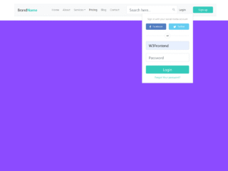
Here’s a tutorial on how to create a Bootstrap Navbar With Profile Picture. This guide will walk you through the necessary steps to implement a fully functional and responsive navbar, including the profile picture dropdown. Let’s get started!
Add Header Assets
To begin, add the following CDN links and meta tag inside the <head> tag of your HTML document. These links provide the necessary Bootstrap and Font Awesome CSS for styling and icons.
 <meta name="viewport" content="width=device-width, initial-scale=1">
<link rel="stylesheet" href="https://cdnjs.cloudflare.com/ajax/libs/font-awesome/5.15.3/css/all.min.css" integrity="sha512-iBBXm8fW90+nuLcSKlbmrPcLa0OT92xO1BIsZ+ywDWZCvqsWgccV3gFoRBv0z+8dLJgyAHIhR35VZc2oM/gI1w==" crossorigin="anonymous" referrerpolicy="no-referrer" />
<link href="https://cdn.jsdelivr.net/npm/bootstrap@5.0.1/dist/css/bootstrap.min.css" rel="stylesheet" integrity="sha384-+0n0xVW2eSR5OomGNYDnhzAbDsOXxcvSN1TPprVMTNDbiYZCxYbOOl7+AMvyTG2x" crossorigin="anonymous">
Create the HTML Structure
Next, construct the basic HTML structure for the navbar. This includes the navbar container, brand, toggler button for responsiveness, navigation links, and the profile picture dropdown. The profile picture is implemented using Font Awesome user icon.
<nav class="navbar navbar-expand-lg navbar-dark bg-dark">
  <div class="container-fluid">
    <a class="navbar-brand" href="#">Navbar</a>
    <button class="navbar-toggler" type="button" data-bs-toggle="collapse" data-bs-target="#navbarSupportedContent" aria-controls="navbarSupportedContent" aria-expanded="false" aria-label="Toggle navigation">
      <span class="navbar-toggler-icon"></span>
    </button>
    <div class="collapse navbar-collapse" id="navbarSupportedContent">
      <ul class="navbar-nav me-auto mb-2 mb-lg-0">
        <li class="nav-item">
          <a class="nav-link active" aria-current="page" href="#">Home</a>
        </li>
        <li class="nav-item">
          <a class="nav-link" href="#">Link</a>
        </li>
        <li class="nav-item dropdown">
          <a class="nav-link dropdown-toggle" href="#" id="navbarDropdown" role="button" data-bs-toggle="dropdown" aria-expanded="false">
            Dropdown
          </a>
          <ul class="dropdown-menu" aria-labelledby="navbarDropdown">
            <li><a class="dropdown-item" href="#">Action</a></li>
            <li><a class="dropdown-item" href="#">Another action</a></li>
            <li><hr class="dropdown-divider"></li>
            <li><a class="dropdown-item" href="#">Something else here</a></li>
          </ul>
        </li>
      </ul>
      <ul class="navbar-nav ms-auto mb-2 mb-lg-0 profile-menu">
        <li class="nav-item dropdown">
          <a class="nav-link dropdown-toggle" href="#" id="navbarDropdown" role="button" data-bs-toggle="dropdown" aria-expanded="false">
            <i class="fas fa-user"></i>
          </a>
          <ul class="dropdown-menu" aria-labelledby="navbarDropdown">
            <li><a class="dropdown-item" href="#"><i class="fas fa-sliders-h fa-fw"></i> Account</a></li>
            <li><a class="dropdown-item" href="#"><i class="fas fa-cog fa-fw"></i> Settings</a></li>
            <li><hr class="dropdown-divider"></li>
            <li><a class="dropdown-item" href="#"><i class="fas fa-sign-out-alt fa-fw"></i> Log Out</a></li>
          </ul>
        </li>
     </ul>
    </div>
  </div>
</nav>
Add Custom CSS Styles
Now, let’s add some custom CSS to style the profile menu and dropdown. This ensures that the dropdown aligns correctly and the icons have appropriate spacing. This also adds custom CSS to style toggle button.
.profile-menu .dropdown-menu {
  right: 0;
  left: unset;
}
.profile-menu .fa-fw {
  margin-right: 10px;
}

.toggle-change::after {
  border-top: 0;
  border-bottom: 0.3em solid;
}
Add JavaScript Functionality
Finally, include the following JavaScript code to add functionality that helps in styling the dropdown button. This JavaScript function adds an event listener to the dropdown toggle, allowing the toggle button to apply custom CSS when clicked.
document.querySelectorAll('.dropdown-toggle').forEach(item => {
  item.addEventListener('click', event => {

    if(event.target.classList.contains('dropdown-toggle') ){
      event.target.classList.toggle('toggle-change');
    }
    else if(event.target.parentElement.classList.contains('dropdown-toggle')){
      event.target.parentElement.classList.toggle('toggle-change');
    }
  })
});
With these steps, you should now have a fully functional Bootstrap Navbar With Profile Picture. This enhancement ensures the navbar is responsive, styled correctly, and provides a user-friendly profile menu.
