
Here’s a comprehensive guide on implementing a Bootstrap Date And Time Picker in your web projects. This tutorial will walk you through the necessary steps, from including the required libraries to initializing the date and time pickers with JavaScript.
Add Header Assets
To begin, you’ll need to include the necessary CSS files in the “ section of your HTML document. These include Bootstrap’s CSS, Font Awesome for icons, and the Bootstrap Datetimepicker CSS.
<link rel='stylesheet' href='https://cdnjs.cloudflare.com/ajax/libs/twitter-bootstrap/4.1.3/css/bootstrap.min.css'>
<link rel='stylesheet' href='https://cdnjs.cloudflare.com/ajax/libs/font-awesome/5.8.1/css/all.min.css'>
<link rel='stylesheet' href='https://cdnjs.cloudflare.com/ajax/libs/bootstrap-datetimepicker/4.17.47/css/bootstrap-datetimepicker.min.css'>
Create the HTML Structure
Next, create the HTML structure for the date and time pickers within your page. This includes creating input fields and associating them with the appropriate IDs.
.container-fluid
.row
.col-lg-6.offset-lg-3.col-md-8.offset-md-2
.content
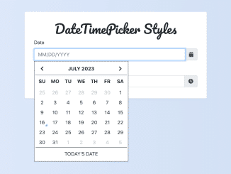
h1 DateTimePicker Styles
.form-group
label Date
#datepicker.input-group.date
input.form-control(placeholder="MM/DD/YYYY")
span.input-group-append.input-group-addon
span.input-group-text
i.fa.fa-calendar
.form-group
label Time
#timepicker.input-group.time
input.form-control(placeholder="HH:MM AM/PM")
span.input-group-append.input-group-addon
span.input-group-text
i.fa.fa-clock
Apply CSS Styles
Now, let’s add some CSS to enhance the appearance of the date and time pickers. This includes styling the input groups, form controls, and the datetimepicker widget itself.
.input-group-addon {
  cursor: pointer;
}

.input-group.date {
  text-transform: uppercase;
}

.form-control {
  border: 1px solid #ccc;
  box-shadow: none;
  &:hover, &:focus, &:active {
    box-shadow: none;
  }
  &:focus {
    border: 1px solid #34495e;
  }
}

@import url('https://fonts.googleapis.com/css?family=Open+Sans:400,700');
@import url('https://fonts.googleapis.com/css?family=Pacifico');

body {
  background: #e0e0e0;
  font-family: 'Open Sans', sans-serif;
  font-size: 14px;
  line-height: 21px;
  padding: 15px 0;
}

h1 {
  color: #333;
  font-family: 'Pacifico', cursive;
  font-size: 28px;
  line-height: 42px;
  margin: 0 0 15px;
  text-align: center;
}

.content {
  background: #fff;
  border-radius: 3px;
  box-shadow: 0 1px 2px rgba(0, 0, 0, 0.075), 0 2px 4px rgba(0, 0, 0, 0.0375);
  padding: 30px 30px 20px;
}

.bootstrap-datetimepicker-widget.dropdown-menu {
  border: 1px solid #34495e;
  border-radius: 0;
  box-shadow: none;
  margin: 10px 0 0 0;
  padding: 0;
  min-width: 300px;
  max-width: 100%;
  width: auto;
  &.bottom:before,
  &.bottom:after {
    display: none;
  }
  table td,
  table th {
    border-radius: 0;
  }
  table td.old, table td.new {
    color: #bbb;
  }
  table td.today:before {
    border-bottom-color: #0095ff;
  }
  table td.active,
  table td.active:hover,
  table td span.active {
    background-color: #0095ff;
    text-shadow: none;

    &.today:before {
      border-bottom-color: #fff;
    }
  }
  table th {
    height: 40px;
    padding: 0;
    width: 40px;
    &.picker-switch {
      width: auto;
    }
  }
  table tr:first-of-type th {
    border-bottom: 1px solid #34495e;
  }
  table td.day {
    height: 32px;
    line-height: 32px;
    padding: 0;
    width: auto;
  }
  table td span {
    border-radius: 0;
    height: 77px;
    line-height: 77px;
    margin: 0;
    width: 25%;
  }
  .datepicker-months tbody tr td,
  .datepicker-years tbody tr td,
  .datepicker-decades tbody tr td {
    padding: 0;
  }

  .datepicker-decades tbody tr td {
    height: 27px;
    line-height: 27px;

    span {
      display: block;
      float: left;
      width: 50%;
      height: 46px;
      line-height: 46px !important;
      padding: 0;
      &:not(.decade) {
        display: none;
      }
    }
  }
  .timepicker-picker table td {
    padding: 0;
    width: 30%;
    height: 20px;
    line-height: 20px;
    &:nth-child(2) {
      width: 10%;
    }
    a,
    span,
    button {
      border: none;
      border-radius: 0;
      height: 56px;
      line-height: 56px;
      padding: 0;
      width: 100%;
    }
    span {
      color: #333;
      margin-top: -1px;
    }
    button {
      background-color: #fff;
      color: #333;
      font-weight: bold;
      font-size: 1.2em;
      &:hover {
        background-color: #eee;
      }
    }
  }
}
.bootstrap-datetimepicker-widget.dropdown-menu .picker-switch table td {
  border-top: 1px solid #34495e;
  a, span {
    display: block;
    height: 40px;
    line-height: 40px;
    padding: 0;
    width: 100%;
  }
}
.todayText:before {
  content: "Today's Date"
}
Implement JavaScript Functionality
Finally, add the JavaScript code to initialize the Bootstrap Date and Time Pickers. This code checks if the user is on a mobile device and uses native pickers if so. Otherwise, it initializes the DateTimePicker plugin.
if (/Mobi/.test(navigator.userAgent)) {
  // if mobile device, use native pickers
  $(".date input").attr("type", "date");
  $(".time input").attr("type", "time");
} else {
  // if desktop device, use DateTimePicker
  $("#datepicker").datetimepicker({
    useCurrent: false,
    format: "DD-MMM-YYYY",
    showTodayButton: true,
    icons: {
      next: "fa fa-chevron-right",
      previous: "fa fa-chevron-left",
      today: 'todayText',
    }
  });
  $("#timepicker").datetimepicker({
    format: "LT",
    icons: {
      up: "fa fa-chevron-up",
      down: "fa fa-chevron-down"
    }
  });
}
With these steps, you have successfully created a Bootstrap Date And Time Picker. If you have any questions or suggestions, feel free to comment below.