
This tutorial will guide you through the process of creating a visually appealing and functional Bootstrap Multi Step Wizard With Progress Bar. This wizard is useful for breaking down complex forms or processes into manageable steps, improving user experience and completion rates.
Adding Bootstrap CSS
First, we need to include Bootstrap’s CSS to utilize its grid system and pre-defined styles. Add the following CDN link to the “ section of your HTML document.
<link rel='stylesheet' href='https://maxcdn.bootstrapcdn.com/bootstrap/3.3.6/css/bootstrap.min.css'>
Creating the HTML Structure
Next, create the basic HTML structure for the wizard. This includes the container, the wizard itself, the navigation tabs (representing the steps), and the content for each step.
<div class="container">
<div class="row">
<section>
<div class="wizard">
<div class="wizard-inner">
<div class="connecting-line"></div>
<ul class="nav nav-tabs" role="tablist">
<li role="presentation" class="active">
<a href="#step1" data-toggle="tab" aria-controls="step1" role="tab" title="Step 1">
<span class="round-tab">
<i class="glyphicon glyphicon-folder-open"></i>
</span>
</a>
</li>
<li role="presentation" class="disabled">
<a href="#step2" data-toggle="tab" aria-controls="step2" role="tab" title="Step 2">
<span class="round-tab">
<i class="glyphicon glyphicon-pencil"></i>
</span>
</a>
</li>
<li role="presentation" class="disabled">
<a href="#step3" data-toggle="tab" aria-controls="step3" role="tab" title="Step 3">
<span class="round-tab">
<i class="glyphicon glyphicon-picture"></i>
</span>
</a>
</li>
<li role="presentation" class="disabled">
<a href="#complete" data-toggle="tab" aria-controls="complete" role="tab" title="Complete">
<span class="round-tab">
<i class="glyphicon glyphicon-ok"></i>
</span>
</a>
</li>
</ul>
</div>
<form role="form">
<div class="tab-content">
<div class="tab-pane active" role="tabpanel" id="step1">
<h3>Step 1</h3>
<div class="bs-calltoaction bs-calltoaction-primary">
<div class="row">
<div class="col-md-9 cta-contents">
<h1 class="cta-title">Its a Call To Action</h1>
<div class="cta-desc">
<p>Describe the action here.</p>
<p>Describe the action here.</p>
<p>Describe the action here.</p>
</div>
</div>
<p>Step - 1</p>
</div>
</div>
<ul class="list-inline pull-right">
<li><button type="button" class="btn btn-primary next-step">Save and continue</button></li>
</ul>
</div>
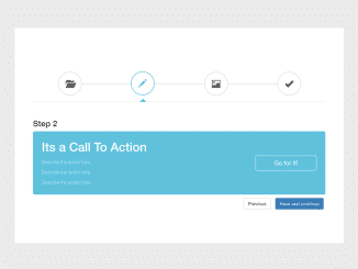
<div class="tab-pane" role="tabpanel" id="step2">
<h3>Step 2</h3>
<div class="bs-calltoaction bs-calltoaction-info">
<div class="row">
<div class="col-md-9 cta-contents">
<h1 class="cta-title">Its a Call To Action</h1>
<div class="cta-desc">
<p>Describe the action here.</p>
<p>Describe the action here.</p>
<p>Describe the action here.</p>
</div>
</div>
<div class="col-md-3 cta-button">
<a href="#" class="btn btn-lg btn-block btn-info">Go for It!</a>
</div>
</div>
</div>
<ul class="list-inline pull-right">
<li><button type="button" class="btn btn-default prev-step">Previous</button></li>
<li><button type="button" class="btn btn-primary next-step">Save and continue</button></li>
</ul>
</div>
<div class="tab-pane" role="tabpanel" id="step3">
<h3>Step 3</h3>
<div class="bs-calltoaction bs-calltoaction-success">
<div class="row">
<div class="col-md-9 cta-contents">
<h1 class="cta-title">Its a Call To Action</h1>
<div class="cta-desc">
<p>Describe the action here.</p>
<p>Describe the action here.</p>
<p>Describe the action here.</p>
</div>
</div>
<div class="col-md-3 cta-button">
<a href="#" class="btn btn-lg btn-block btn-success">Go for It!</a>
</div>
</div>
</div>
<ul class="list-inline pull-right">
<li><button type="button" class="btn btn-default prev-step">Previous</button></li>
<li><button type="button" class="btn btn-default next-step">Skip</button></li>
<li><button type="button" class="btn btn-primary btn-info-full next-step">Save and continue</button></li>
</ul>
</div>
<div class="tab-pane" role="tabpanel" id="complete">
<h3>Complete</h3>
<div class="container">
<blockquote class="quote-box">
<p class="quotation-mark">
“
</p>
<p class="quote-text">
Don't believe anything that you read on the internet, it may be fake.
</p>
<hr>
<div class="blog-post-actions">
<p class="blog-post-bottom pull-left">
Abraham Lincoln
</p>
<p class="blog-post-bottom pull-right">
<span class="badge quote-badge">896</span> ❤
</p>
</div>
</blockquote>
</div>
</div>
<div class="clearfix"></div>
</div>
</form>
</div>
</section>
</div>
</div>
Styling the Wizard with CSS
Now, let’s add some custom CSS styles to enhance the appearance of the wizard. This will style the navigation tabs, the connecting line, and the active step indicator.
.wizard {
    margin: 20px auto;
    background: #fff;
}

    .wizard .nav-tabs {
        position: relative;
        margin: 40px auto;
        margin-bottom: 0;
        border-bottom-color: #e0e0e0;
    }

    .wizard > div.wizard-inner {
        position: relative;
    }

.connecting-line {
    height: 2px;
    background: #e0e0e0;
    position: absolute;
    width: 80%;
    margin: 0 auto;
    left: 0;
    right: 0;
    top: 50%;
    z-index: 1;
}

.wizard .nav-tabs > li.active > a, .wizard .nav-tabs > li.active > a:hover, .wizard .nav-tabs > li.active > a:focus {
    color: #555555;
    cursor: default;
    border: 0;
    border-bottom-color: transparent;
}

span.round-tab {
    width: 70px;
    height: 70px;
    line-height: 70px;
    display: inline-block;
    border-radius: 100px;
    background: #fff;
    border: 2px solid #e0e0e0;
    z-index: 2;
    position: absolute;
    left: 0;
    text-align: center;
    font-size: 25px;
}
span.round-tab i{
    color:#555555;
}
.wizard li.active span.round-tab {
    background: #fff;
    border: 2px solid #5bc0de;

}
.wizard li.active span.round-tab i{
    color: #5bc0de;
}

span.round-tab:hover {
    color: #333;
    border: 2px solid #333;
}

.wizard .nav-tabs > li {
    width: 25%;
}

.wizard li:after {
    content: " ";
    position: absolute;
    left: 46%;
    opacity: 0;
    margin: 0 auto;
    bottom: 0px;
    border: 5px solid transparent;
    border-bottom-color: #5bc0de;
    transition: 0.1s ease-in-out;
}

.wizard li.active:after {
    content: " ";
    position: absolute;
    left: 46%;
    opacity: 1;
    margin: 0 auto;
    bottom: 0px;
    border: 10px solid transparent;
    border-bottom-color: #5bc0de;
}

.wizard .nav-tabs > li a {
    width: 70px;
    height: 70px;
    margin: 20px auto;
    border-radius: 100%;
    padding: 0;
}

    .wizard .nav-tabs > li a:hover {
        background: transparent;
    }

.wizard .tab-pane {
    position: relative;
    padding-top: 50px;
}

.wizard h3 {
    margin-top: 0;
}

@media( max-width : 585px ) {

    .wizard {
        width: 90%;
        height: auto !important;
    }

    span.round-tab {
        font-size: 16px;
        width: 50px;
        height: 50px;
        line-height: 50px;
    }

    .wizard .nav-tabs > li a {
        width: 50px;
        height: 50px;
        line-height: 50px;
    }

    .wizard li.active:after {
        content: " ";
        position: absolute;
        left: 35%;
    }
}
.bs-calltoaction{
    position: relative;
    width:auto;
    padding: 15px 25px;
    border: 1px solid black;
    margin-top: 10px;
    margin-bottom: 10px;
    border-radius: 5px;
}

    .bs-calltoaction > .row{
        display:table;
        width: calc(100% + 30px);
    }

        .bs-calltoaction > .row > [class^="col-"],
        .bs-calltoaction > .row > [class*=" col-"]{
            float:none;
            display:table-cell;
            vertical-align:middle;
        }

            .cta-contents{
                padding-top: 10px;
                padding-bottom: 10px;
            }

                .cta-title{
                    margin: 0 auto 15px;
                    padding: 0;
                }

                .cta-desc{
                    padding: 0;
                }

                .cta-desc p:last-child{
                    margin-bottom: 0;
                }

            .cta-button{
                padding-top: 10px;
                padding-bottom: 10px;
            }

@media (max-width: 991px){
    .bs-calltoaction > .row{
        display:block;
        width: auto;
    }

        .bs-calltoaction > .row > [class^="col-"],
        .bs-calltoaction > .row > [class*=" col-"]{
            float:none;
            display:block;
            vertical-align:middle;
            position: relative;
        }

        .cta-contents{
            text-align: center;
        }
}


.bs-calltoaction.bs-calltoaction-default{
    color: #333;
    background-color: #fff;
    border-color: #ccc;
}

.bs-calltoaction.bs-calltoaction-primary{
    color: #fff;
    background-color: #337ab7;
    border-color: #2e6da4;
}

.bs-calltoaction.bs-calltoaction-info{
    color: #fff;
    background-color: #5bc0de;
    border-color: #46b8da;
}

.bs-calltoaction.bs-calltoaction-success{
    color: #fff;
    background-color: #5cb85c;
    border-color: #4cae4c;
}

.bs-calltoaction.bs-calltoaction-warning{
    color: #fff;
    background-color: #f0ad4e;
    border-color: #eea236;
}

.bs-calltoaction.bs-calltoaction-danger{
    color: #fff;
    background-color: #d9534f;
    border-color: #d43f3a;
}

.bs-calltoaction.bs-calltoaction-primary .cta-button .btn,
.bs-calltoaction.bs-calltoaction-info .cta-button .btn,
.bs-calltoaction.bs-calltoaction-success .cta-button .btn,
.bs-calltoaction.bs-calltoaction-warning .cta-button .btn,
.bs-calltoaction.bs-calltoaction-danger .cta-button .btn{
    border-color:#fff;
}

blockquote{
    border-left:none
}

.quote-badge{
    background-color: rgba(0, 0, 0, 0.2);
}

.quote-box{

    overflow: hidden;
    margin-top: -50px;
    padding-top: -100px;
    border-radius: 17px;
    background-color: #4ADFCC;
    margin-top: 25px;
    color:white;
    width: 325px;
    box-shadow: 2px 2px 2px 2px #E0E0E0;

}

.quotation-mark{

    margin-top: -10px;
    font-weight: bold;
    font-size:100px;
    color:white;
    font-family: "Times New Roman", Georgia, Serif;

}

.quote-text{

    font-size: 19px;
    margin-top: -65px;
}
Implementing Navigation with JavaScript
To enable navigation between the steps, we’ll use JavaScript. This code will handle the “Next” and “Previous” button clicks, enable/disable tabs, and move the user through the wizard.
$(document).ready(function () {
    //Initialize tooltips
    $('.nav-tabs > li a[title]').tooltip();

    //Wizard
    $('a[data-toggle="tab"]').on('show.bs.tab', function (e) {

        var $target = $(e.target);

        if ($target.parent().hasClass('disabled')) {
            return false;
        }
    });

    $(".next-step").click(function (e) {

        var $active = $('.wizard .nav-tabs li.active');
        $active.next().removeClass('disabled');
        nextTab($active);

    });
    $(".prev-step").click(function (e) {

        var $active = $('.wizard .nav-tabs li.active');
        prevTab($active);

    });
});

function nextTab(elem) {
    $(elem).next().find('a[data-toggle="tab"]').click();
}
function prevTab(elem) {
    $(elem).prev().find('a[data-toggle="tab"]').click();
}
With these steps, you should have a fully functional Bootstrap Multi Step Wizard With Progress Bar. Remember to customize the content within each step to match your specific needs.