
Do you want to display your images in a stunning and interactive way on your website? Creating a modern CSS Grid Photo Gallery can help you achieve this. This tutorial will guide you through building a responsive image gallery. It uses advanced CSS features like Grid layout and anchor-positioning for an engaging image swap effect. This method ensures a dynamic and visually appealing presentation of your content without needing JavaScript.
How to Create a CSS Grid Photo Gallery
Step 1: Create the HTML Structure
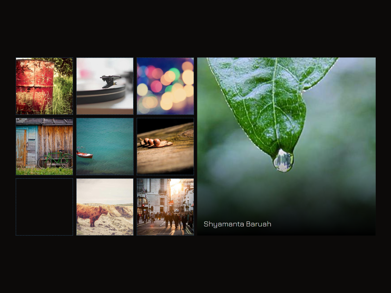
First, set up the basic HTML for your gallery. This includes a main container and several image links. Each link has an image and a title. The main-img div will serve as the container for the swapped image.
<div class="gallery">

  <div class="main-img"><h1>Image swap using <code>anchor-positioning</code></h1></div>

  <a href="#item-1" id="item-1">
    <img src="https://picsum.photos/id/34/400/400" alt="Aleks Dorohovich">
    <h2>Aleks Dorohovich</h2>
  </a>

  <a href="#item-2" id="item-2">
    <img src="https://picsum.photos/id/39/400/400" alt="Luke Chesser">
    <h2>Luke Chesser</h2>
  </a>

  <a href="#item-3" id="item-3">
    <img src="https://picsum.photos/id/56/400/400" alt="Sebastian Muller">
    <h2>Sebastian Muller</h2>
  </a>

  <a href="#item-4" id="item-4">
    <img src="https://picsum.photos/id/76/400/400" alt="Alexander Shustov">
    <h2>Alexander Shustov</h2>
  </a>

  <a href="#item-5" id="item-5">
    <img src="https://picsum.photos/id/124/400/400" alt="Anton Sulsky">
    <h2>Anton Sulsky</h2>
  </a>

  <a href="#item-6" id="item-6">
    <img src="https://picsum.photos/id/139/400/400" alt="Steve Richey">
    <h2>Steve Richey</h2>
  </a>

  <a href="#item-7" id="item-7">
    <img src="https://picsum.photos/id/159/400/400" alt="Shyamanta Baruah">
    <h2>Shyamanta Baruah</h2>
  </a>

  <a href="#item-8" id="item-8">
    <img src="https://picsum.photos/id/200/400/400" alt="Elias Carlsson">
    <h2>Elias Carlsson</h2>
  </a>

  <a href="#item-9" id="item-9">
    <img src="https://picsum.photos/id/441/400/400" alt="327">
    <h2>Ryan Schroeder</h2>
  </a>

</div>
Step 2: Apply CSS Styling
Next, we will style the gallery using CSS Grid. This CSS will arrange your images in a grid layout. It also handles the responsive behavior and the interactive image swap. Modern CSS features like anchor-positioning are used here for the dynamic image display.
@import url(https://fonts.bunny.net/css?family=jura:300,500);
@layer base, mouse, demo;

@layer demo{
  body{
    font-family: "Jura", sans-serif;
  }
  .gallery {
    --size: 100%;
    --grid-cols: repeat(3, 1fr);
    --grid-rows: repeat(6,1fr);
    --gap: .5rem;
		--main-image-columns: 1 / -1;
		--main-image-rows: 1 / span 3;
    --main-img-w: 100%;
    --main-img-h: auto;

   @media (width > 600px) {
      --size: 120px;
      --grid-cols: repeat(6, 1fr);
      --grid-rows: repeat(3,1fr);
			--main-image-columns: 4 / -1;
			--main-image-rows: 1 / span 3;
      --main-img-w: auto;
      --main-img-h: 100%;
    }
    width: min(100%, 900px);
    display: grid;
    grid-template-columns: var(--grid-cols);
		grid-template-rows: var(--grid-rows);
    gap: var(--gap);
    position: relative;

    > .main-img {
      position: relative;
      grid-column: var(--main-image-columns);
      grid-row: var(--main-image-rows);
      display: grid;
      place-content: center;
			padding: 1em;
      font-size: 2rem;
      anchor-name: --main-img;
      overflow: hidden;
			/* gradient to help with readability of the image title */
      border-image: fill 0 linear-gradient(transparent 50%, black);
			& > h1{
				margin: 0;
				font-size: clamp(1rem, 2.5vw + 0.45rem, 1.2rem);
			}
      /* if any sibling has target - hide title */
      &:has(~:target) h1{
        display: none;
      }
    }
    > a {
      display: block;
      aspect-ratio: 1;
      border: 1px dotted steelblue;
      overflow: hidden;
      &:hover:not(:target) img{
        opacity: .5;
      }
      & > img{
        object-fit: cover;
        transition: opacity 300ms ease-in-out;
      }
			/* set anchor position on current :target image */
      &:target img{
        position: absolute;
        inset: anchor(top) anchor(right) anchor(bottom) anchor(left);
        position-anchor: --main-img;
        width: var(--main-img-w,0);
        height: var(--main-img-h,0);
        animation: --fade-in  750ms ease-in-out;
				z-index: -1;
      }
      > h2 {
        color: white;
        font-size: 1.2rem;
        font-weight: 300;
        opacity: 0;
        translate: 0 1lh;
        transition: all 300ms ease-in-out;
      }
      &:target h2{
        position: absolute;
        inset: auto;
        bottom:anchor(bottom);
        left: calc(anchor(left) + 1rem);
        position-anchor: --main-img;
        opacity: 1;
        translate: 0 0;
      }
    }
  }

  @keyframes --fade-in{
    from{
      opacity: 0;
    }
    to{
      opacity: 1;
    }
  }
}

/* general styling not relevant for this demo */
@layer base {
	* {
		box-sizing: border-box;
	}
	:root {
		color-scheme: light dark;
		--bg-dark: rgb(12, 10, 9);
		--bg-light: rgb(248, 244, 238);
		--txt-light: rgb(10, 10, 10);
		--txt-dark: rgb(245, 245, 245););
		--line-light: rgba(0 0 0 / .25);
		--line-dark: rgba(255 255 255 / .25);

    --clr-bg: light-dark(var(--bg-light), var(--bg-dark));
    --clr-txt: light-dark(var(--txt-light), var(--txt-dark));
    --clr-lines: light-dark(var(--line-light), var(--line-dark));
	}

	body {
		background-color: var(--clr-bg);
		color: var(--clr-txt);
		min-height: 100svh;
		margin: 0;
		padding: 2rem;
		font-family: "Jura", sans-serif;
		font-size: 1rem;
		line-height: 1.5;
    display: grid;
    place-items: center;
    gap: 2rem;
	}
  @supports not (position-anchor: --test) {
	 body::before {
			content:"Sorry, your browser doesn't support anchor-positioning";
			position: fixed;
			top: 2rem;
			left: 50%;
			translate: -50% 0;
			font-size: 0.8rem;
		}
	}
  img {
    max-width: 100%;
    display: block;
  }
}
That’s all! You have successfully created a dynamic CSS Grid Photo Gallery. If you have any questions or suggestions, feel free to comment below.