
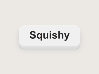
Here’s a comprehensive guide to crafting a visually appealing and interactive CSS squishy button with a smooth transition effect. This effect adds a subtle but engaging animation to your buttons, enhancing the user experience. Let’s dive into the steps required to implement this effect.
Setting Up the Basic Structure
First, we’ll lay the groundwork with the basic HTML for our button. This involves creating a simple <button> element with appropriate text.
HTML Structure
<button>Squishy</button>
Styling the Button with CSS
Now, we’ll move on to the core of this tutorial: styling the button with CSS. We’ll define the button’s appearance, including its colors, fonts, and most importantly, the properties that enable the squishy effect and smooth transitions.
CSS Styles
body {
  font-family: sans-serif;
  min-height: 100dvh;
  justify-content: center;
  align-items: center;
  display: flex;
  background-color: #ece9e4;
  font-size: 1rem;
}

button {
  position: relative;
  font: inherit;
  background-color: #f0f0f0;
  border: 0;
  color: #242424;
  border-radius: 0.5em;
  font-size: 3rem;
  padding: 0.375em 1em;
  font-weight: 600;
  text-shadow: 0 0.0625em 0 #fff;
  box-shadow: inset 0 0.0625em 0 0 #f4f4f4, 0 0.0625em 0 0 #efefef, 0 0.125em 0 0 #ececec, 0 0.25em 0 0 #e0e0e0, 0 0.3125em 0 0 #dedede, 0 0.375em 0 0 #dcdcdc, 0 0.425em 0 0 #cacaca, 0 0.425em 0.5em 0 #cecece;
  transition: 0.25s ease;
  pointer: cursor;
  touch-action: manipulation;
  -webkit-tap-highlight-color: rgba(0, 0, 0, 0);
  cursor: pointer;
}
button:active, button:hover {
  transform: translateY(0.225em);
  box-shadow: inset 0 0.03em 0 0 #f4f4f4, 0 0.03em 0 0 #efefef, 0 0.0625em 0 0 #ececec, 0 0.125em 0 0 #e0e0e0, 0 0.125em 0 0 #dedede, 0 0.2em 0 0 #dcdcdc, 0 0.225em 0 0 #cacaca, 0 0.225em 0.375em 0 #cecece;
}
button:active:after, button:hover:after {
  height: calc(100% + 0.225em);
}
button:after {
  position: absolute;
  content: "";
  display: block;
  width: 100%;
  height: calc(100% + 0.375em);
  top: 0;
  left: 0;
  background-color: transparent;
  transition: height 0.25s ease;
}