
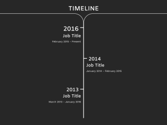
Here’s how to create a simple vertical timeline in Bootstrap. This step-by-step tutorial guides you through building a visually appealing and informative timeline using Bootstrap’s grid system and CSS styling. Let’s get started!
Adding Header Assets
This section involves adding essential CSS links to your HTML document’s section. These links include Bootstrap’s CSS for styling and Google Fonts for typography.
<link rel='stylesheet' href='https://maxcdn.bootstrapcdn.com/bootstrap/4.0.0-alpha.5/css/bootstrap.min.css'>
Creating the HTML Structure
Here, we’ll construct the basic HTML markup for the timeline, using Bootstrap’s grid system to structure the timeline elements.
<!-- Google Font -->
    <link href="https://fonts.googleapis.com/css?family=Amiko:600" rel="stylesheet">
    <link href="https://fonts.googleapis.com/css?family=Work+Sans" rel="stylesheet">
      <div class="container" id="timeline">
        <div id="timeline-header">
          <h1>TIMELINE</h1>
        </div>
        <div class="col-xs-6" id="start-left">
        </div>
        <div class="col-xs-6" id="start-right">
        </div>
        <div class="col-xs-6 time-left">
          <div class="date">
            <h1>2016</h1>
          </div>
          <div class="date-details">
            <h3>Job Title</h3>
            <p>February 2015 - Present</p>
          </div>
          <div class="inner-left">
          </div>
        </div>

        <div class="col-xs-6 time-right">
        </div>
        <!-- Break -->
        <div class="col-xs-6 time-left">
        </div>

        <div class="col-xs-6 time-right">
          <div class="date">
            <h2>2014</h2>
          </div>
          <div class="date-details">
            <h3>Job Title</h3>
            <p>January 2014 - February 2015</p>
          </div>
          <div class="inner-right">
          </div>
        </div>
        <!-- Break -->
        <div class="col-xs-6 time-left">
          <div class="date">
            <h2>2013</h2>
          </div>
          <div class="date-details">
            <h3>Job Title</h3>
            <p>March 2013 - January 2016</p>
          </div>
          <div class="inner-left">
          </div>
        </div>

        <div class="col-xs-6 time-right">
        </div>
    </div>

<!-- Special thanks to
Atticus Koya "https://codepen.io/OfficialAntarctica/pens/public/"
for inspiring me with his timeline creation. -->
Styling with CSS
This step involves applying CSS styles to customize the appearance of the timeline, including colors, fonts, borders, and positioning of elements.
/* Fonts */
h1, h2, h3, h4 {
  font-family: 'Amiko', sans-serif !important;
}

p {
  font-family: 'Work Sans', sans-serif !important;
}


#timeline {
  position: relative;
  height: 100%;
  padding: 0 0 40px;
  background-color: #272727;

}

#timeline-header{
  position: relative;
  text-align: center;
  border-width: 4px;
  border-color: #fff;
  color: #fff;
  text-align: center;
  padding-top: 40px;
}


#start-left {
  position: relative;
  left: 0;
  border-top: 2px solid #fff;
  border-right: 2px solid #fff;
  border-radius: 0 60px 0 0;
  height: 80px;
  background-color: #272727;
}

#start-right {
  position: relative;
  right: 0;
  border-top: 2px solid #fff;
  border-left: 2px solid #fff;
  border-radius: 60px 0 0 0;
  height: 80px;
  background-color: #272727;
}

/* Left side */

.time-left {
  border-right: 2px solid #fff;
  height: 200px;
  color: #fff;
  padding: 0 15px 0 0;
  text-align: right;
}

.time-left .date {
  width: 100%;
  padding-right: 15px;
}

.inner-left {
  width: 20px;
  height: 95%;
  position: absolute;
  right: 0;
  bottom: 0;
  padding: 0;
  margin: 0;
  border-top: 4px solid #fff;
  border-color: #fff;
}

/* Right Side */

.time-right {
  border-left: 2px solid #fff;
  height: 200px;
  color: #fff;
  padding: 0 0 0 15px;
  text-align: left;
}

.inner-right {
  width: 20px;
  height: 95%;
  position: absolute;
  left: 0;
  bottom: 0;
  padding: 0;
  margin: 0;
  border-top: 4px solid #fff;
  border-color: #fff;
}

.time-right .date {
  width: 100%;
  padding-left: 15px;
}

/* Media query to help keep the Job Titles from overflowing */

@media only screen and (max-width: 750px) {

  .date-details h3 {
    font-size: 1.35rem;
  }

}