
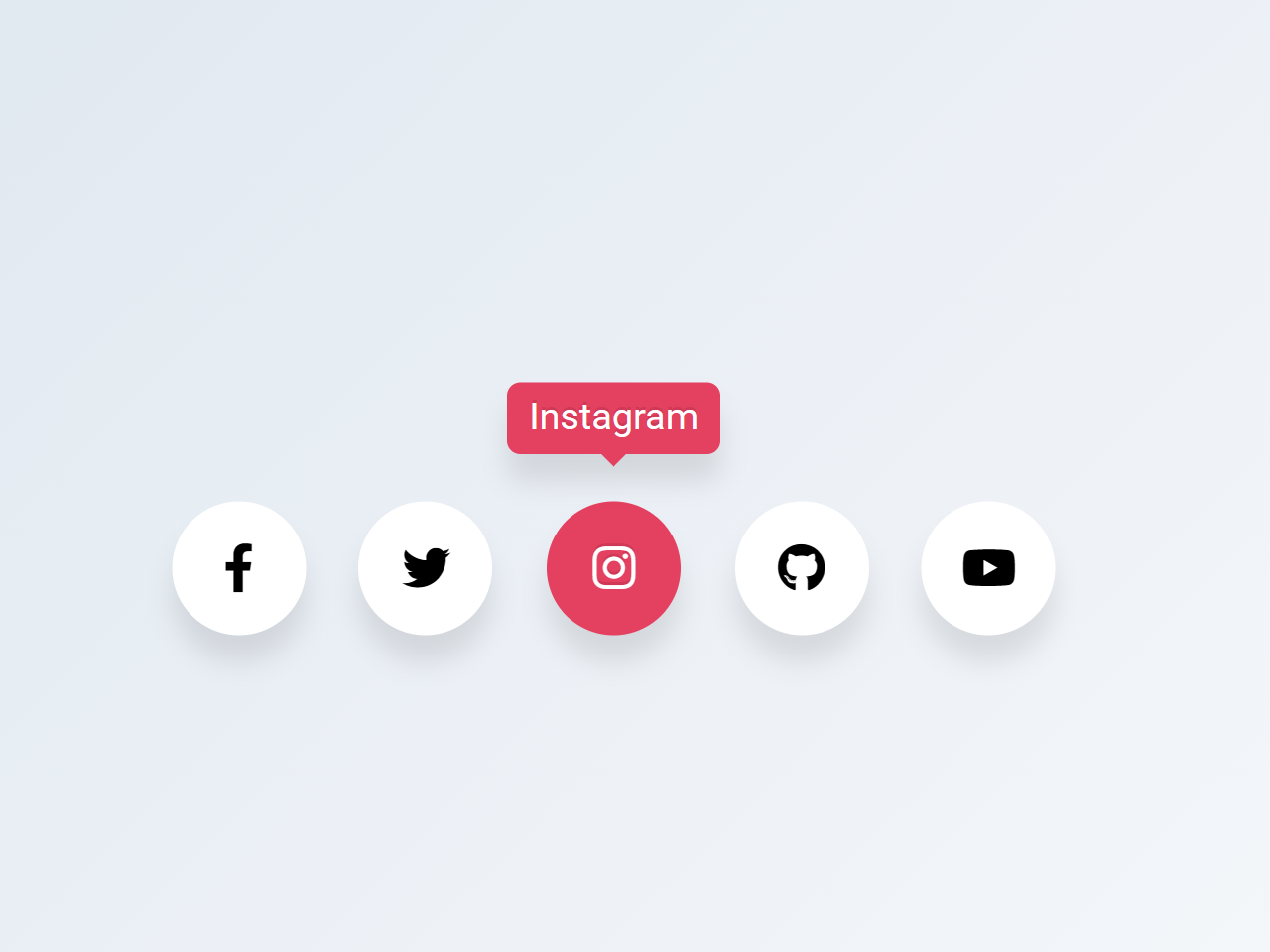
This tutorial shows you how to create circular social media icons with a hover effect. We’ll use HTML for structure, CSS for styling, and Font Awesome for the icons. This is a great way to add interactive elements to your website and improve user experience.
Step 1: Add Header Assets
First, include necessary assets in the header of your HTML document. This includes linking to Font Awesome for the icons.
<link rel='stylesheet' href='https://cdnjs.cloudflare.com/ajax/libs/font-awesome/5.15.1/css/all.min.css'>
Step 2: Create the HTML Structure
Next, create the HTML structure for your social media icons. This uses a list (`ul`) with list items (`li`) for each icon. Each icon includes a tooltip that appears on hover.
<ul class="wrapper">
  <li class="icon facebook">
    <span class="tooltip">Facebook</span>
    <span><i class="fab fa-facebook-f"></i></span>
  </li>
  <li class="icon twitter">
    <span class="tooltip">Twitter</span>
    <span><i class="fab fa-twitter"></i></span>
  </li>
  <li class="icon instagram">
    <span class="tooltip">Instagram</span>
    <span><i class="fab fa-instagram"></i></span>
  </li>
  <li class="icon github">
    <span class="tooltip">Github</span>
    <span><i class="fab fa-github"></i></span>
  </li>
  <li class="icon youtube">
    <span class="tooltip">Youtube</span>
    <span><i class="fab fa-youtube"></i></span>
  </li>
</ul>
Step 3: Add CSS Styling
Now, let’s add the CSS to style the icons, tooltips, and hover effects. This includes setting up the layout, background, colors, and animations.
/*
    Auther: Abdelrhman Said
*/

@import url("https://fonts.googleapis.com/css2?family=Poppins&display=swap");

* {
  margin: 0;
  padding: 0;
  box-sizing: border-box;
}

*:focus,
*:active {
  outline: none !important;
  -webkit-tap-highlight-color: transparent;
}

html,
body {
  display: grid;
  height: 100%;
  width: 100%;
  font-family: "Poppins", sans-serif;
  place-items: center;
  background: linear-gradient(315deg, #ffffff, #d7e1ec);
}

.wrapper {
  display: inline-flex;
  list-style: none;
}

.wrapper .icon {
  position: relative;
  background: #ffffff;
  border-radius: 50%;
  margin: 10px;
  width: 50px;
  height: 50px;
  font-size: 18px;
  display: flex;
  justify-content: center;
  align-items: center;
  flex-direction: column;
  box-shadow: 0 10px 10px rgba(0, 0, 0, 0.1);
  cursor: pointer;
  transition: all 0.2s cubic-bezier(0.68, -0.55, 0.265, 1.55);
}

.wrapper .tooltip {
  position: absolute;
  top: 0;
  font-size: 14px;
  background: #ffffff;
  color: #ffffff;
  padding: 5px 8px;
  border-radius: 5px;
  box-shadow: 0 10px 10px rgba(0, 0, 0, 0.1);
  opacity: 0;
  pointer-events: none;
  transition: all 0.3s cubic-bezier(0.68, -0.55, 0.265, 1.55);
}

.wrapper .tooltip::before {
  position: absolute;
  content: "";
  height: 8px;
  width: 8px;
  background: #ffffff;
  bottom: -3px;
  left: 50%;
  transform: translate(-50%) rotate(45deg);
  transition: all 0.3s cubic-bezier(0.68, -0.55, 0.265, 1.55);
}

.wrapper .icon:hover .tooltip {
  top: -45px;
  opacity: 1;
  visibility: visible;
  pointer-events: auto;
}

.wrapper .icon:hover span,
.wrapper .icon:hover .tooltip {
  text-shadow: 0px -1px 0px rgba(0, 0, 0, 0.1);
}

.wrapper .facebook:hover,
.wrapper .facebook:hover .tooltip,
.wrapper .facebook:hover .tooltip::before {
  background: #1877F2;
  color: #ffffff;
}

.wrapper .twitter:hover,
.wrapper .twitter:hover .tooltip,
.wrapper .twitter:hover .tooltip::before {
  background: #1DA1F2;
  color: #ffffff;
}

.wrapper .instagram:hover,
.wrapper .instagram:hover .tooltip,
.wrapper .instagram:hover .tooltip::before {
  background: #E4405F;
  color: #ffffff;
}

.wrapper .github:hover,
.wrapper .github:hover .tooltip,
.wrapper .github:hover .tooltip::before {
  background: #333333;
  color: #ffffff;
}

.wrapper .youtube:hover,
.wrapper .youtube:hover .tooltip,
.wrapper .youtube:hover .tooltip::before {
  background: #CD201F;
  color: #ffffff;
}
That’s all! Hopefully, you have successfully integrated these circular social media icons with hover effect into your web/app project. If you have any questions or suggestions, feel free to comment below.
