
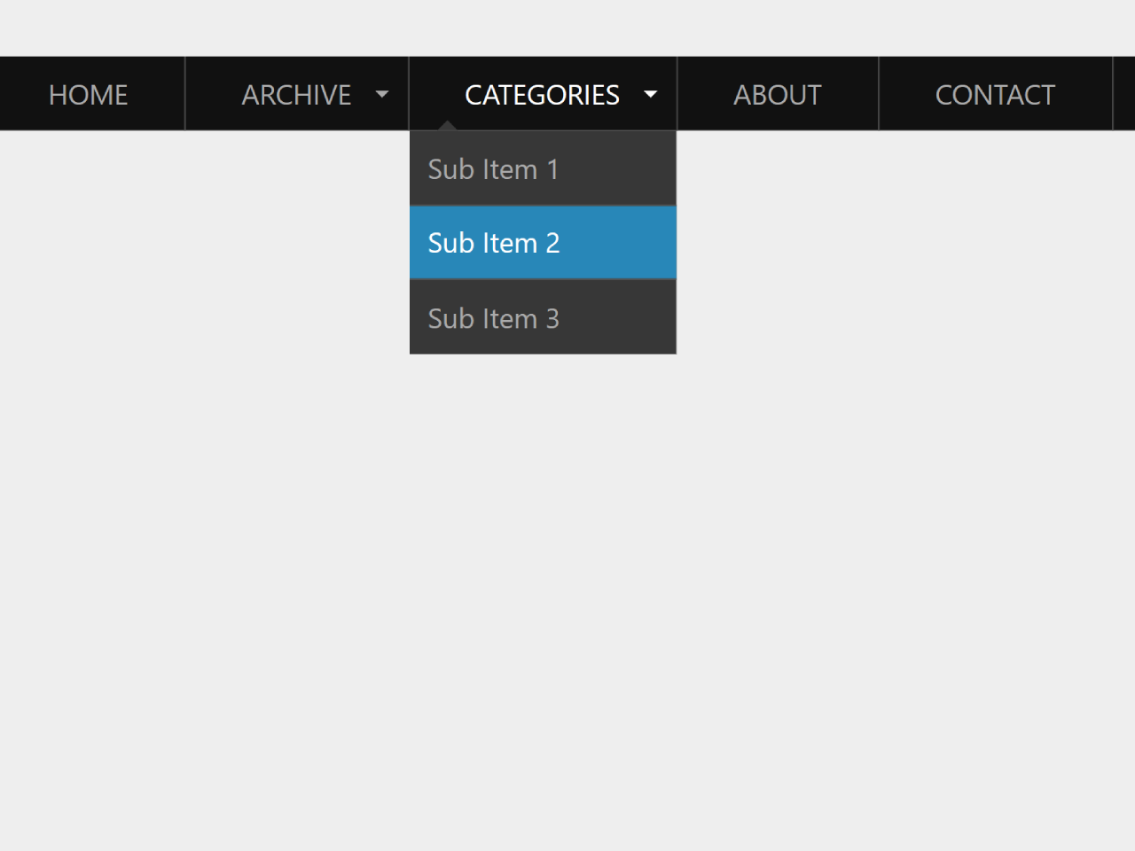
How to Create Responsive Navigation Bar With Dropdown
First of all, load the following assets into the head tag of your HTML document.
<script src="https://public.codepenassets.com/js/prefixfree-1.0.7.min.js"></script>
Create the HTML structure as follows:
<nav class="animenu" role="navigation" aria-label="Menu">
  <button class="animenu__btn" type="button">
    <span class="animenu__btn__bar"></span>
    <span class="animenu__btn__bar"></span>
    <span class="animenu__btn__bar"></span>
  </button>

  <ul class="animenu__nav">
    <li><a href="#">Home</a></li>
    <li>
      <a href="#" class="animenu__nav__hasDropdown" aria-haspopup="true">Archive</a>
      <ul class="animenu__nav__dropdown" aria-label="submenu" role="menu">
        <li><a href="#" role="menuitem">Sub Item 1</a></li>
        <li><a href="#" role="menuitem">Sub Item 2</a></li>
        <li><a href="#" role="menuitem">Sub Item 3</a></li>
      </ul>
    </li>
    <li>
      <a href="#" class="animenu__nav__hasDropdown" aria-haspopup="true">Categories</a>
      <ul class="animenu__nav__dropdown" aria-label="submenu" role="menu">
        <li><a href="#" role="menuitem">Sub Item 1</a></li>
        <li><a href="#" role="menuitem">Sub Item 2</a></li>
        <li><a href="#" role="menuitem">Sub Item 3</a></li>
      </ul>
    </li>
    <li><a href="#">About</a></li>
    <li><a href="#">Contact</a></li>
  </ul>
</nav>
Style using the following CSS styles:
*, *:after, *:before {
  box-sizing: border-box !important;
}

.cd__main{
  display: block !important;
}

.animenu__btn {
  display: none;
  cursor: pointer;
  background-color: #111;
  border: 0;
  padding: 10px;
  height: 40px;
  width: 40px;
}
.animenu__btn:hover {
  background-color: #0186ba;
}

.animenu__btn__bar {
  display: block;
  width: 20px;
  height: 2px;
  background-color: #fff;
  transition: 0.15s cubic-bezier(0.75, -0.55, 0.25, 1.55);
}
.animenu__btn__bar + .animenu__btn__bar {
  margin-top: 4px;
}

.animenu__btn--active .animenu__btn__bar {
  margin: 0;
  position: absolute;
}
.animenu__btn--active .animenu__btn__bar:nth-child(1) {
  transform: rotate(45deg);
}
.animenu__btn--active .animenu__btn__bar:nth-child(2) {
  opacity: 0;
}
.animenu__btn--active .animenu__btn__bar:nth-child(3) {
  transform: rotate(-45deg);
}

.animenu {
  display: block;
}
.animenu ul {
  padding: 0;
  list-style: none;
  font: 0 -apple-system, BlinkMacSystemFont, "Segoe UI", "Roboto", "Helvetica Neue", Arial, sans-serif, "Apple Color Emoji", "Segoe UI Emoji", "Segoe UI Symbol";
}
.animenu li, .animenu a {
  display: inline-block;
  font-size: 15px;
}
.animenu a {
  color: #aaaaaa;
  text-decoration: none;
}

.animenu__nav {
  background-color: #111;
}
.animenu__nav > li {
  position: relative;
  border-right: 1px solid #444444;
}
.animenu__nav > li > a {
  padding: 10px 30px;
  text-transform: uppercase;
}
.animenu__nav > li:hover > ul {
  opacity: 1;
  visibility: visible;
  margin: 0;
}
.animenu__nav > li:hover > a {
  color: #fff;
}
.animenu__nav > li:focus-within > ul {
  opacity: 1;
  visibility: visible;
  margin: 0;
}
.animenu__nav > li:focus-within > a {
  color: #fff;
}
.animenu__nav__hasDropdown:before {
  content: "";
  position: absolute;
  border: 4px solid transparent;
  border-bottom: 0;
  border-top-color: currentColor;
  top: 50%;
  margin-top: -2px;
  right: 10px;
}

.animenu__nav__dropdown {
  min-width: 100%;
  position: absolute;
  top: 100%;
  left: 0;
  z-index: 1;
  opacity: 0;
  visibility: hidden;
  margin: 20px 0 0 0;
  background-color: #373737;
  transition: margin 0.15s, opacity 0.15s;
}
.animenu__nav__dropdown > li {
  width: 100%;
  border-bottom: 1px solid #515151;
}
.animenu__nav__dropdown > li:first-child > a:after {
  content: "";
  position: absolute;
  height: 0;
  width: 0;
  left: 1em;
  top: -6px;
  border: 6px solid transparent;
  border-top: 0;
  border-bottom-color: inherit;
}
.animenu__nav__dropdown > li:last-child {
  border: 0;
}
.animenu__nav__dropdown a {
  padding: 10px;
  width: 100%;
  border-color: #373737;
}
.animenu__nav__dropdown a:hover {
  background-color: #0186ba;
  border-color: #0186ba;
  color: #fff;
}
.animenu__nav__dropdown a:focus-within {
  background-color: #0186ba;
  border-color: #0186ba;
  color: #fff;
}

@media screen and (max-width: 767px) {
  .animenu__btn {
    display: inline-block;
  }

  .animenu__nav,
.animenu__nav__dropdown {
    display: none;
  }

  .animenu__nav {
    margin: 10px 0;
  }
  .animenu__nav > li {
    width: 100%;
    border-right: 0;
    border-bottom: 1px solid #515151;
  }
  .animenu__nav > li:last-child {
    border: 0;
  }
  .animenu__nav > li:first-child > a:after {
    content: "";
    position: absolute;
    height: 0;
    width: 0;
    left: 1em;
    top: -6px;
    border: 6px solid transparent;
    border-top: 0;
    border-bottom-color: inherit;
  }
  .animenu__nav > li > a {
    width: 100%;
    padding: 10px;
    border-color: #111;
    position: relative;
  }
  .animenu__nav a:hover {
    background-color: #0186ba;
    border-color: #0186ba;
    color: #fff;
  }

  .animenu__nav__dropdown {
    position: static;
    background-color: #373737;
    margin: 0;
    transition: none;
    visibility: visible;
    opacity: 1;
  }
  .animenu__nav__dropdown > li:first-child > a:after {
    content: none;
  }
  .animenu__nav__dropdown a {
    padding-left: 20px;
    width: 100%;
  }
}
.animenu__nav--active {
  display: block !important;
}
.animenu__nav--active .animenu__nav__dropdown {
  display: block;
}
Add the following JavaScript function:
// Animenu
// -------
// https://github.com/catalinred/animenu
// https://twitter.com/catalinred

// ES6
// a.k.a unicorns everywhere 🙂
(() => {
  let $ = el => document.querySelector(el);

  $(".animenu__btn").addEventListener("click", function(){
    this.classList.toggle("animenu__btn--active")
    $(".animenu__nav").classList.toggle("animenu__nav--active")
  });
})()
That’s all! hopefully, you have successfully created Responsive Navigation Bar With Dropdown. If you have any questions or suggestions, feel free to comment below.