
This tutorial explains how to javascript check if image is portrait or landscape. This functionality is useful in web development for various purposes, such as dynamically adjusting layouts, applying specific styling based on image orientation, or organizing image galleries. With the provided code, you can easily detect the orientation of images on your webpage and take appropriate actions.
Setting Up the HTML Document
First, you need to set up the basic HTML structure. Here’s how to prepare your HTML file.
Adding Header Assets
Include necessary meta tags and font links in the <head> section of your HTML document.
<meta name="viewport" content="width=device-width, initial-scale=1">
<link href="https://fonts.googleapis.com/css?family=Encode+Sans+Expanded" rel="stylesheet">
Constructing the HTML Body
Create the main structure of your webpage within the <body> tag. This includes the image containers, information section, and placeholders for sorted images.
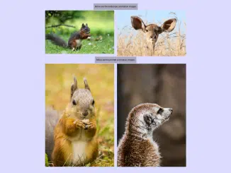
<body onload="calculateOrientation()">
<div id='info'>This small script programmatically detects and displays orientation (landscape / portrait / square) for various images. After that, it also sorts them based on orientation.<span><em>Made with vanilla JS.</em></span></div>
<div class='img-filmstrip'>
	<div class='img-container'>
		<img src='https://res.cloudinary.com/zkriszti/image/upload/v1515155404/orientation/pexels-photo-416163.jpg'>
		<div class='orientation'></div>
	</div>
	<div class='img-container'>
		<img src='http://res.cloudinary.com/zkriszti/image/upload/v1515155404/orientation/pexels-photo-459205.jpg'>
		<div class='orientation'></div>
	</div>
	<div class='img-container'>
		<img src='http://res.cloudinary.com/zkriszti/image/upload/v1515155404/orientation/pexels-photo-561870.jpg'>
		<div class='orientation'></div>
	</div>
	<div class='img-container'>
		<img src='http://res.cloudinary.com/zkriszti/image/upload/v1515155404/orientation/pexels-photo-770599.jpg'>
		<div class='orientation'></div>
	</div>
	<div class='img-container'>
		<img src='http://res.cloudinary.com/zkriszti/image/upload/v1515155404/orientation/pexels-photo-773049.jpg'>
		<div class='orientation'></div>
	</div>
</div>
<div id='ls-coll' class='title-coll'>Below are the landscape orientation images:</div>
<div id='landscape-collection' class='img-coll'></div>
<div id='p-coll' class='title-coll'>Below are the portrait orientation images:</div>
<div id='portrait-collection' class='img-coll'></div>
Applying CSS Styles
Next, add CSS styles to make the app look good and work well on different screen sizes.
* {box-sizing: border-box;}
body {font-family: 'Encode Sans Expanded', sans-serif;}

#info, .title-coll {background: rgba(120,120,120,0.5); font-size: 1.2rem; line-height: 1.7; padding: 0.8rem; margin-bottom: 5px; text-align: center;}
#info span {margin-top: 2rem; display: block;}

.img-filmstrip {display: flex; max-width: 100%; flex-wrap: wrap;}
.img-container {
	position: relative;
	margin-bottom: 5px;
	max-width: 100%;
	}
.img-container:last-child {margin-right: 0;}
img {max-width: 100%; display: block;}
.orientation {
	position: absolute;
	bottom: 0;
	background: rgba(120,120,120,0.5);
	width: 100%;
	padding: 0.5rem 0 0.5rem 1rem;
	font-weight: bold;
	color: #e6e6e6;
}

.img-coll img {margin-bottom: 5px;}

@media only screen and (min-width: 520px) {
	.img-filmstrip {display: flex; flex-direction: row; flex-wrap: wrap; align-items: flex-start} .img-container {width: 49%; } .img-container:nth-child(2n+1) {margin-right: 2%;}
	}

@media only screen and (min-width: 677px) {
	.title-coll {clear: both;}
	.img-coll img {width: 49%; float: left;}
	.img-coll img:nth-child(2n+1) {margin-right: 2%;}
}

@media only screen and (min-width: 800px) {
	.img-container:nth-child(n) {margin-right:0; width: 18%; margin-right: 2.5%;}
	.img-container:last-child {margin-right: 0;}
	}
Implementing the JavaScript Functionality
Now, let’s implement the core JavaScript function to detect image orientation and sort the images accordingly.
'use strict';
/* Detect orientation */

let images = document.querySelectorAll('.img-container img');
let i;
let captionOri;
let ratio;
let landscapes = [];
let lsCollection = document.getElementById('landscape-collection');
let portraits = [];
let pCollection = document.getElementById('portrait-collection');

function calculateOrientation() {

	for (i = 0; i < images.length; i++) {
		ratio = images[i].clientWidth / images[i].clientHeight;
		captionOri = images[i].nextElementSibling;

		if (ratio < 1){
			captionOri.innerHTML = 'portrait';
			portraits.push(images[i]);
			let newPImg = images[i].cloneNode(false);
			pCollection.appendChild(newPImg);
		} else if (ratio === 1) {
			captionOri.innerHTML = 'square';
		} else {
			captionOri.innerHTML = 'landscape';
			landscapes.push(images[i]);
			let newLsImg = images[i].cloneNode(false);
			lsCollection.appendChild(newLsImg);
		}
	}
}
Final Thoughts
By following these steps, you have successfully implemented a Javascript Check If Image Is Portrait Or Landscape function. This provides a dynamic way to handle images based on their orientation.


