

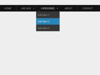
How to Create Responsive Navbar Html Css With Source Code
First of all, load the following assets into the head tag of your HTML document.
<link rel="stylesheet" href="https://public.codepenassets.com/css/normalize-5.0.0.min.css">
Create the HTML structure as follows:
<section class="navigation">
  <div class="nav-container">
    <div class="brand">
      <a href="#!">Logo</a>
    </div>
    <nav>
      <div class="nav-mobile"><a id="nav-toggle" href="#!"><span></span></a></div>
      <ul class="nav-list">
        <li>
          <a href="#!">Home</a>
        </li>
        <li>
          <a href="#!">About</a>
        </li>
        <li>
          <a href="#!">Services</a>
          <ul class="nav-dropdown">
            <li>
              <a href="#!">Web Design</a>
            </li>
            <li>
              <a href="#!">Web Development</a>
            </li>
            <li>
              <a href="#!">Graphic Design</a>
            </li>
          </ul>
        </li>
        <li>
          <a href="#!">Pricing</a>
        </li>
        <li>
          <a href="#!">Portfolio</a>
          <ul class="nav-dropdown">
            <li>
              <a href="#!">Web Design</a>
            </li>
            <li>
              <a href="#!">Web Development</a>
            </li>
            <li>
              <a href="#!">Graphic Design</a>
            </li>
          </ul>
        </li>
        <li>
          <a href="#!">Contact</a>
        </li>
      </ul>
    </nav>
  </div>
</section>
Style using the following CSS styles:
.cd__main{
  display: block !important;
}
.navigation {
  height: 70px;
  background: #262626;
}

.brand {
  position: absolute;
  padding-left: 20px;
  float: left;
  line-height: 70px;
  text-transform: uppercase;
  font-size: 1.4em;
}
.brand a,
.brand a:visited {
  color: #ffffff;
  text-decoration: none;
}

.nav-container {
  max-width: 1000px;
  margin: 0 auto;
}

nav {
  float: right;
}
nav ul {
  list-style: none;
  margin: 0;
  padding: 0;
}
nav ul li {
  float: left;
  position: relative;
}
nav ul li a,
nav ul li a:visited {
  display: block;
  padding: 0 20px;
  line-height: 70px;
  background: #262626;
  color: #ffffff;
  text-decoration: none;
}
nav ul li a:hover,
nav ul li a:visited:hover {
  background: #2581DC;
  color: #ffffff;
}
nav ul li a:not(:only-child):after,
nav ul li a:visited:not(:only-child):after {
  padding-left: 4px;
  content: " ▾";
}
nav ul li ul li {
  min-width: 190px;
}
nav ul li ul li a {
  padding: 15px;
  line-height: 20px;
}

.nav-dropdown {
  position: absolute;
  display: none;
  z-index: 1;
  box-shadow: 0 3px 12px rgba(0, 0, 0, 0.15);
}

/* Mobile navigation */
.nav-mobile {
  display: none;
  position: absolute;
  top: 0;
  right: 0;
  background: #262626;
  height: 70px;
  width: 70px;
}

@media only screen and (max-width: 798px) {
  .nav-mobile {
    display: block;
  }

  nav {
    width: 100%;
    padding: 70px 0 15px;
  }
  nav ul {
    display: none;
  }
  nav ul li {
    float: none;
  }
  nav ul li a {
    padding: 15px;
    line-height: 20px;
  }
  nav ul li ul li a {
    padding-left: 30px;
  }

  .nav-dropdown {
    position: static;
  }
}
@media screen and (min-width: 799px) {
  .nav-list {
    display: block !important;
  }
}
#nav-toggle {
  position: absolute;
  left: 18px;
  top: 22px;
  cursor: pointer;
  padding: 10px 35px 16px 0px;
}
#nav-toggle span,
#nav-toggle span:before,
#nav-toggle span:after {
  cursor: pointer;
  border-radius: 1px;
  height: 5px;
  width: 35px;
  background: #ffffff;
  position: absolute;
  display: block;
  content: "";
  transition: all 300ms ease-in-out;
}
#nav-toggle span:before {
  top: -10px;
}
#nav-toggle span:after {
  bottom: -10px;
}
#nav-toggle.active span {
  background-color: transparent;
}
#nav-toggle.active span:before, #nav-toggle.active span:after {
  top: 0;
}
#nav-toggle.active span:before {
  transform: rotate(45deg);
}
#nav-toggle.active span:after {
  transform: rotate(-45deg);
}

article {
  max-width: 1000px;
  margin: 0 auto;
  padding: 10px;
}
Load the following scripts before closing the body tag:
<script src='//cdnjs.cloudflare.com/ajax/libs/jquery/2.1.3/jquery.min.js'></script>
Add the following JavaScript function:
(function($) { // Begin jQuery
  $(function() { // DOM ready
    // If a link has a dropdown, add sub menu toggle.
    $('nav ul li a:not(:only-child)').click(function(e) {
      $(this).siblings('.nav-dropdown').toggle();
      // Close one dropdown when selecting another
      $('.nav-dropdown').not($(this).siblings()).hide();
      e.stopPropagation();
    });
    // Clicking away from dropdown will remove the dropdown class
    $('html').click(function() {
      $('.nav-dropdown').hide();
    });
    // Toggle open and close nav styles on click
    $('#nav-toggle').click(function() {
      $('nav ul').slideToggle();
    });
    // Hamburger to X toggle
    $('#nav-toggle').on('click', function() {
      this.classList.toggle('active');
    });
  }); // end DOM ready
})(jQuery); // end jQuery
That’s all! hopefully, you have successfully created Responsive Navbar Html Css With Source Code. If you have any questions or suggestions, feel free to comment below.